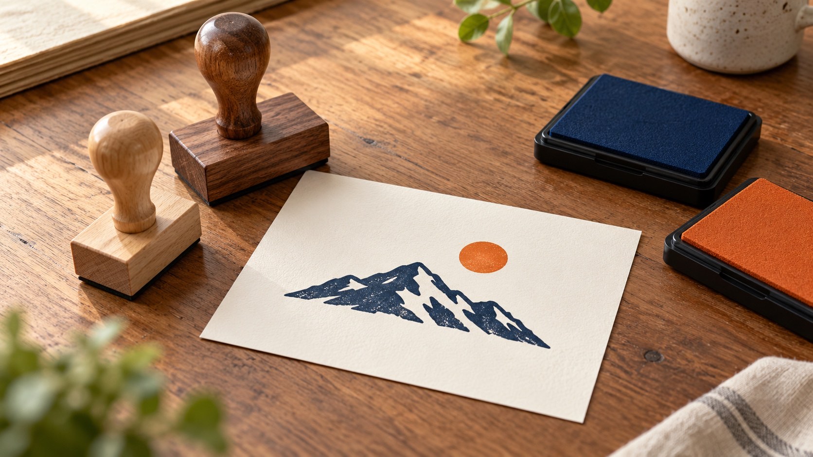
A two-color rubber stamp looks straightforward in a mockup: a dark name, a brighter symbol, perhaps a colored ring around both. On paper, those parts need a workable way to receive different inks and arrive in the right positions. The difficult decision often sits in the small white gap between them.
Choose the printing method before polishing the artwork. A purpose-made multicolor mechanism and two separate hand stamps impose different limits. Once that choice is clear, separate the artwork, give the colors enough room and ask for a proof that represents the process you will actually use.
This guide focuses on a reusable mark for ordinary cards, tags and paper packaging. The examples are design exercises, including the gap calculation, rather than measured performance results. Your maker needs to confirm the limits of the particular tools, inks and material.
Choose how the two colors will reach the paper
“Two-color stamp” can mean a single impression from a tool designed to apply different inks to separate areas. It can also mean two impressions made with separate stamps. A third possibility is selectively inking different parts of one hand stamp before printing. Those methods should not share an order brief that merely says “two colors.”
Some multicolor systems use an ink pad divided into separate fields. The available field shapes, clearances and ink choices depend on that system. A small colored dot in your drawing may require more room in the pad arrangement than the dot itself suggests. Ask the maker to assess the complete layout against their current rules.
With two independent stamps, each tool carries one part of the design. You gain freedom to separate the impressions in time or place, but someone must align the second part with the first. That alignment is called registration. A pleasing screen overlay says nothing about how consistently an operator can reproduce it.
Selective inking introduces a different task: keeping ink on its intended areas without contaminating the neighboring design. It may suit deliberate craft work, but evaluate the real preparation and cleanup before choosing it for repeated packaging. Do not assume one ordinary pad can deliver two sharply bounded ink areas.
Ask the supplier which method they propose, how many impressions the operator makes, and what the supplied proof demonstrates. Settle that conversation before comparing prices. A quotation for one assembled multicolor unit is not directly comparable with a quotation for two wooden mounts and no alignment method.
If the job needs fine adjoining colors, gradients or precise overlaps, describe that requirement immediately. The maker may propose another process. Changing the method at this stage is much easier than discovering after manufacture that the important part of the logo cannot be reproduced as drawn.
Give the second color a job that survives a small shift
Start with the reason for adding color. A separate sun above a mountain, a small accent beside a name or a secondary line can remain recognizable with some positional variation. A thin orange outline around every navy letter depends on a much closer relationship.
For two manually applied impressions, favor shapes that look intentional across a modest range of relative positions. This is a design strategy, not a promised tolerance. Move the accent slightly in a working copy and inspect the result at the intended size. Does it still look like the same composition?
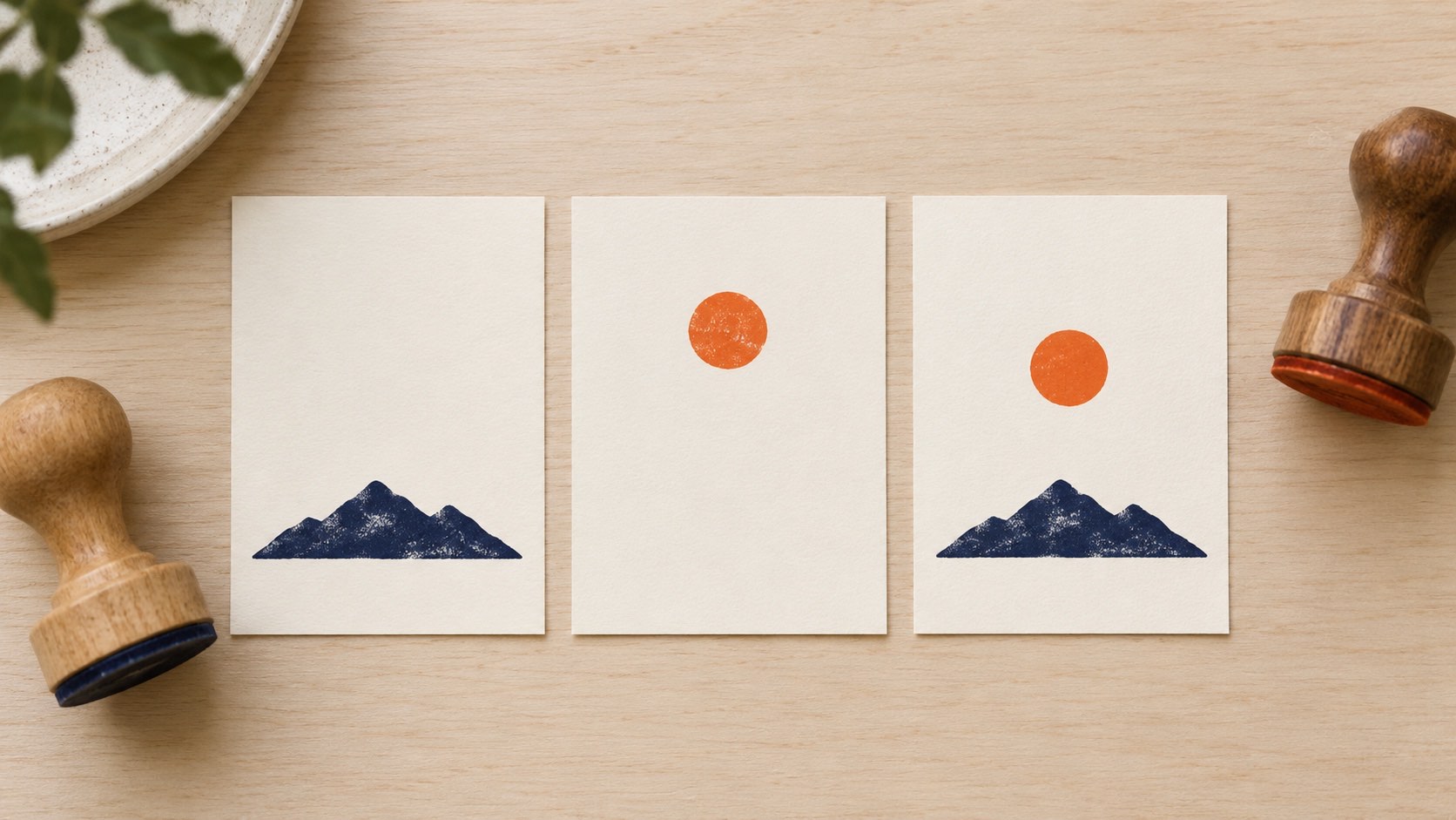
Imagine a navy mountain with an orange sun floating above it. The white space between them can absorb a little movement without changing the idea. Now imagine the orange sun precisely filling a circular hole cut into the mountain. A shift can expose a white crescent on one side and an overlap on the other.
Color should also support the reading order. If the company name must be read first, keep it clear in its own ink area. A bright secondary line should not become the only legible part of a weak impression. Check what remains understandable if the accent is pale or slightly misplaced.
Avoid splitting one small word between two independently aligned impressions unless the process can support it. The reader expects the letters to share a baseline and spacing. A gap that looks minor between separate symbols can look conspicuous inside a short word.
Build a few alternatives around the same information: a separate accent, a separate secondary line, and a version with only one ink. Compare the actual benefit of the second color. If it adds handling but little useful distinction, keeping a single-color version may be the better decision for that job.
Make one master and two aligned separations
Keep one complete master showing the intended composition. For a two-pass process, make a separate production view for each ink, with each view derived from that same master. These views are the color separations: one shows everything intended for the first impression, the other everything intended for the second.
Preserve the same artwork coordinate system while preparing those views. If each file is automatically cropped tightly to its visible shapes, their outer rectangles can lose the relationship that made the combined design work. A supplier may still handle differently sized blocks, but they need an explicit reference for where the resulting impressions belong.
For example, the sun separation might contain a small circle near the top of a larger common artboard. The mountain separation occupies the lower area. Send a combined reference and tell the maker how the two files relate. Let them specify whether they want common artboards, dimensioned references or another production format.
Use clear names for the views and identify the intended ink beside each one in the brief. The manufacturing shapes may be shown in black even when the final ink is orange. Explain that convention so nobody mistakes a geometry file for a change to the approved color.
Check both separations alone. A decorative ring should not accidentally appear in both passes, and a letter should not disappear because it was hidden while exporting. Then recombine the exported files using the agreed reference, rather than checking only the original editable master.
Check the scale of each exported view as well. If one is resized to fit its visible content while the other retains the full artboard, the sun may become larger relative to the mountain even though each file opens normally. Put the exports back into a common reference at their stated dimensions. This catches a file-preparation error before it is mistaken for inaccurate stamping.
Do not decide independently to mirror one separation and leave the other readable. Ask what orientation the maker wants. Keep a normal-reading composite as the impression reference, and let the production instructions specify any reversal needed to make the physical printing faces.
Any registration marks intended only for setup must be identified as such. A cross or outline on a reference sheet should not quietly become part of the rubber plate. Confirm what prints on the finished item and what exists solely to describe alignment.
Use the gap as a design decision
White space between colors is part of the artwork. It separates the shapes visually and, for some production systems, provides room required by the inking arrangement. For a two-pass method, it can also keep ordinary misalignment from immediately creating an unwanted overlap.
There is no single spacing number that approves every two-color rubber stamp. Ask the chosen maker for the required separation between color areas and any minimum area needed by their pad system. Do not apply a dimension found in an old catalog to unrelated hardware.
A simple calculation helps explain the geometry. Suppose you draw a 1.8 mm gap between two straight boundaries. If the second impression moves 0.6 mm toward the first, the geometric gap becomes 1.2 mm. These invented values illustrate subtraction; they are not recommended clearances or measured stamp accuracy.
That example leaves out rotation, ink spread, paper behavior and variation across the impression. A small turn can change the clearance at opposite ends differently. Use the calculation to see why a gap matters, then ask for an appropriate physical check of the complete design.
The rubber stamp artwork preparation guide covers fine strokes and open spaces within a single impression. In a two-color design, add a second question: does each color remain clear when its position relative to the other changes within the process you can actually maintain?
Keep narrow accent outlines, tiny interlocking shapes and close parallel borders out of an early prototype. If they are essential to the identity, bring that requirement to the maker and compare production options. Do not quietly enlarge the gap until the logo says something different.
For a purpose-made multicolor unit, the supplier's approved layout governs the relevant spacing. A hand-alignment experiment does not validate its pad construction. Conversely, a layout accepted by a multicolor ordering system does not establish that two separate hand stamps will be easy to register.
Specify the physical inks and paper together
Two colors in the artwork are not two ink specifications. Ask which compatible inks are available for the intended mechanism and paper. The screen appearance is a reference for the conversation, while the real impression is the result you need to assess.
For separate hand stamps, identify which pad belongs to which tool. Place them so the operator can follow the sequence without carrying a freshly inked face over the wrong pad. A simple orientation and storage routine can prevent an avoidable color-selection mistake.
Do not assume that two inks described as blue and orange share the same handling requirements. Follow the instructions for the actual products and receiving material. Mixing unrelated inks, adding a solvent or changing the refill solely to chase a color can introduce a problem the artwork cannot fix.
Intentional overlap needs its own sample. An orange impression over navy is not guaranteed to produce a particular third color or retain a clean edge. The ink coverage, surface and printing order can affect what you see. A transparent overlay on a monitor is only a concept.
If overlap is optional, compare a separated version first. It gives you a clearer way to judge placement and each ink's appearance. If overlap is essential, ask whether the proposed method supports the intended effect and approve the actual combination rather than choosing it from a digital blend.
Keep the material consistent during the first alignment trial. A smooth white card, a rough brown tag and a folded carton create different conditions. Once the geometry works on the intended stock, assess other materials as separate uses rather than extending approval by assumption.
Plan the point at which the second pass and later handling occur. Use the ink maker's guidance and an appropriate trial to establish that sequence. Avoid a universal drying-time rule: the working method needs to suit the exact ink, surface and conditions.
Prove the alignment method before approving the artwork
For two independent tools, establish how the paper returns to its position and how each stamp returns to its own position. A stop at the edge of the card solves only the first problem. The two printing faces still need references that preserve their relationship.
Begin with flat scrap stock matching the job, a stable supporting surface and the simplest useful references. Check the entire travel of both tools. A guide that locates one mount neatly can obstruct the other housing or encourage a tilted approach.
Use the same card orientation for both passes unless there is a documented reason to change it. Turning a card between impressions introduces another relationship to manage. If turning is necessary, make the reference edges and the new orientation obvious in the setup instructions.
Try the full sequence, including loading and unloading. Leaving a single sheet in place while making both impressions can conceal difficulties that appear when the real batch is removed, handled and reloaded. The trial should represent the working method, not just the easiest way to photograph one good result.
Consider whether to complete both colors on each item or run the first color across the batch before applying the second. The right sequence depends on handling requirements, available space and the way the stock can be relocated. Compare those practical conditions instead of assuming either approach is faster.
Ask the next operator to repeat an ordinary piece with the setup note. If alignment depends on a tiny adjustment only the designer remembers, the method is not yet ready for a shared task. Either clarify the reference or give the artwork a more forgiving relationship.
With a single multicolor unit, use the maker's supplied operating method. The registration between its color fields is part of that system rather than a reason to build a two-tool jig. Check the resulting combined impression on the real item and keep any defects tied to the relevant unit.
Read the pattern of a failed impression
The accent moves sideways but keeps its angle
Compare the paper seating and the second tool's sideways reference. If the entire second impression shifts while its shape remains sound, changing line thickness is unlikely to solve it. Find which locating step permits movement, then repeat that step on scrap.
The gap changes from one end to the other
Look for rotation rather than a uniform offset. The card may not be seated against both references, or the second mount may be approaching at an angle. A simple horizontal nudge can correct one end while making the other worse.
Both colors sit correctly, but one transfers poorly
Separate the contact or ink issue from registration. Inspect the relevant tool, pad, material and support while keeping the other pass unchanged. Moving the artwork to compensate for an incomplete impression confuses two different faults.
If the same relative offset appears consistently, send the maker a combined example and both individual impressions. They can help distinguish a tooling relationship from a variable hand-placement problem. Do not remake one plate from a single unclear photograph.
If only occasional pieces fail, keep their position in the sequence visible. They may reveal a loading mistake, interruption or changed grip. Selecting the nicest piece for approval would hide the variation that matters during actual production.
Approve the combined result and the working sequence
Check each ink area separately, then read the complete mark. Correct individual impressions can still form an unbalanced combined design. Look at the relationship of the accent to the name, the white gap and the placement of the entire mark on the item.
The first rubber stamp sample guide helps organize the wider acceptance check. For this job, keep an ordinary combined impression and note the tools, ink assignment, substrate and sequence that produced it.
Agree what variation is acceptable before choosing the reference. An accent that may float within a clear area needs a different acceptance condition from colors intended to meet. The requirement should come from the design's purpose and the capable process, not an invented precision figure.
Review several ordinary pieces from the trial, including any failed examples. Choose a trial length that exposes your real handling sequence; no casual number of prints certifies a process. If the workflow needs formal inspection criteria, obtain those through the responsible production team.
Keep setup pieces separate from the assessed sequence. They explain how the method was adjusted, while the later pieces show what happened after those adjustments were fixed. If you keep moving a guide between every impression, say that the process is still being set up. Approving a collection of individually corrected pieces would leave the next operator without a stable method to follow.
Count the extra application and inspection work when deciding whether the second color earns its place. Keep a one-color fallback if it still communicates the needed information. That can be useful when a material or deadline makes the two-color method impractical.
Send a production brief that leaves no guessing
Package the complete reference with the two identified separations, intended impression dimensions and the chosen production method. Name the receiving stock and state whether the colors must remain apart or intentionally overlap. Ask the supplier to flag any conflict with their current hardware limits.
Include the approved orientation and alignment approach for a two-tool job. Confirm which marks belong on the printing face and which are reference aids. If different mount sizes are proposed, ask how the intended relationship will be retained during operation.
Keep the accepted sample with the working instructions. Recheck the relationship when a tool, ink, material or locating method changes. A replacement unit can carry the same design while requiring a fresh placement check.
Before ordering a two-color rubber stamp, make one useful decision about the gap: is it a deliberate open space the process can preserve, or a precision relationship that needs a more capable method? Settle that with the maker, and the rest of the artwork becomes much easier to prepare.