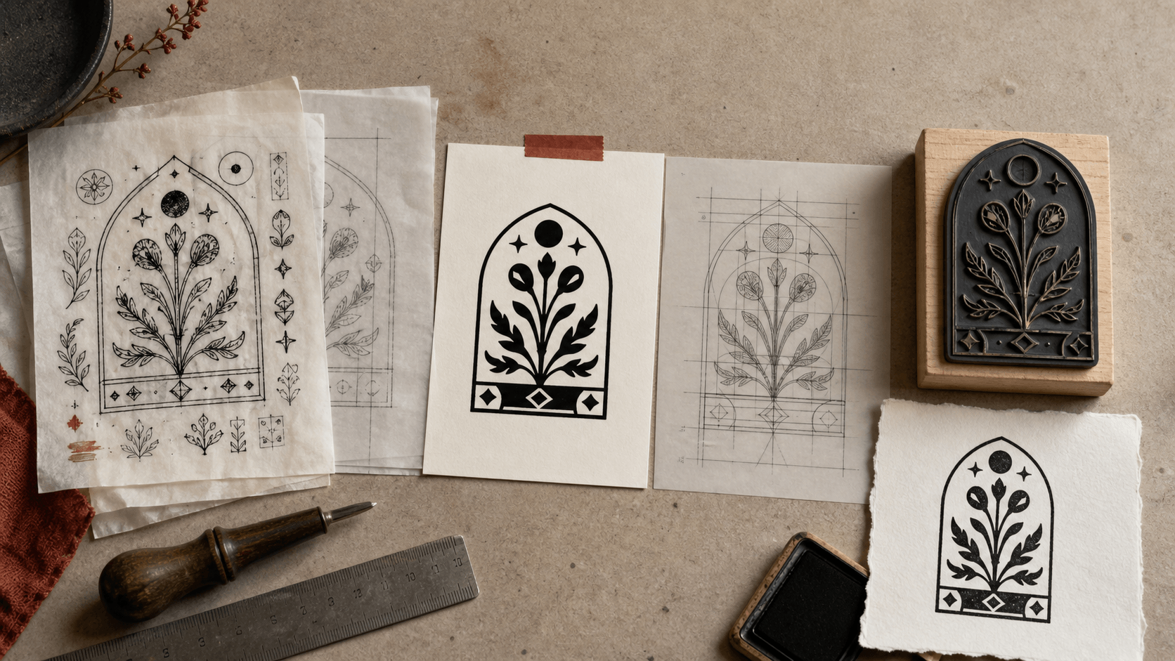
An AI-generated emblem can look remarkably close to a finished rubber stamp. It may already be black and white. It may sit inside a tidy circle, carry a convincing vintage texture, and appear on a mockup with the right amount of imperfect ink. None of that tells you whether it can be made into a reliable stamping surface.
A physical stamp has no patience for simulated detail. Its raised areas must accept ink, its open areas must release it, and every important feature has to survive at the size held in your hand. Generated artwork brings a particular set of problems into that process: invented lettering, shapes that only appear connected, decorative noise disguised as age, uncertain source material, and files that look vector-like without containing sensible paths. The right response is not to avoid AI imagery altogether. It is to give it a production test that separates an appealing idea from usable artwork.
The checklist below begins before tracing and continues through the first real impression. It is designed for a business owner, maker, or designer who already has a generated concept and wants to know what must happen next.
1. Save the concept, then strip away its presentation
Keep an untouched copy of the selected image before making changes. Save the prompt or brief, the date, the tool, and any source images that were intentionally supplied. Give the file a plain version name. This small record helps later when several near-identical generations, exports, and corrected files accumulate in the same folder.
Next, ignore the mockup. Remove the desk scene, paper grain, shadows, ink bleeding, rubber handle, foil, embossing, and any other effect that demonstrates how the image might feel. These cues are persuasive because they let the eye imagine a finished object. They can also conceal gaps, weak edges, and fake detail. What remains should be evaluated as flat artwork: one solid foreground color against a plain background.
If the mark loses its character as soon as the texture disappears, identify which underlying idea was actually useful. Perhaps it was the broad silhouette of a fox, the way two initials overlapped, or the irregular rhythm of an outer ring. Preserve that idea as a reference, not every pixel around it. A generated image is often strongest as a direction for redrawing.
Do not sharpen or auto-trace the entire mockup just to make it feel technical. Sharpening can harden accidental specks into apparent features. Tracing can create thousands of small paths around simulated ink grain. Both operations may produce a more complex file without producing a better stamp.
2. Establish what you are permitted to use
Production is the wrong moment to discover that nobody recorded where an image came from. Review the terms that applied to the tool and account when the concept was generated. If reference images were uploaded, confirm who owned them and whether they were authorized for this use. Look closely for recognizable third-party logos, characters, insignia, or packaging elements that may have appeared even though they were not named in the brief.
Visual similarity can be easy to miss when a model changes surface details but retains the overall impression of a familiar mark. Search and clearance needs depend on the intended use and jurisdiction. A private craft label and a primary commercial identity do not carry the same level of risk. If the design will represent a business, product line, certification, or public-facing service, an appropriate trademark search and professional advice may be sensible before money is spent on production.
Copyright treatment of AI-assisted material is also developing and differs by jurisdiction. The amount and nature of human contribution can matter. Keep a practical record of the human work: the original brief, deliberate selection, redrawing, typography, proportion changes, and other expressive decisions. The purpose of that record is accuracy, not a promise that it creates a particular legal result.
Finally, consider confidentiality. Do not upload an unreleased brand, customer list, signature, official credential, or other sensitive material to a service without checking its data terms and your organization's policy. A beautiful mark is not worth an avoidable information problem.
3. Replace every generated letter with real text
Assume all lettering in the generated image is wrong until it has been retyped and checked. Sometimes the error is obvious: nonsense words, duplicated letters, or characters from two alphabets. More dangerous are forms that look plausible at a glance. A model may drop a suffix, merge two letters, change one digit, invent punctuation, or make a curved line of type unreadable without breaking the overall impression.
Write the approved wording in a separate text document before laying it out. Include capitalization, punctuation, spacing, accents, legal suffixes, dates, and any required registration or contact details. Ask the person responsible for that information to approve the text itself. Do not ask them to proofread it for the first time inside a decorative circle.
Recreate the wording with a known typeface and editable text layers. If type must eventually be converted to outlines for a production file, preserve a master version with live text. Check the license for the chosen font and any restrictions relevant to the intended use. Similar-looking type is often safer and easier to control than trying to trace the unstable letter shapes in a generated image.
Curved text needs careful spacing. Letters that appear evenly distributed mathematically may still look crowded near wide characters or loose near narrow ones. Review the baseline, direction, start and end points, and the relationship between the upper and lower arcs. Then read every character aloud from the final proof. Familiar brand wording is exactly what the brain tends to autocorrect.
4. Convert the idea into a true one-color structure
A rubber stamp normally needs a clear decision for every area: it either prints or it does not. Gray shading, soft transparency, feathered edges, and realistic lighting do not automatically translate into that binary structure. Converting an image to grayscale is not enough, and applying a threshold filter merely lets software make the decision by brightness.
Instead, decide what each shaded region means. A dark fold in an illustrated ribbon might become a single open cut. Fur texture could become three purposeful notches rather than forty hairs. A gradient behind a monogram may disappear entirely so the initials gain a clean field. Work from the most important silhouette inward and stop adding detail once the idea reads clearly.
Pay particular attention to floating islands. In a screen image, a white speck inside a black area is just a group of pixels. On a stamp surface, it may require a small recess surrounded by raised rubber. A black dot inside a white area may need its own raised island and enough connection or support to survive. Shapes that appear to touch because of antialiasing can be physically separate when the soft edge is removed.
View the artwork both as black-on-white and reversed white-on-black. The reverse view exposes narrow bridges, uneven counters, and accidental holes. If the mark only reads in one orientation because shading is doing most of the work, simplify it again.
5. Remove generated detail that has no job
AI images often contain detail that is locally plausible but globally meaningless. Leaves change species around a wreath. A rope border becomes beads and then returns to rope. Symmetrical ornaments contain different numbers of petals. Tiny filler lines accumulate wherever the model found empty space. At full screen size, this gives the image richness. In a stamp, it gives ink places to collect.
Ask each small element what it contributes. Does it identify the subject, separate two larger forms, support the intended style, or improve balance? If the answer is simply “it was already there,” remove it. Repetition should be made deliberate. A border needs a consistent rhythm; mirrored flourishes should either match or differ for a reason; a circle should have one controlled thickness rather than a nervous edge copied from pixels.
Generated distress deserves the same test. Authentic ink variation happens during use and changes with pressure, surface, and ink load. It does not need to be drawn into every stamp. If a worn effect is central to the identity, create a limited set of larger, intentional interruptions after the clean design works. Keep an undistressed master. This lets the manufacturer and designer distinguish intended gaps from damage or weak impressions.
Simplification can feel like losing the magic of the original image. Compare at actual stamp size, not while zoomed in. The version with fewer details will often look more confident because the eye no longer has to solve visual noise.
6. Rebuild the artwork with controllable parts
Once the useful features are identified, reconstruct them in a stamp maker with editable elements. Keep the border, main text, secondary text, symbol, and any dividers separate. Set a real target size early so every design choice has a physical context.
Automatic vector tracing can provide a rough start for a simple, high-contrast silhouette. It should not be treated as approval. Inspect the paths. Pixel-based artwork often turns into excessive nodes, lumpy curves, doubled edges, microscopic shapes, and open paths. A file can carry an SVG or EPS extension while remaining structurally poor. The format describes the container, not the quality of the drawing.
Redraw circles as circles, straight lines as straight lines, and simple curves with a small number of well-placed points. Join shapes that should behave as one printing surface. Remove hidden duplicates and stray objects. Make repeated items truly consistent. This work may take longer than pressing an auto-trace button, but it creates a master that can be resized and revised without magnifying accidents.
Keep a clean hierarchy of layers and meaningful names. “Outer border” and “company name” are more useful than dozens of anonymous paths. If a correction arrives after the first proof, the right element can be found without disturbing the whole composition. That control is the practical bridge between AI inspiration and production artwork.
7. Check line weight, gaps, and counters at final size
There is no single universal minimum line thickness for every rubber stamp. Laser settings, rubber material, plate process, stamp dimensions, ink, and manufacturer standards all matter. Obtain current specifications from the supplier who will make the stamp, and use those numbers as production requirements rather than relying on a generic rule found elsewhere.
Before that conversation, you can still identify fragile areas. Look for hairlines, sharp points, tiny counters inside letters, narrow white channels between black shapes, and details that nearly touch. These are common in AI concepts because the full-size preview can suggest a separation with only a few blended pixels. Once converted to solid geometry and reduced, the separation disappears.
Measure the important lines and gaps in the file at the intended output size. Do not assume they scale favorably. Reducing a large generated emblem to a 30-millimeter stamp reduces every small feature along with it. Strengthen essential strokes, open enclosed spaces, and remove nonessential marks. Pay extra attention where curved type approaches the border and where a symbol contains several nested shapes.
Check counters as shapes in their own right. The open area inside an “e,” “a,” or “R” must remain visible. So must the spaces between an animal's legs, the center of a flower, or the gaps in a monogram. A mark can preserve its outer silhouette while losing the internal cues that make it recognizable.
8. Run an actual-size rejection test
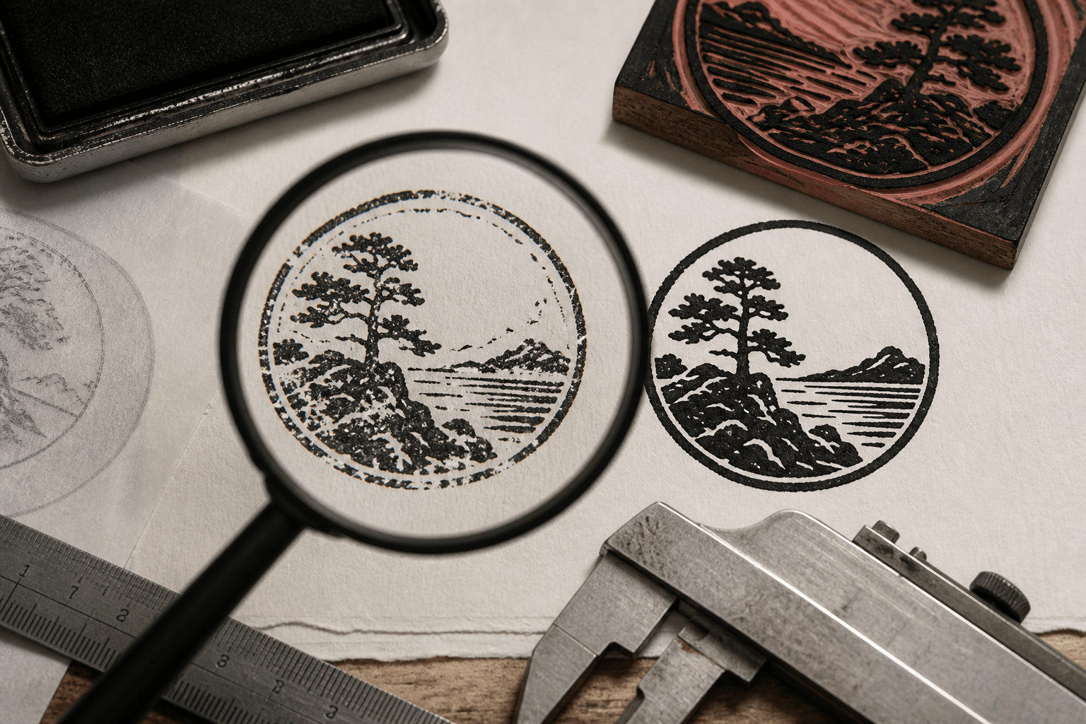
Print the design in solid black at 100 percent of the intended size. Disable “fit to page” and verify a known measurement with a ruler. Look at the proof under ordinary light and at normal reading distance. Then set it down for a few minutes and look again. The goal is not to admire the concept; it is to find a reason not to manufacture it yet.
Reject the proof if any required word needs magnification, if two elements merge, if a symbol becomes ambiguous, or if the visual weight shifts badly after reduction. Reject it if fine texture is doing the work of a clear edge. Reject it if a filled area becomes a large ink block with no breathing room. These failures are cheaper on paper than in rubber.
Try a rough ink simulation made from the clean art, but do not let it replace the solid proof. A texture filter can make defects look charming. The black proof is deliberately unforgiving. If possible, also test on a sample of the real substrate. Kraft board, coated labels, fabric, and smooth office paper respond differently to ink and pressure.
Have another person verify the wording from the proof without seeing the source document first. Their task is to read what is actually there. After that, compare character by character with the approved copy. Record the version that passed, the date, the intended dimensions, and the approver.
9. Compare the rebuild with a known stamp structure
A generated concept can become visually unbalanced during simplification. Removing texture may leave a large empty pocket; correcting the wording may make one arc longer; strengthening a central symbol may crowd the border. At this stage, compare the rebuild with a few established editable stamp layouts, not to copy their decoration but to check structural decisions.
Look at the hierarchy. Is the primary name clearly first, or do all rings and phrases compete at the same strength? Look at margins. Does the outer border protect the content, or squeeze it? Look at the division of space between text and symbol. Templates make these relationships easier to notice because their parts have already been separated into a system.
If the AI concept depends on an unconventional composition, keep it. A reference structure is a diagnostic tool, not a demand for sameness. You may decide that an off-center icon is the distinctive feature worth protecting. The comparison should help you confirm that the choice is intentional and that the remaining content still reads.
This is also a useful moment to make a simpler fallback. Keep the full identity stamp, then create a version with fewer words or without the outer ornament for smaller applications. Do not force one complex design to cover every size. A family of related marks can preserve identity more reliably than an overburdened miniature.
10. Prepare a production handoff that answers questions
Contact the chosen manufacturer before final export if anything about the specifications is uncertain. Confirm physical dimensions, supported file formats, color setup, minimum printable line and gap, whether text should be outlined, and whether the art needs to be positive or reversed. Ask how they want black and white represented. Different production systems and services may have different preferences.
Supply the clean master or an agreed production export, not a screenshot of the AI mockup. Include the intended size in writing and, if helpful, a reference PDF that shows the expected orientation and wording. Avoid sending a pile of alternatives with names such as “final,” “final-new,” and “final-use-this.” One approved production file and one clearly labeled reference reduce mistakes.
Keep the editable master separate from the outlined or flattened delivery copy. Record any change made to satisfy the manufacturer's process. If they thicken a line or close a gap, request an updated proof or file for the archive so the version on record matches the version made.
AI provenance does not need to dominate the handoff unless the manufacturer asks about it or a contract requires disclosure. What they do need is unambiguous artwork. The internal project record can preserve the earlier concept, prompt, permissions review, and human edits.
11. Judge the first impression, not the original render
When the stamp arrives, compare its first impressions with the approved actual-size proof. Test light, normal, and firm pressure on the intended material. Look for predictable trouble: filled counters, broken fine lines, uneven large areas, unwanted contact around the edge, or details that only appear under excessive pressure.
Some variation is part of rubber stamping. The objective is not to reproduce a sterile digital preview on every attempt. The important question is whether normal use delivers the correct words, recognizable symbol, intended hierarchy, and acceptable character. If the design needs a perfect combination of ink and pressure to become legible, the artwork is too fragile.
Document the successful impression and any handling notes. If a revision is needed, correct the editable master rather than painting over the export. Strengthen or open the smallest responsible area, then repeat the actual-size proof and manufacturer check. Do not reintroduce the original AI image as the master just because it looks richer on screen.
The useful contribution of AI should still be visible in the idea: perhaps an unexpected monogram, a strong silhouette, or a border direction that gave the project its voice. Everything after that is careful translation. A production-ready rubber stamp is not the generated image made more technical. It is a new, controlled piece of artwork built from the part of that image worth keeping.