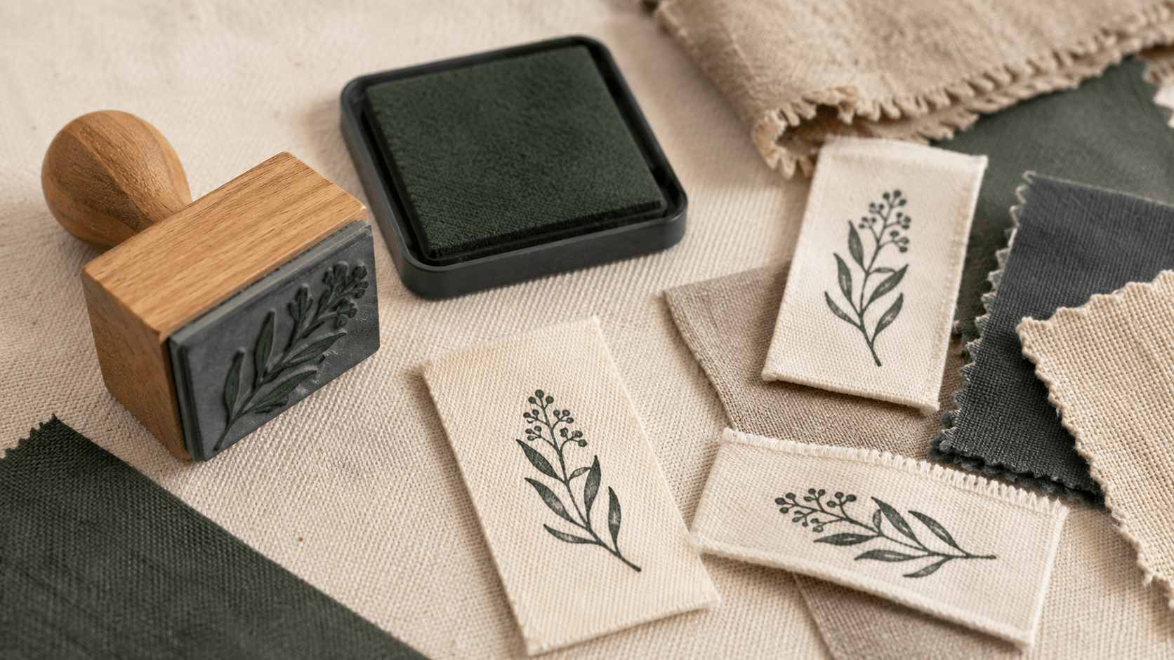
A rubber stamp for fabric labels has to do more than look tidy on a screen. The impression must cross yarns, survive the texture of the weave, and remain recognizable after the ink is set according to its instructions. Fine letters that work on smooth paper can split across a coarse label. A solid icon can become patchy. The same ink may behave differently on cotton, linen, a synthetic blend, or a coated ribbon.
The design and the material therefore have to be tested as one system. Start with the finished label, not an isolated logo file. Decide what the mark must communicate, how large it can be, which fabric and ink will be used, and how the label will be handled later. Then simplify the artwork until it can tolerate an ordinary human impression rather than one perfect studio sample.
This guide focuses on fabric labels, care tags, small textile patches, and similar maker applications. It does not promise that one ink or setting method will work on every textile. The ink maker’s current directions and the fabric’s care label should control the process.
1. Decide what must survive the fabric
A fabric stamp often begins with a full brand lockup: name, icon, slogan, location, website, and a decorative frame. That may be a useful identity system, but it is rarely a useful small textile impression. The first design decision is not which border to use. It is which part of the identity must remain after the weakest reasonable print.
For many labels, the answer is the maker’s name or a short wordmark plus one simple symbol. A care instruction is a different job. A size marker is different again. Keep those functions separate unless the label is large enough to give each one clear space.
Write a priority list with three levels. Level one is essential: the text or mark that must be readable. Level two is helpful but removable. Level three is decorative. Build the first proof with level one only. Add level two only if the impression still feels open at actual size. Decorative elements should earn their place by improving recognition, not by filling silence.
Think about where the label will be seen. A folded side-seam tag is read close up but has little width. A cotton patch on product packaging may be larger but more textured. A direct impression inside a handmade bag may land on a seam, lining, or uneven surface. The same artwork should not be assumed to work unchanged in every position.
Also decide how long the mark needs to last. A removable craft-market tag has a different duty from a washable garment label. This choice affects the ink and setting method more than the drawing, but it should shape the test plan from the beginning.
2. Choose the fabric and ink as a pair
“Fabric” is not one printing surface. Cotton canvas, smooth cotton tape, linen, rayon, polyester, and coated ribbon have different textures and absorbency. Even two fabrics with the same fiber name may have different finishes. Design advice that ignores the actual swatch can only go so far.
Choose the label material before approving the mark. If the supplier offers a sample card or offcut, use it. Wash or prepare the swatch in the same way the finished product will be prepared. A sizing or coating on new fabric can change how ink sits on the surface.
Use an ink specifically described by its maker for the chosen material and application. Read the current setting, drying, cleaning, and wash instructions. Some fabric pigment inks are heat-set; one current manufacturer, for example, specifies heat applied through a cloth and explains that wash performance varies by fiber and correct procedure. Other products may air-dry, require a different temperature, or be unsuitable for a particular synthetic surface. Do not transfer one brand’s timing to another container.
Color is part of this pairing. A dark ink on a pale woven tape is usually easier to proof than a light ink on a dark or absorbent textile. Light and metallic impressions depend on opacity, coverage, and surface behavior. If the project needs a pale mark on dark fabric, test the exact ink and fabric before designing the whole identity around that effect.
Make a simple material note: fabric name, supplier or batch, preparation, ink, setting method, and intended care. Keep it with the proof. Without that record, a successful sample is hard to reproduce later.
3. Simplify artwork for the weave
A woven surface interrupts edges. Valleys between yarns may receive less ink, while raised fibers can spread it beyond the intended shape. Small counters inside letters can close. Parallel hairlines can merge into a gray patch. The design needs enough visual redundancy to remain recognizable when some information disappears.
Start in one color with no gradients, shadows, or translucent effects. Convert the logo into solid printed shapes and unprinted gaps. Zoom out rather than in. At the final impression size, ask whether the silhouette is still distinct before inspecting the fine details.
Remove tiny enclosed elements first. A leaf with twelve veins may become a leaf with three. A detailed animal illustration may become a profile or a single characteristic shape. A script monogram may need open joins and fewer flourishes. Simplification is not a careless copy of the logo; it is a deliberate small-format version.
Avoid large uninterrupted solids when the fabric is coarse. They can print unevenly because pressure and ink coverage vary across the area. Breaking a heavy shape into a bold outline or a few separated forms may give a more consistent handmade result. Test both rather than deciding from the digital preview.
Do not add artificial distress before the clean structure works. Real fabric and hand pressure already create variation. A distressed texture can combine with the weave and turn controlled wear into missing information. Keep a clean master, then test a restrained textured variant only if the brand truly needs it.
4. Set the final impression size first
A fabric-label design should begin with the physical space it will occupy. Measure the usable flat area after seams, folds, and stitch allowances—not the full width of the uncut tape. If the label folds in half, mark the fold and keep essential elements away from it. If it will be sewn on four sides, reserve a quiet border for the needle line.
Set those dimensions in the online stamp maker before arranging the artwork. Working at the final size prevents a large, comfortable composition from being shrunk into a fragile one at the last step. Keep the text, border, and image as separate layers so you can remove or enlarge one element without distorting the rest.
Print the design at 100 percent and place the paper proof on the label. This is not a fabric test yet; it is a scale test. Can you read the name without bringing it unnaturally close? Does the icon still look like the intended object? Is there room for a slightly misplaced impression? Does a stitched edge threaten the text?
Prepare two sizes if the use really changes. A narrow folded tag may carry only the name. A larger flat patch may add the symbol. Those are useful variants because the job changes. Avoid making five nearly identical sizes simply because the editor allows it. Every version adds another file, plate, and chance for the wrong one to reach production.
Record dimensions in the filename or approval sheet, not only in a screenshot. A supplier needs an actual measurement. A screen image without scale is not a production specification.
5. Build lettering that resists filling in
Letters fail in predictable places: narrow counters, hairline strokes, tight joins, small punctuation, and cramped spacing. The safest fabric-label type is not necessarily bold in the bluntest sense. It is open, even, and large enough for the weave.
Inspect lowercase a, e, and s; the inside of B, R, and P; the gap between closely paired letters; and any dot over i or j. Script fonts need special attention where strokes cross or return on themselves. A delicate font can be part of the brand elsewhere while a sturdier companion carries the fabric mark.
Give the words more air than a polished digital logo might use. Slightly wider tracking can stop neighboring letters from joining when ink spreads. More space between a name and a border can keep the edge from swallowing the outer strokes. Avoid stretching type to fit a box. Shorten the wording or choose a better proportion instead.
The general rubber-stamp artwork preparation guide explains why line weight, gaps, and real-size proofs matter in physical production. For fabric, treat its production questions as a starting point and add the weave test. A supplier’s minimum line recommendation may be based on the plate it can make, not on the coarsest textile you plan to stamp.
Ask the physical-stamp supplier for its current minimum type, line, and gap guidance at the chosen plate size. Different production methods and materials have different limits. Keep the answer in the handoff notes. Do not borrow a number from an unrelated supplier and present it as universal.
6. Use negative space as part of the design
Unprinted fabric is not empty. It separates letters, defines the center of the icon, and gives a slightly uneven impression room to breathe. When every gap is narrow, a small amount of ink spread changes the meaning of the mark.
Look at negative space in three scales. The smallest gaps sit inside letters and icons. Mid-sized gaps separate the name, motif, and border. The largest gap is the quiet area around the whole impression. Each scale needs protection.
A border is optional. It can unify a label and make positioning easier, but it also consumes width and creates a strong line that may print more heavily than the words. Try the design without a border, with a single open rule, and with a broken or partial frame. Judge the actual swatches, not the symmetry of the vector file.
If a small icon sits above the name, leave enough fabric between them that a heavy impression does not turn them into one object. If the mark is circular, keep the outer wording away from both the ring and the center symbol. If the label is narrow, a horizontal wordmark may use space more honestly than forcing the content into a fashionable circle.
Turn the proof into a rough black shape and squint at it. The main reading should remain. If the black areas fuse into a single block, remove weight or increase the gaps. If the mark breaks into unrelated pieces, strengthen the primary silhouette.
7. Prepare a production file
Keep an editable master with live layers, then prepare a production copy that matches the supplier’s instructions. Many physical-stamp workflows prefer solid one-color vector artwork with fonts converted to outlines, but the selected manufacturer’s current specification is the authority. Ask before exporting.
Clean the file. Remove hidden sketches, duplicate shapes, clipping fragments, and off-canvas objects. Confirm that all printed areas are solid and all intended holes are genuinely open. A gray visual effect on screen may not translate into a controlled partial impression.
Include an actual-size reference PDF or printed proof even when supplying a vector master. The reference shows orientation, final dimensions, and what the artwork is meant to look like. Label it as a proof rather than production art if the supplier requests a different file.
Do not mirror the design unless the manufacturer explicitly asks for mirrored artwork. Stamp producers commonly handle the plate reversal as part of manufacturing, but workflows vary. A wordmark supplied backward can become an expensive mistake if both sides assume the other will correct it.
Use a file name that describes the content and size, such as studio-name-fabric-label-30x18mm-v04. Keep clean and distressed versions clearly separated. Add a short note naming the approved fabric, ink test, and date. The artwork alone cannot preserve those production decisions.
8. Make a controlled swatch test
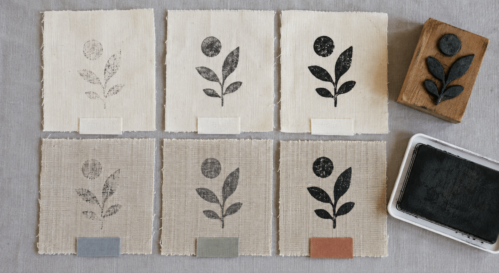
A swatch test should answer one question at a time. Cut several pieces from the actual label material and mark the back or edge so they cannot be mixed up. Prepare a clean table for fabric, ink, impression pressure, setting method, and result.
Begin with three ink loads or pressures: light, normal, and heavy. Use the same stamp and surface beneath the fabric. A slightly padded printing surface may help in some hand-stamping setups, but too much give can blur edges. Test the working surface that will be used in production.
Let the samples dry and set them exactly as the ink manufacturer directs, while respecting the fabric’s care limits. Record the temperature or iron setting, time, protective cloth, and any wait before washing. If the instructions warn that performance varies by fiber, do not collapse all fabrics into one result.
Evaluate the dry impression before washing. Photograph it close and at normal viewing distance. Then wash only the samples intended for washable use, following a defined cycle. Compare the same letters and gaps after drying. A sample that looks acceptable while wet may change as fibers move or excess ink leaves the surface.
Do not approve the design from the strongest sample alone. Choose the version that performs consistently under normal pressure. The goal is not to prove that one perfect impression is possible. It is to find a design and process that ordinary packing or sewing work can repeat.
9. Diagnose common fabric-stamp failures
The letters look broken
First check contact, not the font. A seam, fold, or hard table may prevent full contact. Try a flat swatch and a consistent backing. If the same strokes still disappear, increase their weight or choose more open lettering.
The impression is fuzzy
Too much ink, sideways movement, heavy rocking, or a very absorbent surface can widen edges. Reduce one variable at a time. Do not compensate by making every line thinner; thin lines may disappear under normal pressure.
Solid areas look patchy
The weave may prevent even contact across a large block. Test a bold outline or separated shapes. A handmade texture can be acceptable when the identity remains recognizable, but missing parts of a letter or symbol are not merely character.
The mark fades or transfers
Stop and check the ink instructions, fabric compatibility, drying time, and setting process. Do not assume more heat is safe. Excess heat can damage fabric or finish. If the chosen combination cannot meet the intended care routine, change the ink, fabric, or application rather than hiding the problem in the artwork.
The label curls or distorts
The setting method may be too aggressive for the narrow tape or synthetic fiber. Test larger swatches, lower-risk compatible materials, or a different approved ink process. The fabric’s care guidance sets a limit that the stamp project must respect.
10. Plan a repeatable marking routine
Once the swatch is approved, write down the ordinary method. Name the fabric side to stamp, the backing surface, the ink pad, how the stamp is loaded, the pressure motion, drying location, setting method, and wash-test frequency if the label must be washable.
Create a physical reference swatch and store it away from direct wear. It should show an acceptable impression, not an unusually perfect one. A second swatch can show the point at which the print is too light, too blurred, or incomplete.
Plan drying space. Freshly stamped labels stacked too soon can transfer ink. A production routine needs enough trays, racks, or flat area for the ink’s stated drying and setting process. If the available workspace cannot support the volume, the design is not the only issue.
Clean the stamp using a method compatible with both the ink and plate material. Solvent and pigment inks can have specific cleaner requirements, and some cleaners may not suit every photopolymer or rubber surface. Follow the product directions rather than improvising with a strong household solvent.
When a new roll of labels or batch of fabric arrives, repeat a short check. Material names can remain the same while finish and texture change. One fresh swatch is cheaper than discovering a weak impression after dozens of products are packed.
11. Send a clear brief to the supplier
The final supplier package should be easy to misunderstand only with effort. Include the clean production file, an actual-size proof, plate dimensions, intended fabric, the smallest critical gap or detail, and a note that the artwork will be hand-stamped on textile labels. Ask the supplier to confirm its line, gap, type, and file requirements for that job.
If you have approved swatches, send clear photographs and explain which result is acceptable. A photograph does not replace the vector file, but it tells the producer what the design must preserve. Ask for a proof before manufacturing multiples.
Keep the clean master, production version, supplier proof, and material note together. When the label size or fabric changes, return to the actual-size and swatch tests. Do not quietly scale the old plate and hope the same details survive.
The next practical step is simple: cut five pieces of the real label material, print the design at its intended size, and mark the safe area around seams and folds. If the essential name or symbol already feels crowded on paper, simplify it before making the stamp. Fabric will not give that lost space back.