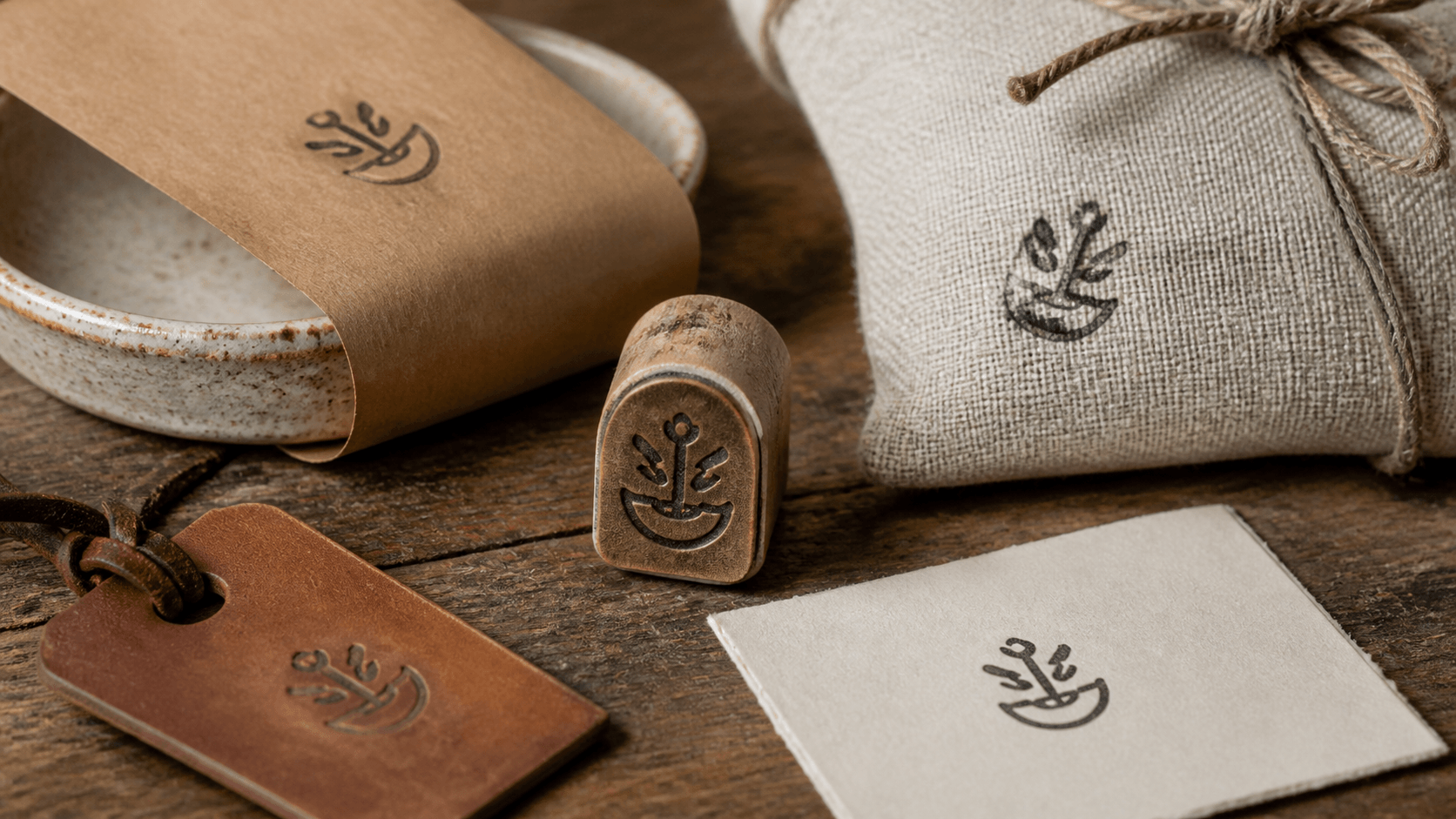
A maker's mark is the quiet signature of a handmade product. It can appear on a clay care card, a paper band around soap, a box for jewelry, a fabric tag, or the back of a print. It does not need to tell the whole brand story. It needs to connect the object to its maker in a way that feels deliberate and remains recognizable after ordinary stamping variation.
That last part changes the design. A detailed illustration may look charming at poster size and turn muddy on a 20 mm tag. A delicate monogram may disappear on textured kraft. A long studio name might fit a card but not a narrow ribbon. Good maker's mark artwork begins with real surfaces and real sizes, then reduces the identity to the few features that matter.
This guide helps you define the mark's job, choose a compact structure, protect negative space, build useful size variants, and proof the design across handmade packaging. It also separates brand decisions from production decisions. The mark should feel personal, but it should not depend on perfect pressure or a carefully staged photograph to work.
Decide what the mark must identify
Start by naming the maker clearly. That may be a studio name, surname, set of initials, established symbol, or short wordmark. If customers already recognize one element, make it the anchor. Do not invent an unrelated vintage crest simply because traditional stamps often use one. Recognition grows from consistency, not borrowed decoration.
Write a one-sentence job for the mark. Examples include “identify the studio on small packaging” or “sign paper goods without adding a full printed label.” The sentence should describe a repeatable use, not a mood. It will help you reject details that are attractive but do not support the task.
List the surfaces where the mark will actually appear during the next year. Separate direct product marking from packaging and stationery. A safe mark for a card is not automatically suitable for direct contact with food, skin, fabric, ceramic, or another product material. Confirm materials, inks, and any applicable production requirements with the appropriate supplier or specialist.
Choose one primary placement for the first design. You can adapt it later, but designing simultaneously for a large box, tiny tag, fabric tape, and irregular product surface creates conflicting demands. The primary placement establishes the most honest size and detail limit.
Reduce the identity to one strong idea
Gather the current logo, signature, initials, packaging, and any symbol already associated with the work. Circle the element that remains recognizable without color or explanation. It may be the silhouette of a tool, an unusual letter pair, a simple vessel outline, or the rhythm of the studio name.
Convert the idea into solid dark shapes and open material. Remove gradients, shadows, photographs, and fine tonal texture. If two parts are distinguished only by color, separate them with space, shape, or line weight. A normal one-color stamp cannot preserve a subtle difference between two similar hues.
Use the same production discipline described in the guide to preparing artwork for a real rubber stamp: simplify at the intended size, protect clear gaps, and deliver a clean source rather than expecting the producer to guess which details matter.
Make three reductions, not thirty variations. One can be name-led, one symbol-led, and one combine the two. Print all three at the primary size. The best option is usually the one a fresh viewer can describe most easily, not the one with the most craft references hidden inside it.
Choose a structure that suits the name
A short studio name can sit in a compact rectangle or under a small symbol. Initials can work inside a circle, square, shield-like outline, or without a border. A long name often benefits from a horizontal wordmark. Do not force text around a circle merely because the final tool is a stamp.
Borders change the character and the available space. A circle feels like a self-contained seal. A rectangle can resemble a practical workshop label. An unframed mark feels lighter and allows the stamped material to become part of the composition. Choose the structure because it supports the identity, not because it fills an empty corner of the design.
If a descriptor is needed, keep it short and subordinate. Words such as pottery, studio, goods, press, or handmade can clarify an unfamiliar name, but they should not compete with it. Test whether the mark remains meaningful without the descriptor. If it does, the smallest version may omit that line.
A founding year or location can add context when it is true and relevant. It is not a requirement for authenticity. Adding “established” language to make a new business seem older damages trust, while a location that changes can shorten the useful life of the stamp. Include only details you are prepared to keep current.
Protect negative space before adding style
Negative space is the uninked material inside and around the mark. It keeps letter counters open, separates a symbol from its border, and allows the design to breathe. On a small stamp, these empty areas are structural. When they close, separate elements merge and the identity changes.
Zoom out to actual size and look for narrow channels. The gap between two initials, the opening in a leaf, and the space around a pottery handle may all be more fragile than the outer silhouette. Widen those spaces before making every line heavier. Strengthening black shapes without opening the design can make congestion worse.
Watch for accidental shapes. Two nearby strokes may create a dark blob; an interior gap may resemble a letter that was never intended; a border may touch a symbol and turn it into a different silhouette. Flip the artwork horizontally or view it from a distance to interrupt familiarity and reveal these collisions.
Leave clear space outside the mark as well. A stamp placed against a tag edge, string hole, printed rule, or package fold loses its outline. Define a simple minimum margin for layouts. The physical stamp may vary slightly, so the placement rule needs tolerance rather than a hairline-perfect boundary.
Draw for the smallest important size
Measure the primary placement and print several empty shapes at likely stamp sizes. Put them on the real tag, card, or package. This is faster and more honest than deciding that a 30 mm stamp “sounds about right.” The surrounding object changes how large the mark feels.
Place the artwork into the chosen footprint and print it at 100 percent. Do not use fit-to-page scaling. Read it at normal viewing distance and under ordinary workroom lighting. If you need to bring the proof close to your face, customers may not recognize it during normal handling.
Remove detail in a deliberate order. Start with interior texture and tiny ornaments. Then simplify secondary wording, dividers, and borders. Preserve the defining silhouette, the main name or initials, and the most characteristic space relationships. The small mark should feel distilled, not merely stripped.
Set a minimum approved size and keep it with the asset record. Below that size, use a separate compact mark or no stamp. A weak impression is not better than a clean unmarked area. Knowing when not to use the full design is part of maintaining the identity.
Create a compact variant only if the surfaces require it
A compact variant makes sense when an important placement is materially smaller or narrower than the main one. It may keep the symbol and initials while removing the descriptor and border. It should not introduce a new drawing, font, or tone. The relationship needs to be obvious when both versions appear in the same package.
Start from the approved master and duplicate it. Lock the defining proportions before removing elements. If the main mark uses a distinctive angled monogram, keep that angle. If its identity comes from a rounded rectangular silhouette, do not turn the compact version into a star-shaped badge.
Proof the two versions side by side. Ask whether they appear to come from one maker without reading explanatory text. Compare stroke weight and total ink density. A tiny version with heavier lines may need more open space so it does not look darker than the main mark.
Stop at two versions unless another real constraint appears. An alternate for every product category makes the mark harder to recognize and the files harder to control. Product differences can be communicated through color, labels, handwriting, or packaging structure while the maker's identity stays stable.
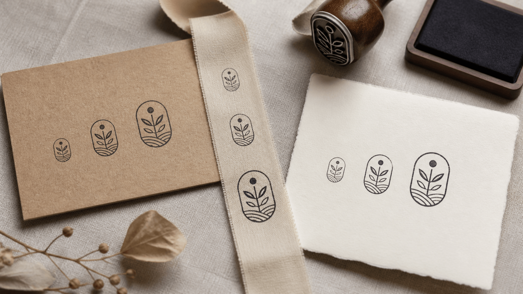
Proof the mark on honest surfaces
A smooth white proof sheet shows the artwork clearly, but it does not predict kraft fibers, coated card, cotton ribbon, rough recycled stock, or a curved object. Test the real material with the intended stamp and ink. Put a firm, appropriate support beneath flexible packaging and use the pressure someone would apply during normal work.
Create several impressions, including ordinary ones. The mark should not require the single perfect result chosen for a product photograph. Look for repeated weak points: a closed counter, missing serif, filled border, patchy center, or one side that fails on a seam. Repeated problems belong to the system, not to bad luck.
Allow the impression to dry, then handle it as the package will be handled. Fold tissue, thread the tag, stack the cards, and rub surfaces lightly. Confirm that the ink and process are suitable for the material and product context. If transfer or smearing appears, change the combination or workflow before using it with finished goods.
Photograph the normal proof beside the product, not only in isolation. The mark may compete with a glaze pattern, textile weave, printed label, or colorful contents. A quieter placement or simpler version can strengthen the overall package even if the stamp itself looks less dramatic.
Choose placement that feels made, not random
Handmade does not mean careless. Decide which placements should be consistent and where variation is welcome. A centered card may need a simple guide. A tissue pattern can rotate and wander within a loose rhythm. A tag can use a fixed distance from the bottom edge while allowing small natural shifts.
Use the package construction as a guide. Align the mark with a fold, panel, seam, or printed block rather than guessing from the air. Avoid stamping across ridges and unsupported voids unless a broken impression is intentional. Place the mark where the operator can press evenly.
Consider the reveal. A mark on the outside identifies the parcel immediately. A mark under the lid creates a private moment after opening. A small sign-off on the back of a care card feels personal without crowding the front. Choose one or two meaningful reveals instead of stamping every available surface.
Make a cardboard jig for repeated formal placement. For organic patterns, prepare a sample sheet that shows acceptable density and rotation. When comparing the main and compact variants, keep both available in the browser-based stamp maker while you produce placement proofs. The sample should guide judgment without forcing every impression to match. Consistent intent matters more than identical millimeters.
Build an editable master and clean production copy
Keep text, symbol, border, and optional descriptor as separate elements in the master. Name the layers clearly and remove abandoned sketches from the active file. The master should make a future spelling correction or size adaptation straightforward without changing the entire composition.
Build and compare these elements in the editable source, then save the design under a recognizable internal name before exporting. Match that name in the downloaded files so the production artwork can be traced back to its source.
Prepare the production copy according to the producer's requested file type, dimensions, and line guidance. Remove backgrounds, proof notes, color samples, and hidden alternatives. Do not send a page of concepts and ask the producer to choose which one is intended.
Create an actual-size approval sheet showing the main and compact marks, their intended uses, and key dimensions outside the artwork. Check spelling, orientation, background, and scale after export. Save the approved master, delivery files, and proof together, while keeping rejected concepts in a separate archive.
Use the mark consistently without making packaging rigid
Choose a small set of approved ink colors. One reliable dark color may be enough; a second can serve a particular collection or season if it still preserves recognition. Avoid changing color, layout, symbol, and packaging material at the same time. The mark needs some stable features to do its identifying work.
Keep the stamp, matching ink, cleaning materials, placement guide, and a current proof sample together. Label physical tools by role if two versions are similar. A packer should not have to measure the face or make a test impression simply to choose the main mark.
Train with acceptable variation. Show examples that are usable, too light, too heavy, smeared, or badly placed. This respects the handmade process while protecting the identity. The goal is not to discard every imperfect impression; it is to recognize when variation has crossed into illegibility.
Review the mark when packaging, the studio name, a product surface, or the production method changes. Do not redesign it merely because you have seen it many times. Familiarity is part of what makes a maker's mark valuable. Change should answer a real problem.
Keep claims and symbols honest
A mark can suggest heritage, geography, material, certification, or authorship even when it uses very little text. Make sure those suggestions are accurate. Do not add a year the studio was not established, a place the work is not connected to, or an official-looking emblem that implies an approval the product does not hold.
Use only symbols, fonts, and artwork you are permitted to use for the intended commercial context. A generic decorative icon may be available for design use without becoming an exclusive identity. If uniqueness matters, develop an original form and review it appropriately before investing in physical tools and packaging.
Be precise about “handmade” or similar wording. If the production process changes, the stamp should not preserve a claim that no longer describes the product honestly. Keep operational or material claims on labels that can be updated when they are not a stable part of the maker's identity.
When the mark is used by assistants or production partners, define what it identifies. It may represent the studio rather than one person's literal hand. A clear internal understanding prevents the symbol from promising a level or type of authorship the business cannot support.
Maker's mark approval checklist
- The mark has one clear identifying job.
- Its strongest element already belongs to the maker's identity.
- The design works as solid ink and open material.
- Important negative spaces remain open at actual size.
- The structure suits the real name rather than a stamp convention.
- The compact variant exists only for a documented constraint.
- Proofs have been made on the intended materials.
- Placement rules support normal working speed.
- The editable master and production copy are clearly connected.
- Every date, location, symbol, and authorship claim is accurate.
A maker's mark earns character through use. Ink shifts, paper fibers show, and one impression may be lighter than the next. The design should welcome that evidence of process without depending on failure for its charm. Reduce the identity to a strong idea, give it enough empty space, and test it where customers will actually encounter it. The result can feel unmistakably handmade while still being clear, repeatable, and honest.