
A bilingual company seal can become crowded before the design work even begins. Two company names, two writing systems, a registration detail, a location, a border, and perhaps a logo all compete for the same small circle. Shrinking everything until it fits is the fastest solution on screen and one of the least reliable in use.
The design needs more than translation. It needs an agreed legal or business identity in each language, a clear relationship between them, correct reading direction, appropriate fonts, and a layout that survives at its final size. The two versions do not always occupy equal space or follow the same rhythm. Good bilingual seal design makes room for those differences rather than forcing one language to imitate the other.
This guide focuses on the planning and proofing decisions that keep a two-language seal readable. It does not prescribe official wording or legal validity. Company-seal requirements and permitted use vary by jurisdiction, document, and organization, so confirm the applicable rules and obtain professional advice when the mark has legal, regulatory, or contractual significance.
1. Approve both company names before laying out the seal
Collect the exact approved name in each language from an authoritative internal or official source. Do not translate the name during the design session. A company's registered local-language name, trading name, and informal translation may be different. Decide which form belongs on the seal and who has authority to approve it.
Prepare a copy sheet that keeps every string separate. Include capitalization, punctuation, spacing, diacritics, abbreviations, legal suffixes, and numerals exactly as they should appear. If a line uses a translated name, label it as a translation. If it uses a phonetic rendering of the original name, label it as a transliteration. These are not interchangeable.
Confirm whether both names have equal status. In some contexts, the local registered name is primary and an English version is supporting. In others, both are operating names that need comparable prominence. That relationship should be an explicit business or legal decision, not an accidental result of which line fits more easily.
Check supporting information separately. Registration numbers, entity types, locations, departments, and dates may follow different conventions in each language. Do not duplicate a field merely to make the design look balanced. Add it because the intended use requires it.
Freeze the approved copy before typography begins. Changes after text is curved around a seal can alter spacing across the whole composition. If the name is still under discussion, work with clearly marked temporary text and do not present the result as a final proof.
2. Decide how the two languages relate
A bilingual company seal needs a hierarchy even when the two names have equal importance. Hierarchy does not have to mean one is much larger. It can come from position: one language on the upper arc and the other on the lower arc, or one in the outer ring and one in the center. It can come from weight, spacing, or the order in which the eye encounters the text.
Write down the intended relationship in plain words. Examples include “local name first, English name supporting,” “two equal arcs,” or “registered name in the outer ring, translated trading name in the center.” This sentence gives reviewers a basis for judging the layout. Without it, every typographic difference can look like favoritism or error.
Equal status does not require identical point sizes. Scripts differ in average character width, visual density, height, and internal detail. Two strings set at one numeric size may not look equal. Optical balance matters, but it should be adjusted without making either language difficult to read.
Consider the reader and document context. If most users read one language but the second is needed for international documents, a primary-supporting hierarchy may be clearer. If the seal routinely circulates between two language communities, equal treatment may suit the task. There is no universal arrangement that makes a seal “official.”
Avoid placing the second language as an afterthought in tiny type. If it is important enough to include, it needs enough space to be read. If there is not enough space, remove nonessential decoration, use a larger seal, simplify supporting details, or prepare an approved alternative layout.
3. Map reading direction before drawing arcs
Latin-based text is commonly read left to right. Arabic and Hebrew are read right to left. Other scripts have their own conventions, and mixed strings can contain neutral characters such as spaces, punctuation, slashes, and numerals. Curving text around a circle adds another layer: the line has a start point, an end point, and an orientation relative to the center.
Do not assume that mirroring a left-to-right arc creates a correct right-to-left arc. Enter the exact approved string in a toolchain that supports the script, then inspect the character order and joining behavior. Export a proof and ask a fluent reader to check it. A line can look visually balanced to a nonreader while being reversed, disconnected, or punctuated incorrectly.
Decide how the lower arc should read. Some seal layouts keep all characters upright, with the lower text running around the circle in the opposite path direction. Others place the lower line differently. The correct choice depends on the script, local convention, and reader expectation. Use real examples authorized for reference, but do not copy official insignia or another organization's seal.
Watch numbers and abbreviations inside right-to-left text. Their displayed order can behave differently from the surrounding letters. Parentheses, hyphens, and separators may shift in unexpected ways when text moves between an editor, vector export, PDF, and production software. Test the full final string rather than a short sample.
Keep a screenshot or PDF of the approved reading order beside the editable file. If later software substitutes a font or changes direction handling, the visual reference makes the error easier to spot.
4. Choose fonts by script quality, not superficial similarity
A typeface that supports English may not contain the glyphs needed for the second language. When glyphs are missing, software can substitute characters from another font. The line may appear complete but change weight, height, spacing, and personality halfway through a word. Check the entire approved character set, including accents, diacritics, punctuation, and numerals.
A single multilingual font family can simplify the visual relationship, but broad character coverage does not guarantee that every script is equally well drawn. Two different typefaces may create a more respectful and readable result. Match them by functional qualities—stroke weight, openness, density, formality, and behavior at small size—rather than forcing the shapes to look identical.
Test regular and semibold weights before choosing bold. A heavier weight can help small text survive an impression, yet complex scripts may close up as strokes thicken. Thin details and counters need room. The manufacturer's production limits and the final physical size should guide the final choice.
Confirm the font license for the intended commercial and production use. Retain the font names and versions in the project record. If the delivery file must use outlined text, preserve a separate editable master with live text so a spelling correction does not require tracing outlines.
Never judge script quality alone when you do not read the language. Ask a fluent reviewer to inspect letterforms, joining, marks, and tone. A font can be technically complete and still feel inappropriate for a company identity or formal seal.
5. Allocate space according to the actual strings
Count visual length, not just characters. Ten wide uppercase Latin letters may occupy more arc than a longer string in another script. Diacritics may need vertical clearance. Connected scripts may create dense word shapes with fewer obvious gaps. Use the approved strings at actual size to discover their needs.
Begin with the longest or densest required line. Give it a comfortable path, then place the shorter language in the remaining structure. Do not compress one arc aggressively simply to preserve an ornamental center. The company names are the purpose of the seal; decoration is optional.
Adjust the radius before reducing type size. A slightly larger circle or a wider text path can create meaningful breathing room. If the seal size is fixed, consider moving one language into a straight central line or dividing supporting information differently. A bilingual seal does not have to place both names on identical arcs.
Keep a clear gap between the text and both the outer and inner borders. Marks above or below letters may extend beyond the apparent body of the type. Check that they do not touch a ring or logo. This space also helps the text survive imperfect ink and pressure.
If the approved names remain too long, return to the business owner. An abbreviation, recognized short name, or separate seal might be possible, but the designer should not invent one. Record the approved decision before changing the copy.
6. Use separators only when they solve a reading problem
Dots, stars, short lines, and small diamonds often separate upper and lower arcs. In a bilingual layout they can help readers see where one language ends and the other begins. They can also consume the exact side space needed by long names.
Start without separators. If the transition is clear through spacing and position, leave the sides quiet. Add a simple mark only when it improves orientation or balances genuinely uneven arc lengths. Keep it large enough to reproduce but visually weaker than the names.
Avoid symbols with official, religious, political, or certification associations unless their use is intentional and authorized. A decorative star can imply more than the designer expects in some contexts. Neutral geometry is usually safer.
Do not use punctuation as decoration if it belongs grammatically to one of the names. A centered dot that separates languages is different from punctuation inside an approved company name. Keep those roles clear on the copy sheet and in the layer names.
Check separators after text direction changes. A neutral character may move or attach visually to surrounding text in unexpected ways. Creating the separator as a separate graphic element can provide more predictable placement, provided it is not mistaken for part of the wording.
7. Decide what belongs in the center
The center can hold a logo, registration number, location, entity type, short translated name, or nothing at all. Empty space is a valid choice. It gives the outer text room and can make a bilingual company seal feel more deliberate.
If a logo is used, simplify it for one-color reproduction and confirm permission. Detailed gradients, fine slogans, and small registered marks can turn into noise. Keep the logo visually secondary when the company names are the information the document reader must verify.
A registration number may be more useful than decoration, but check whether it is required, permitted, sensitive, or likely to change. Use a separate text layer and verify every digit. Consider how numbers behave next to each writing system and whether a label is needed to prevent ambiguity.
Locations can distinguish entities with similar names, but they also add language and transliteration questions. Decide whether the city or jurisdiction appears once or twice, and in which approved form. Do not add “international,” “registered,” “official,” or similar terms merely to make the center look complete.
Use the center to resolve hierarchy, not to escape it. Placing one language in the middle and another around the edge creates a strong relationship. Make sure that relationship matches the approved brief and remains clear when the seal is viewed without an explanatory mockup.
8. Compare editable templates without copying authority
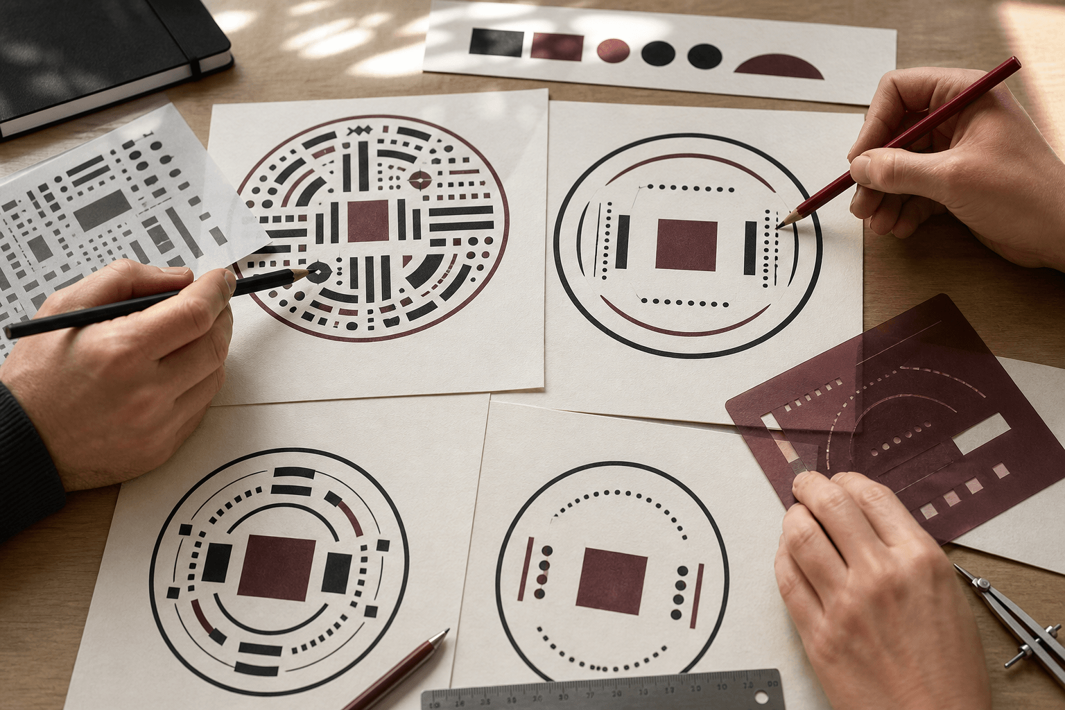
Browse a few editable company seal templates to compare structural options: two arcs, an outer ring plus center line, a border with side separators, or a quieter open center. Replace all sample content with the approved bilingual copy before judging fit.
A template is a layout starting point, not evidence that its wording or symbols suit your organization. Remove government-style emblems, certification language, sample registration details, and decorative claims that are not authorized. The finished seal should represent the actual company, not the authority suggested by a formal-looking example.
Keep the two language lines as separate editable elements. The same applies to borders, separators, logo, numbers, and location. Separate elements allow optical adjustment without stretching an entire design. They also make later corrections safer.
Test more than one structure with the real names. A template that looks elegant with short sample text may fail with the approved strings. Compare actual-size proofs based on readability and hierarchy, not the attractiveness of the large editor preview.
Choose one direction and document why it works: correct name order, enough script clearance, readable size, controlled center, and appropriate visual status. This note makes review more focused and protects the design from drifting back toward decorative options that already failed.
9. Construct and export in a controlled company seal maker
Build the selected structure in a company seal maker with editable layers. Enter text by copying from the approved source, not by retyping from memory. Confirm that the editor displays every glyph and that line direction remains correct before curving or spacing it.
Set the final physical dimensions early. Adjust each language at 100 percent view, then zoom out and print an actual-size proof. Use optical spacing carefully, but do not manually break joined text or separate marks from their letters. If the tool does not handle the script correctly, stop and prepare that line in suitable software rather than forcing it into a broken form.
Preserve live text in the editable master. Before production export, duplicate the file if text needs to be outlined. Inspect the outlines for missing marks, overlapping shapes, open paths, and changes in reading order. A vector extension does not guarantee that text conversion was correct.
Export a clean one-color proof without simulated ink texture. Texture can be added to a separate digital-use variant after the geometry and wording are approved. The master needs stable borders, open counters, and clear text that a manufacturer can evaluate.
Keep the file names neutral and specific. Include the language pair, size, and approval state where useful. Avoid a trail of “final-final” files. The version sent for production should match the version signed off by both language reviewers.
10. Proof with fluent readers at actual size
Ask at least one qualified fluent reader for each language to review the actual-size proof. A bilingual reviewer who understands both names and the business context is especially valuable, but do not make one person silently responsible for legal, linguistic, and production approval at once.
Give reviewers a checklist. Is the company name exact? Is the translation or transliteration the approved one? Are characters ordered, joined, and marked correctly? Does punctuation sit where expected? Is the typeface appropriate? Can the text be read without magnification? Does the hierarchy match the brief?
Ask reviewers to mark the proof rather than describing changes vaguely in a message. A note such as “reverse this arc” can be misinterpreted when direction is already part of the problem. Annotated PDFs or printed proofs keep the correction attached to the exact version.
After language approval, run a separate production review. Check line thickness, gaps, counters, borders, logo detail, and physical dimensions against the manufacturer's current requirements. A linguistically correct line can still be too dense to reproduce.
Apply corrections to the editable master and issue a new proof with a new version identifier. Do not patch only the export. Repeat both relevant reviews if the change affects reading order, wording, size, or spacing.
11. Test the seal in every expected destination
A company seal may appear as a rubber-stamp impression, a transparent image in a PDF, a mark in a Word file, or artwork supplied to a printer. Test the approved design in each authorized destination. A layout that works in a 45-millimeter impression may become unreadable as a small digital mark on an invoice.
For physical use, follow the manufacturer's specifications and test the real ink, surface, and pressure. Look for closed counters, broken marks, crowded arcs, and uneven solid areas. Confirm that fluent readers can still identify both names in a normal impression, not only in the perfect digital proof.
For digital use, test light and dark backgrounds, document export, printing, and grayscale copies. Keep a transparent PNG or suitable vector copy derived from the approved master. Do not use a photograph of the rubber stamp as the everyday digital asset when clean artwork is available.
If one destination requires a much smaller mark, create an approved simplified variant rather than shrinking the full seal beyond readability. It might omit optional decoration or use a different arrangement while preserving the required names. Label the use of each version clearly.
12. Record approval and protect the final versions
The final package should show what was approved, by whom, and for which use. Keep the bilingual copy sheet, editable master, actual-size proof, language review, production version, and permitted-use note together. Record the fonts and any outlined delivery copy.
Limit casual editing. One small change to a font or path can alter script support, punctuation order, or spacing. Give everyday users approved exports rather than the master. Retire superseded versions when a company name, registration detail, office, translation, or legal status changes.
Store the physical seal according to its authority. Define who may use it, how use is recorded when required, and what happens if it is lost or replaced. A careful graphic design cannot compensate for uncontrolled possession or misleading use.
Before ordering or distributing the seal, return to the first copy sheet. Read both names character by character, compare the hierarchy with the written brief, and inspect one final actual-size proof. A clear bilingual company seal is not the version that packs the most information into a circle. It is the version in which both languages remain accurate, readable, and appropriately represented every time the mark is used.