
A long company name can fit into a round seal without becoming a necklace of tiny letters. The solution is rarely to keep shrinking the type until every character stays inside one upper arc. A round seal is a system of arcs, gaps, borders, and a center. When the wording grows, those parts need to share the work differently.
The name may be long because it includes a legal suffix, several descriptive words, a location, or a parent organization. Some of that wording may need to remain exact; some may belong elsewhere in the seal. Before touching the radius or font size, separate required identity from supporting information. A layout problem often becomes manageable as soon as the text has an honest hierarchy.
This guide focuses on typographic structure. It shows how to divide long wording, control curved text, use the lower arc, simplify the center, and proof the result at actual size. It does not determine what a company seal is legally required to contain. Confirm required wording and use with the responsible authority for your organization and jurisdiction.
Confirm the exact wording before designing
Copy the company name from the source your organization treats as authoritative. Check spelling, punctuation, spacing, capitalization, accents, abbreviations, and the legal suffix. Do not type from memory or copy from an old logo without confirming that the logo uses the full current name.
Write every other proposed element on a separate line: registration number, city, department, year, country, short descriptor, or document function. Mark each as required, useful, or decorative. This exercise prevents a star, slogan, or redundant location from consuming space needed by the actual identity.
Look for duplicated meaning. The full legal name may already contain the business type that a descriptor repeats. The country may be unnecessary if the seal is used only inside a local workflow. A founding year can add tradition, but it should not force a required identifier into unreadable type. Remove only what the responsible reviewer agrees is optional.
Decide whether the seal must reproduce one exact official form or whether it is a general business identity mark. That distinction affects how freely the layout can abbreviate or reorganize text. If the wording has formal significance, obtain approval for the text list before investing time in fine spacing.
Choose an arc structure that fits the name
The familiar single upper arc works well for short and medium names. A long name can exceed the comfortable reading span, especially when the seal also needs a lower identifier. Instead of forcing the entire name across the top, consider a two-arc structure, a broken arc, or a center-led structure with shorter surrounding text.
A two-arc name places the first logical phrase above and the second below. This is not the same as cutting the text at the halfway character. Break at a natural boundary between words or organizational units. Keep both arcs visually related through size, weight, spacing, and distance from the center.
A broken upper arc uses small dividers to create two phrases around the top half of the circle. It can help when the name contains a clear parent and division, but too many separators make the border busy. A center-led structure moves a short recognizable name or monogram into the middle and places the full legal wording around the edge.
Before committing, review the practical controls for making curved text readable in an online stamp. Long wording magnifies every arc problem: uneven tracking, awkward start angles, tight inner spacing, and letters that appear to lean away from one another.
Set the reading order deliberately
A reader should know where to begin. The strongest phrase usually sits at the top because that is where people expect to start a round seal. If the legal name is divided, make the first arc slightly more prominent or use separators that clearly guide the eye toward the continuation.
Do not create three competing starting points. A large center acronym, bold upper arc, and equally bold lower arc can all demand attention at once. Choose one first read, one second read, and one supporting level. Size, weight, and open space should communicate that order without explanatory labels.
Consider whether lower-arc text should read from left to right while curving upward, or follow the outer circle continuously. Both conventions exist in seal designs. Choose the orientation that your intended readers can understand at actual size. Familiarity is useful, but it should not override a clean reading path.
Use a plain printed proof to test order. Show it to someone who has not watched the design process and ask what they read first, second, and third. Do not tell them the intended sequence. If several readers start in different places, adjust hierarchy before fine-tuning individual letters.
Balance radius, size, and letter spacing
Curved text has three closely related controls. Radius determines the path and available circumference. Type size determines character height. Letter spacing controls how widely the characters travel along the path. Changing all three at once makes it hard to understand which adjustment improved the result.
Begin with a radius that leaves a clear gap between the text and both neighboring borders. Set a readable type size, then use moderate tracking to distribute the phrase. If the text remains too long, increase the radius only while a comfortable outer margin remains. After that, revise the structure or choose a naturally narrower typeface.
Do not squeeze a regular font horizontally to imitate a condensed face. Distortion narrows counters and changes stroke relationships, often making the small seal harder to read. A typeface designed with condensed proportions keeps its letters coherent. Compare options using the exact company name because repeated wide characters can change the result dramatically.
Inspect spaces between words separately from spaces between letters. Automatic tracking may make word gaps disappear or become unusually wide. A long arc needs visible phrase boundaries, but huge gaps create the impression that words belong to different lines. Optical correction matters more than a single numeric spacing value.
Use capitalization and weight with restraint
All caps create an even silhouette and are common in formal seals, but they are not automatically more readable. A long sequence of capitals can become a continuous band, especially in a condensed font. Mixed case offers more varied word shapes and may allow a longer name to be recognized more quickly.
Test both using the approved spelling. If the brand or official wording requires capitals, create hierarchy through size and weight rather than changing case. Avoid very heavy letters when internal counters are already small. Dark borders and bold type can merge into one dense ring after reduction.
Pair no more than two clearly related text styles. One can serve the company name and another can support a number or location. Introducing a decorative third face to make the center interesting usually weakens the seal. The circle, spacing, and hierarchy already provide character.
Watch punctuation at small sizes. Periods, commas, apostrophes, and abbreviation points can look like ink noise or vanish. Keep required punctuation, but give it adequate space and proof it carefully. Do not substitute decorative dots for punctuation if that changes the company's approved name.
Let borders and dividers create breathing room
Borders should organize the seal rather than consume it. A double outer ring can provide a formal frame, but it reduces the radius available to text. When the name is unusually long, one confident outer line and a lighter inner separator may create more usable space than two heavy circles.
Leave a visible gap between letters and rings. Near-tangencies look like printing errors and become unpredictable in an impression. If a capital almost touches the inner border, increase the gap by adjusting radius, size, or the border itself. Do not assume that a tiny screen gap will survive physical use.
Dividers help distinguish upper and lower phrases. Simple dots, short bars, or small geometric marks are usually enough. Their visual weight should relate to the text, not the outer border. Large stars can become the first thing a reader sees and make a serious seal feel generic.
Empty arc space is not a defect. When a short lower line sits beneath a long upper name, trying to stretch both across identical angles can create awkward gaps. Let the lower line occupy the space it needs and use balanced dividers to complete the transition.
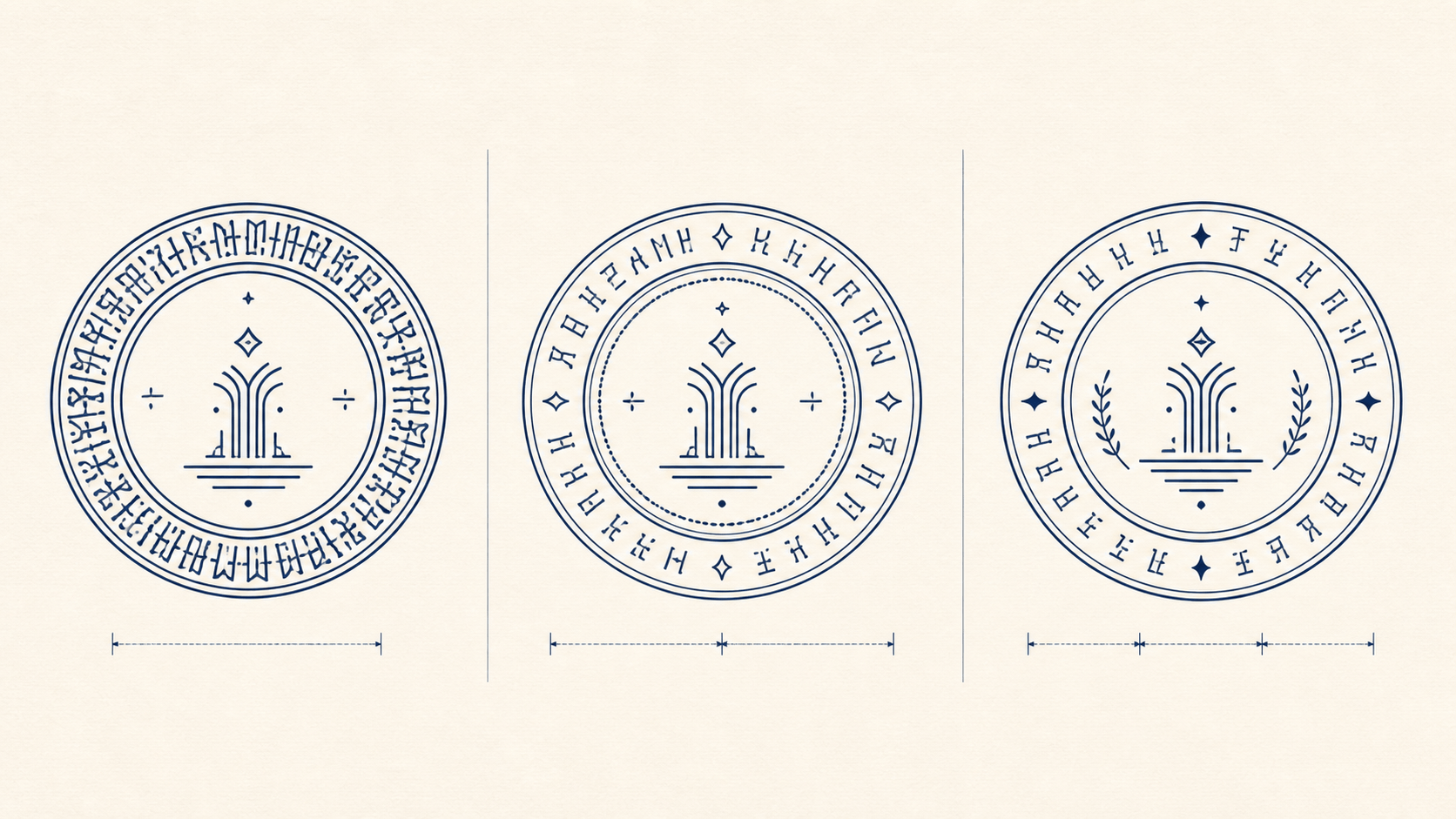
Keep the center quieter than you expect
The center is valuable because it gives the eye a place to rest after following the arc. It can hold a simple monogram, a small one-color symbol, a short year, or open space. It does not need to repeat the full company name that already surrounds it.
If you use initials, check whether they are actually distinctive and authorized. Several companies may share the same letters, and an improvised monogram can conflict with an established identity. Set it at a size that supports the outer name without turning the seal into an acronym with a decorative caption.
A logo should be simplified for one-color reproduction. Remove gradients, taglines, hairlines, and tiny internal shapes. Preserve the recognizable silhouette and essential negative spaces. Give it a clear zone from the inner ring so it does not appear trapped inside the seal.
When the outer text is dense, an empty center can be the strongest choice. A small line, restrained dot, or no symbol at all may create a more formal composition than a detailed illustration. Judge the whole seal at actual size, not the center at a comfortable editing zoom.
Test templates with real wording
A template is useful because it provides working relationships among rings, arcs, and the center. It cannot predict the length of your company name. Choose a template for its structure, replace every sample phrase immediately, and then decide whether the structure still suits the content.
When browsing round stamp templates, ignore attractive placeholder names and count the actual text zones. Look for enough arc length, an adjustable center, and borders that can be removed or simplified. A spacious starting point is easier to adapt than a decorative design already filled with small details.
Enter all approved text before perfecting one arc. The lower identifier may change the balance of the upper name, and a real logo may need more clear space than the sample icon. Fine-tuning too early leads to repeated work and encourages compromises made only to preserve a temporary layout.
Save a clean structural version before experimenting. Duplicate it for a two-arc name, broken arc, and center-led alternative. Compare actual-size proofs of the three, choose one direction, and remove the rejected versions from the approval folder. A focused comparison is more useful than keeping ten slight variations alive.
Proof the seal at its intended size
Measure the space where the seal will appear. A mark beside a signature, on a certificate, or on a small product card has different limits. Print the design at the intended diameter with scaling turned off. A large on-screen preview cannot tell you whether a suffix or registration number is readable in context.
Place the proof on a sample document. Check nearby rules, signatures, headings, and margins. The seal should feel related to the page without colliding with functional information. If it has to shrink to fit, return to the layout and simplify; do not let the print dialog make the final design decision.
Test a normal print, a scan, and a grayscale copy if those are realistic destinations. Look for closed counters, merged dividers, weak punctuation, and uneven dark areas. For a physical stamp, ask the producer for specifications and proof on the intended plate size and material.
Invite a second reader to compare every character against the approved source. People who designed the seal tend to read what they expect, especially along a curve. Check the legal suffix, repeated letters, registration digits, and the transition between upper and lower phrases.
Prepare large and small versions only when needed
A seal used at materially different diameters may need two masters. The large version can retain a secondary identifier and double border. The small version might use one border, fewer dividers, a simpler center, and stronger text. This is a functional adaptation, not an invitation to change the company identity.
Define the minimum approved size for each version. Put that guidance in the asset record or proof sheet, not inside the artwork. Name the files by role and diameter so a colleague does not insert the detailed version into a space where it will fail.
Keep both versions linked to the same approved wording record. If the company name changes, review the complete family at once. Updating only the large source while an old compact file remains in a shared folder defeats the purpose of controlled variants.
Do not create a special version for every document. Most placement problems can be solved with a sensible full seal and one compact alternative. Additional variants should answer a documented constraint, not a preference for slightly different spacing.
Use a two-part approval
First approve content. The responsible reviewer confirms the exact name, identifiers, abbreviations, punctuation, and any wording required for the intended use. This review should happen on a plain text list as well as the artwork, where decorative structure can make errors harder to notice.
Then approve design. Check reading order, arc spacing, actual-size legibility, center balance, border weight, and reproduction tests. Record which version and dimensions were approved. A casual message saying “looks good” is hard to interpret after another revision appears.
Export the approved production files and a proof sheet from the same master. Open each export independently and compare it with the proof. Confirm background, color, dimensions, and orientation. Keep the approved set separate from experiments and retirement history.
If any wording changes after approval, repeat both reviews. One longer word can alter the full arc and center balance. A content correction is not merely a typing change in a tightly arranged round seal; it can require a new design proof.
Round seal checklist for a long company name
- The exact company wording comes from an approved source.
- Required, useful, and decorative elements have been separated.
- The name breaks at logical word or organizational boundaries.
- The reading order is obvious without explanation.
- Radius, type size, and tracking were adjusted one at a time.
- Type has not been artificially squeezed to fit.
- Borders and dividers leave visible breathing room.
- The center supports the name rather than competing with it.
- The seal has been checked at actual size on a real document.
- Content and design approvals identify the same final version.
A long name does not make a round seal impossible. It makes hierarchy more important. Give the wording enough circumference, share it between arcs when the language allows, keep the center calm, and remove decoration that steals useful space. The finished seal should look as if the circle was chosen for that name—not as if the name was forced into a circle after every other decision had been made.