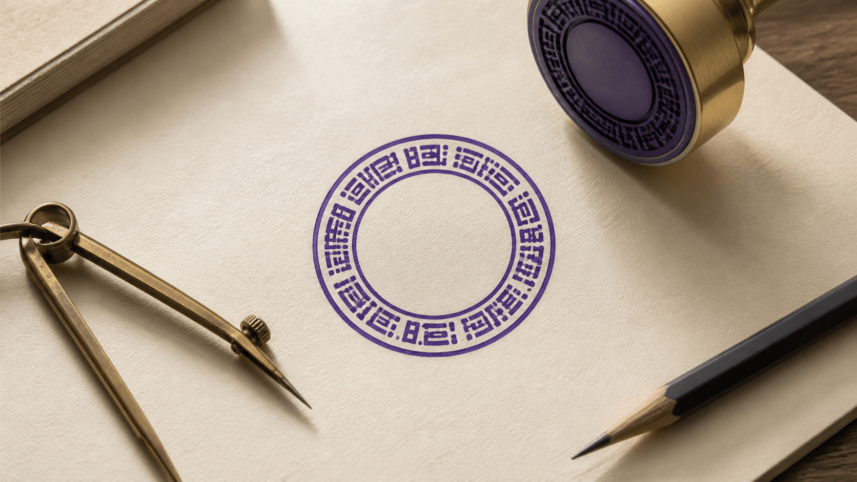
Curved text can make a round stamp feel balanced, but it can also turn a simple business name into a ring of uneven letters. The usual reaction is to keep changing the font. That rarely fixes the real problem. Clear curved stamp text depends on the wording, radius, start point, direction, spacing, and border clearance working together.
The fastest way to improve an arc is to adjust those variables in a stable order. Begin with the final words, establish the path, and only then refine type style. This guide follows that order so you can tell which control is solving the problem instead of nudging five settings at once.
Diagnose curved stamp text before styling it
Look at the arc at the size where the stamp will be used, not only at a large editor zoom. Identify the visible symptom. Are the letters too close to one another? Does the line start higher on one side? Is the lower arc upside down? Does the wording almost touch the ring? Does one short word float in a path designed for a long name?
Each symptom points to a different control. Crowding usually begins with too much text for the available path, a radius that is too small, excessive font size, or insufficient letter spacing. A crooked-looking line may be a start-point or optical-centering issue. Border collisions call for radius or border changes, not necessarily a smaller typeface.
Duplicate the design before troubleshooting. Keep one version unchanged and use the other for controlled tests. Make a single adjustment, view the result at normal size, and note whether the original symptom improved. This is slower than dragging several controls at once for thirty seconds, but it reaches a stable result sooner.
Decide which words belong on each arc
The upper arc normally has more visual authority, so place the primary name or message there. The lower arc can hold a location, department, short identifier, or restrained descriptor. This is a hierarchy choice, not a rule about what a stamp must contain.
Do not make two arcs equally long just to achieve symmetry. A clear company name across the top and a short location below can look balanced when their type sizes and spacing differ. Adding filler dots, repeated words, or unnecessary dates to fill the lower half makes the stamp harder to maintain.
Read the wording aloud. Keep phrases together and remove punctuation that does not help recognition. Long legal or descriptive text may be better as a straight center line or in a rectangular layout. Curving every available detail produces a decorative ring, not a readable message.
Before shortening an official name or identifier, get approval from the person responsible for that information. Typography should not quietly change legal or operational content.
Set the radius before chasing letter spacing
In the online stamp maker, radius controls the size of the invisible circle the text follows. A smaller radius creates a tighter curve and less path length. A larger radius flattens the arc and pushes it outward. If a long name is crowded, increasing radius may create more room while preserving a useful type size.
Move the radius slowly. A line that sits too near the center can compete with a symbol or middle text. A line pushed too far outward can touch the border or appear disconnected from the rest of the design. The correct radius creates a consistent band of open space on both sides of the letters.
Judge the tops and bottoms of the actual glyphs, not only the editor's selection box. Capitals, lowercase letters, punctuation, and accents occupy different vertical space. A border gap that looks adequate around a row of short capitals may feel tight around accented characters or letters with descenders.
In vector graphics, curved type is commonly placed along a path that controls where each character sits. The practical consequence is simple: changing the path changes the placement of every character. Fix the path geometry before fine-tuning individual-looking gaps.
Use the start point to center the phrase visually
The start point determines where the text begins on the circular path. If the phrase is balanced in length but leans toward one side, adjust its start point before changing tracking. A small rotation can move the whole line into place without altering the rhythm between letters.
Mathematical centering is a useful start, not the final judgment. “WILLOW & CO” has different visual weight on each side of the ampersand. A word with a wide letter at one end and a narrow vertical at the other can appear off center even when its measured span is balanced. Nudge the arc until the left and right masses feel stable against the border.
Use reference points in the design. The top center, bottom center, and horizontal diameter provide stronger alignment cues than an asymmetrical symbol. If the border contains side separators, compare the empty arc on both sides of the phrase. Keep the gaps related without forcing pixel-perfect equality.
Make the lower arc face the reader
Lower curved text often looks wrong because it follows the same path direction as the upper line. The letters may appear upside down or read around the bottom in an unexpected direction. An invert or reverse-path control changes how the text sits on the lower half.
After inversion, the line may jump inside or outside the path. Reset its radius and start point rather than assuming the control failed. The lower arc needs its own spacing and placement; copying every upper-arc setting rarely produces a balanced pair.
Read the lower phrase from left to right without turning your head. If the reading direction is natural but the line feels low, adjust the radius. If it is centered but seems to sag, check the typeface and the surrounding white space before rotating it.
Choose a font that survives the curve
A stamp typeface needs open counters, recognizable letterforms, and enough weight to remain present at final size. Extremely thin strokes may disappear. Very heavy strokes can close small spaces inside A, B, e, or R. Highly decorative forms make the changing angle of the arc more noticeable.
Start with a plain, sturdy face and compare regular, medium, and bold weights at actual size. Do not judge only from the font menu or a large preview. A slightly narrower typeface can help a long name, but avoid artificial horizontal compression that distorts every character.
Mixed case often reads more like ordinary language, while capitals can create a compact, formal band. Both can work. Capitals usually need deliberate spacing because repeated vertical strokes can form a dark fence. Mixed case introduces ascenders and descenders that require more border clearance.
Use one or two type families across the whole stamp. A third style added for a date or descriptor usually fragments the design. Hierarchy can come from size, weight, and position without turning the stamp into a font sampler.
Adjust letter spacing after radius and font size
Letter spacing controls the rhythm of the arc, but it cannot rescue a phrase that fundamentally does not fit. With the radius and font size established, increase spacing until adjacent letters stop touching visually. Then check the complete phrase; too much tracking can make it disintegrate into individual symbols.
Look closely around diagonals and curves. AV, WA, LT, and rounded letters beside straight stems can create gaps that feel unequal even when numeric spacing is uniform. The editor may apply one tracking value to the entire line, so choose the setting that gives the best overall rhythm rather than attempting to perfect every pair.
Punctuation deserves its own review. Periods can disappear into worn texture. Commas and apostrophes may seem detached on a curve. A centered dot can separate two short items, but repeated ornaments add clutter. Use separators to clarify a boundary, not to fill empty circumference.
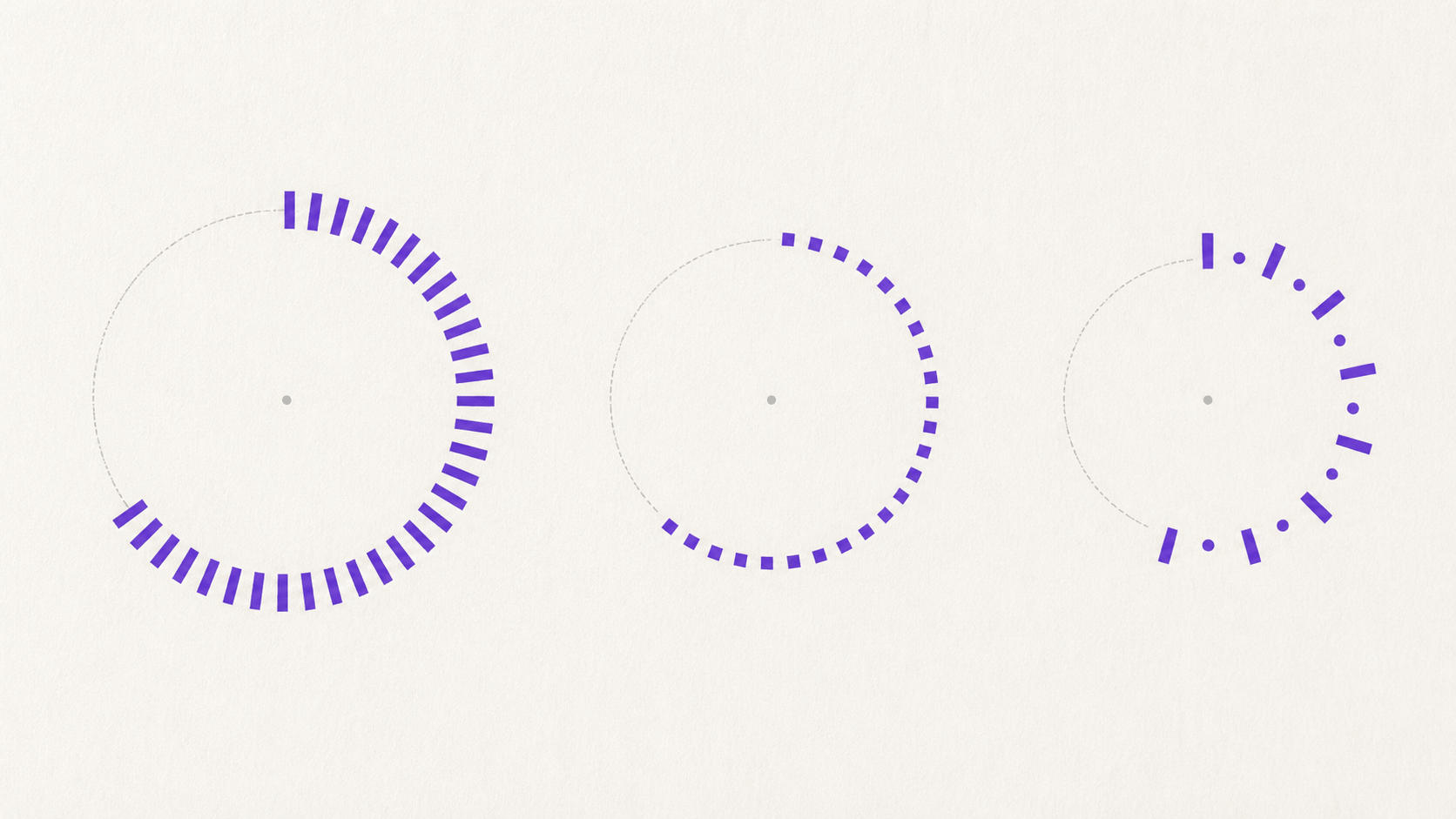
Keep a deliberate gap between text and borders
Curved text should not look trapped between rings. Leave enough open space that the tops of letters do not brush the outer line and their bottoms do not fall into an inner line. This gap is part of the design, not unused space.
If the band is too tight, decide which element matters more. Moving the text slightly inward may be enough. Reducing an inner ring can recover space. A thinner border may preserve the stamp's outline without dominating the name. Shrinking the type should be the last move when readability is already marginal.
Check the closest letters, not just the center of the phrase. The sides of an arc can approach a border differently, especially in oval designs. Rotated characters also present corners that extend beyond their apparent body. Inspect the complete path at final scale.
Balance the upper and lower arcs without cloning them
A long upper name and a short lower location need not share the same font size, radius, or letter spacing. Give the upper line priority. The lower line can be smaller or more widely spaced, provided it remains readable and connected to the design.
Compare the darkness of each band. A bold upper line over a bold lower line can form a heavy ring that leaves the center weak. Reduce the supporting line's weight or size. If the bottom looks empty, first check its radius and tracking; do not add a decorative phrase simply to darken the space.
Side separators can help define the transition between arcs. Use two simple marks at matching positions and leave them smaller than the text. They should behave like punctuation. If they become focal points, remove them and compare the cleaner version.
Correct optical problems after the measurements work
Once the settings are technically sound, stop looking at input values for a moment. View the stamp as a small picture. Does the name appear level across the top? Do the side gaps feel related? Does the bottom line support the center rather than pull the eye downward?
Move the phrase in tiny increments. An asymmetrical word may need a slight rotation. A lower arc with a wide first letter may need a different start point than its character count suggests. These corrections are not errors in the tool; they account for how people perceive shapes rather than how boxes are measured.
Save a copy before optical adjustment. This gives reviewers an objective-centered version and a visually centered version. At final size, the better one is usually obvious. Keep the difference subtle enough that the line still relates cleanly to the border and center axis.
Test curved lettering under realistic stress
First view the stamp clean, at its intended dimensions. Then add any planned texture or opacity change. Wear effects can remove narrow crossbars, dots, punctuation, and the inner spaces of small letters. If the textured version damages the name, reduce the effect rather than making the entire line heavier.
Place the stamp on white, light gray, and one typical document background. Print a proof if print use matters. A normal office printer and a scan or photocopy can reveal spacing that looked acceptable on a bright screen. Keep the source design clean enough that it survives these ordinary transformations.
Ask a reviewer to read the stamp without seeing the typed source. Record the first word or character they hesitate over. That evidence is more useful than asking whether the design “looks good.” Correct the specific failure, then retest at the same size.
Fix common curved-text failures
The phrase is crowded at both ends
Reduce unnecessary wording first. If the whole layout is crowded rather than just the arc, use the online stamp maker guides to reconsider the structure before shrinking the type. Then increase the radius or use a modestly narrower face. Lower the font size only enough to restore open space. Do not solve the problem with negative letter spacing; that usually makes the center of the phrase darker.
The text is centered but looks tilted
Use the start-point control for a small rotation and judge visual weight against the vertical axis. Check for uneven spaces inside the source phrase, including a leading or trailing space. Do not rotate the border to match a poorly positioned line.
The lower line is upside down
Use the invert or direction control, then reset the lower radius and start point. Treat it as an independent arc. Confirm that it reads left to right from the viewer's position.
Letters touch the ring after export
Increase border clearance in the editor and inspect the file at normal size. Thin gaps can appear larger at high zoom than they really are. If texture is applied, check that it has not made the ring or letters spread visually into the gap.
The arc feels empty even though it is readable
Try a slightly larger radius, a controlled increase in tracking, or two quiet side separators. Do not add an irrelevant slogan. Empty space is often preferable to content that has no job.
A reliable adjustment order
- Enter the final approved wording.
- Assign the primary phrase to the upper arc and supporting text to the lower arc.
- Choose a clear typeface and approximate font size.
- Set the upper radius and border clearance.
- Use the start point to center the phrase visually.
- Set the lower direction, radius, and start point independently.
- Adjust letter spacing for an even overall rhythm.
- Add separators only when they clarify the transition.
- Make small optical corrections.
- Proof the clean and textured versions at final size.
Make one controlled curved-text test
Duplicate the current design and change only the radius. Compare the copies at normal size before touching the next control. If the structure itself is the problem, reconsider the layout instead of forcing more text around the arc.
Readable curved stamp text should look calm before it looks clever. Give the wording enough path, keep it clear of the borders, and correct the last few millimetres by eye. The result will hold together at the size where people actually need to read it.