
You already have a rubber stamp. Someone asks for a digital version, so you press it onto paper, scan the impression and save the result. That can be a sensible solution. It can also leave you with a crooked border, paper texture and a name you cannot change without rebuilding the whole image.
The choice between an online stamp and a scanned impression depends on what you need to preserve. A scan records the appearance of one physical mark. An editable design describes the parts that make up the mark. If the task is to retain an existing document, keep the scan. If the task is to produce a reusable stamp for future documents, check whether reconstructing those parts would serve you better.
This guide helps you make that decision before spending an afternoon cleaning up pixels. It covers source quality, a practical resolution calculation, situations where imperfections matter, and a way to move forward when only an old impression survives.
1. Separate a preserved record from a reusable online stamp
Begin with the destination. An impression on a signed, dated or otherwise completed document belongs to that document. Its position, surrounding text and relationship to the page may matter more than the appearance of the stamp alone. Preserve that original file intact. A tidier isolated mark is a separate design asset; it is not a replacement for the record.
A reusable business graphic has a different purpose. It may be placed on a quotation, an internal worksheet or a presentation prepared next month. It needs current wording, predictable proportions and a clean edge. The accidental light patch produced by yesterday's uneven pressure rarely helps those jobs.
Ask a short question: would changing the appearance change what this file is supposed to show? If you are documenting the particular impression that appeared on a particular page, the answer may be yes. If you are designing a new mark for future use, improvement is usually part of the brief.
Neither route turns a visual stamp into an authentication system. A person who receives an image cannot infer who applied it simply from its appearance. If your process requires signatures, approval records or another form of verification, keep that process separate from the design decision.
Write the purpose beside the source filename before editing. “Reference from old stationery” and “original completed document” are very different instructions. This small distinction prevents an enthusiastic cleanup from overwriting the only copy of something you meant to preserve.
2. Compare the appearance you want with the structure you need
A scan contains a grid of colored pixels. It may show a ring, curved lettering and a center symbol, but those parts are not automatically separate objects. An image editor can select regions or remove a background; that is different from selecting a text layer and replacing a word.
An online stamp built from editable elements gives those components their own controls. You can change a line of text while retaining the border. You can move a symbol without cutting it out of the letters around it. The benefit becomes obvious when the first revision arrives, not necessarily when you compare the first two previews.
Appearance still matters. A handmade mark for a craft insert may benefit from the actual ink variation of a physical impression. An administrative label may be easier to read with a regular outline. Neither visual style is inherently more professional; the useful choice depends on what the mark is doing.
Separate intentional character from defects. A slightly broken outer ring might be part of the desired style. A missing character in the company name is not. You can use the guide to realistic digital stamp texture to judge how much visible wear belongs in a reusable graphic, without copying every flaw in the source.
Be cautious about the idea that a vector file solves this distinction automatically. A file can use a vector container while still containing an embedded bitmap. Even an entirely traced outline may leave the letters as shapes rather than editable text. Ask what needs to remain editable, then inspect those specific parts.
For a stamp whose address changes frequently, text editability may matter most. For a one-time commemorative graphic, the exact texture of the impression may matter more. A useful brief identifies that priority explicitly instead of asking for the vaguely “best quality” version.
3. Inspect what the source can actually tell you
Look at the best available source before selecting a conversion method. A physical stamp in good condition gives you the option of making another impression. A clear flatbed scan gives you a stable reference. A small photograph copied from a messaging app may already contain compression, uneven lighting and perspective distortion.
Check the lettering first. If a character is incomplete or ambiguous, zooming cannot tell you what the original wording was. Confirm it from an approved text record. Do not guess whether a damaged character is an O or a zero, especially in a reference number or an address.
Then inspect geometry. A circle photographed at an angle becomes an ellipse. A curled sheet can distort different areas by different amounts. Correcting the camera perspective may improve the overall shape while leaving local irregularities. If accurate geometry is central to the new design, rebuilding the border may be more dependable than repairing a distorted one.
Next, look for contact between the stamp and surrounding content. A line through an impression can belong to the document underneath it. A dark fleck can be paper debris, a damaged edge or part of the symbol. Isolating a mark from a busy page can require decisions the image itself cannot settle.
Finally, examine the quiet areas inside the mark. Thin strokes sometimes vanish against paper grain, while tightly spaced letters can merge into one dark shape. These are different problems. One is missing information; the other is a loss of separation. Increasing contrast may help one area while making the other worse.
Make a short source note: complete wording, reliable dimensions, visible overlap, usable detail. If two of those are uncertain, treat the image as a reference rather than a ready-made production asset. That conclusion can save more time than trying several automatic cleanup tools.
4. Capture a reference that does not add new problems
If you still have the physical stamp, use clean, flat paper suited to its ink and make a few separate impressions. Keep them far enough apart that no mark touches another. Follow the stamp and ink instructions; changing the ink system merely to obtain a darker scan can introduce an avoidable problem.
Choose an impression with complete information. The darkest one is not necessarily the best. A slightly lighter impression with open letter spaces is often a more useful reference than a heavy mark with filled counters. Keep another impression nearby so you can distinguish a repeated feature from an accidental gap.
A flatbed scanner can help keep the page square and evenly lit. If you use a camera, place the sheet flat, hold the camera parallel to it and use diffuse light that avoids glare. Include enough surrounding paper to judge the angle. Cropping tightly at capture time can remove the very edges you need for correction.
Do not sharpen, recolor and erase the background all at once. Save the original capture, make a working copy and change one thing at a time. Otherwise, if small characters become brittle, it is difficult to tell which adjustment caused the damage.
A ruler placed beside the impression can record physical scale. It should lie in the same plane as the paper. A ruler closer to the camera produces a misleading comparison, and a measuring guide added later to the image proves nothing about the original size.
If the mark comes from a document containing private information, crop a working copy to the relevant area before using an external design service. Keep the complete original in the appropriate storage location. An image conversion job should not require sharing the rest of the page.
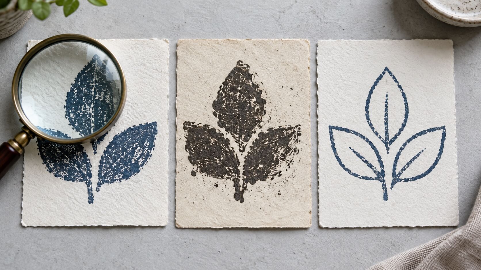
5. Use a size calculation instead of trusting the zoom slider
Screen zoom can make a small source look impressive without adding information. What matters is the number of pixels across the visible impression and the physical width at which you intend to use it. The empty margins around the stamp should not be counted as useful detail.
For an illustrative calculation, suppose the visible impression is 38 millimeters wide and you scan it at 300 pixels per inch. Divide 38 by 25.4 to convert millimeters to inches, then multiply by 300. The impression occupies roughly 449 pixels across. This is a calculation, not a universal recommendation for stamp suppliers.
If that same 449-pixel impression is placed at 76 millimeters wide, its effective resolution falls to about 150 pixels per inch. Doubling the physical width spreads the existing pixels over twice the distance. Exporting the enlarged result at a higher nominal setting does not restore missing detail from the original.
Now consider the canvas. A 1,000-pixel image might contain a stamp only 450 pixels wide, with generous blank paper on both sides. Looking at the total file dimensions alone would overstate the information available in the mark. Measure the part that will actually be seen.
Check whether a resizing command changes the pixel count or only the stated print size. Some software offers both options. Changing the print-size setting can alter the intended physical placement without adding pixels. Resampling creates a different pixel grid, but an enlargement still has to estimate the spaces between the original samples. Keep the unmodified scan so you can compare any enlarged copy with the information you actually captured.
This explains why one scan can look acceptable in a small document corner but poor on a large sign. It also explains why rebuilding a simple border and text can be sensible even if the initial destination is digital. The reconstruction is no longer tied to the sampled edge of that one impression.
There is no need to calculate everything to several decimal places. A rough estimate is enough to detect a large mismatch. When a manufacturer supplies artwork requirements, use those requirements. When the destination is a document, place a sample at the intended size and inspect the exported document, not just the source image.
6. Work through a decision before opening a cleanup tool
Consider a hypothetical neighborhood repair shop with an old stamp impression on a service card. The owner wants a mark for new email quotations. The business name is unchanged, but the telephone number has changed, and the old impression includes a small gap in the outer border.
Keeping the scan would preserve a telephone number that should no longer be used. Painting over that number and drawing a replacement may be possible, but it creates a mixed image with different edges and no straightforward way to make the next change. The better starting point is a reconstruction using approved current wording.
The same shop might also be digitizing historic service records. In that case, the old number and broken border are part of what the original page shows. The scan should remain a faithful record. There is no reason to substitute the newly rebuilt mark into the archived document.
A third task might be a decorative anniversary insert. The shop could deliberately use a scan of its original mark because the imperfect appearance is meaningful. The designer would still need permission to use the asset and would need to avoid presenting outdated contact information as current. The design choice follows the purpose.
Use these decision questions on your own source:
- Does the exact appearance of this particular impression need to survive?
- Is every word and number still correct for the next use?
- Will the mark be used at a larger size than the source can support?
- Will somebody need to change individual components later?
- Can uncertain details be checked against an approved reference?
If appearance is the only fixed requirement and the source is adequate, a scan may be enough. If wording, scale or structure must change, an editable rebuild becomes more attractive. If the source is ambiguous, pause the design decision long enough to establish the correct information.
7. Judge the stamp in its actual destination
A standalone image on a white canvas is a forgiving preview. The real destination may be a colored form, a compressed PDF, a page printed by an office printer or a document viewed on a phone. Each can reveal a weakness the isolated preview hides.
For online documents, check that the background behaves as intended. A scanned paper background may be nearly white but still cover lines underneath it. A transparent export can avoid that rectangle, but transparency does not repair soft lettering or uncertain wording. Treat those as separate questions.
Place the mark beside ordinary body text at the intended size. Can a reader distinguish the business name without zooming far beyond a normal reading view? Does the stamp compete with the information the page is meant to communicate? A large mark is not always a clearer or more useful mark.
If the destination is a PDF, follow the PDF stamp placement and clarity checks after preparing the source. That stage deals with placement and output behavior. It should not become an excuse to keep repairing a source that lacks the detail you need.
A physical manufacturer may require a different version from the one used in a document. A mottled scanned edge that looks appealing on screen may not be the desired shape of a new printing surface. Ask what the supplier needs before assuming that a convincing digital preview is a suitable manufacturing file.
Record the destination test in plain language: “legible on the final quotation at this width” is useful; “looks sharp at 400 percent” is less useful. If two people will use the asset differently, test both destinations instead of seeking a single abstract quality score.
8. Keep the reference and the reusable design separate
Once you choose a method, make the distinction visible in the files. Keep the original capture, the editable reconstruction if one exists, and the output used in documents. They serve different purposes even when their thumbnails look similar.
For a reconstruction, record which facts came from the old impression and which came from an approved current record. A company name may come from current stationery; the proportions may come from the original stamp; an obsolete telephone number may be omitted. This note helps a future editor understand that the result was a deliberate redesign.
Do not describe a recreated mark as an untouched scan. That is inaccurate and makes later review harder. Equally, do not assume that a clean digital reconstruction replaces every historical version. The old asset may still be needed to understand older material.
If several colleagues use the new output, show them the intended placement once. A short example page can prevent stretching, cropping or accidental use of a reference image. Explain which file is ready for daily use and which exists only for editing or comparison.
Retain a way to get back to the design's editable parts. A screenshot of the editor records appearance but not necessarily the elements needed to change it. Confirm the available saving and export options in the tool you use, and verify that the chosen method actually reopens as expected before relying on it.
For a one-time scan-only task, the handoff can be simpler. Keep the original, supply the requested working copy, and state its intended size and destination. There is little value in building a complicated asset system for a mark that will never be reused.
9. Give the next hour one clear objective
If you are unsure which route to choose, run a small comparison. Make one careful capture and one simple reconstruction of the essential wording and outline. Use the same final width and the same destination page. Do not add texture, extra decoration or several export variants yet.
Compare the results against the job, not against each other as isolated pictures. Which one communicates the correct information? Which can support the expected next revision? Which preserves the evidence or character that matters? A choice that wins two irrelevant visual preferences can still fail the main requirement.
Stop the comparison when one method meets the need without an unresolved source problem. An online stamp is useful when its editable structure serves future work. A scanned impression is useful when the actual impression is what you need to retain. The first practical step is to name that difference, then prepare the file that the next person can use with confidence.