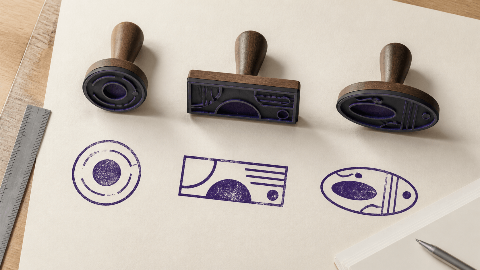
A stamp can contain the right words and still feel wrong because the shape fights the message. A long business name squeezed around a small circle becomes a reading test. A short approval word floating inside a wide rectangle looks timid. Choosing an online stamp shape is less about picking the outline you like and more about giving the information a container that fits.
This guide helps you choose between round, rectangular, oval, and less common layouts before you spend time adjusting every letter. Start with the wording, the place where the stamp will appear, and the size it must occupy. Once those constraints are clear, the shape usually stops being a matter of guesswork.
Choose an online stamp shape from the message outward
Write the exact stamp content in plain text before opening an editor. Include the business name, department, location, date line, status word, registration detail, or short instruction that genuinely needs to appear. Do not add decorative filler just because a sample design has an empty arc.
Then mark the hierarchy. Which line must be read first? Which detail only confirms identity? Which item can be removed if the design becomes crowded? A stamp with one dominant phrase and one supporting line has many workable shapes. A stamp where six items compete at equal weight has a content problem that no border can solve.
Count characters, but also notice their form. A name with many wide capitals takes more room than the same number of narrow lowercase letters. Numbers and punctuation create different gaps. The only reliable test uses the real wording in the real font, not a character-count formula.
Use a round stamp for a centered, seal-like hierarchy
A round layout works well when the information can form layers around a center. The outer arc can carry a business or organization name. A lower arc can hold a location, identifier, or short descriptor. The center can contain a brief word, date, symbol, or open space. The eye naturally reads the border, follows the curve, and lands in the middle.
This structure is especially useful when the name is the most important item and the supporting text is short. The circle creates a clear boundary without needing a wide horizontal area. It also feels visually complete when placed on a blank corner of a document.
The limitation is circumference. Long text may technically fit around an arc, yet become too small or too tightly spaced at the intended size. Adding a second ring reduces the usable radius. Adding a dense center element reduces it again. If the only way to preserve the circle is to shrink every letter, the content is asking for another shape.
A round stamp also resists strong left-to-right messages. Phrases such as “RECEIVED 5 AUG 2026” or “PAID” often read faster in a horizontal block. You can place them in a circle, but the shape may add ceremony where the task calls for speed.
Choose a rectangle when the wording is naturally horizontal
Rectangular stamps suit status labels, addresses, multi-line contact details, dates, reference fields, and department names. Their width follows normal reading direction, so a long line can remain larger than it would on a tight curve. Rows also align cleanly, which helps when several pieces of information have similar importance.
A rectangle gives you useful zones. A bold status can occupy the left side while a date or initials field sits on the right. A business name can span the top, with an address below. A narrow border can contain the design without forcing the text to bend.
Do not mistake available width for permission to fill every corner. Long rectangles become hard to place in document margins, invoice boxes, and signature areas. If the stamp is much wider than the text, reduce the plate width or consider a compact oval. If it contains too many rows, edit the wording before reducing line spacing.
Square designs are a special rectangular case. They work best with short stacked content or a centered mark. A square does not provide the long line length of a wide rectangle, and it lacks the natural text arc of a circle. Choose it because the content forms a balanced block, not simply because it looks different.
Use an oval when a circle is too tight and a rectangle feels rigid
An oval preserves much of the seal-like character of a circle while gaining horizontal room. It can carry a longer name across the top arc or accommodate a wider center phrase without becoming a large round stamp. For a business name that is only slightly too long for a circle, this may be the cleanest compromise.
The oval needs careful proportion. Stretch it too far and curved text begins to flatten across the top while turning sharply at the ends. Make it too tall and the center becomes an awkward empty column. Start with a modest horizontal extension, enter the final wording, and adjust width only as far as the content requires.
Oval layouts also make optical centering more noticeable. A short lower line can look off balance under a long upper name even when both are mathematically centered. Judge the visual weight at normal size and move or resize supporting text in small increments.
Treat triangles and special outlines as exceptions
A triangle, badge, star, or decorative frame can make a mark distinctive, but unusual outlines spend some of the reader's attention on the container. That trade can be worthwhile for a specific internal system, event, or visual identity. It is less useful when the stamp must communicate ordinary business information quickly.
Corner areas are the main challenge. Text rarely fills a triangle evenly without becoming very small, and narrow points may add little usable space. Decorative shapes can also create thin protrusions that disappear at small size or collect too much visual texture.
If a special outline is important, simplify everything inside it. Use fewer words, one clear hierarchy, and generous space between text and border. Verify that the recipient or production vendor accepts the design rather than assuming an unusual form carries a particular official meaning.
Compare shapes with the same content, size, and ink color
A fair comparison changes one variable at a time. Put the exact same wording into a round, rectangular, and oval draft, ideally by duplicating one starting point from the editable stamp templates. Keep the intended physical area similar. Use the same typeface, color, and approximate border weight. Do not give one version a polished symbol and compare it with two unfinished sketches.
View the three drafts together at ordinary document size. Ask which one reveals the main line first, keeps supporting details legible, and leaves the most useful white space. Then place each version in the actual destination: the corner of an invoice, a certificate field, a packaging label, or a PDF approval box. Context often produces a clearer answer than looking at isolated artwork.
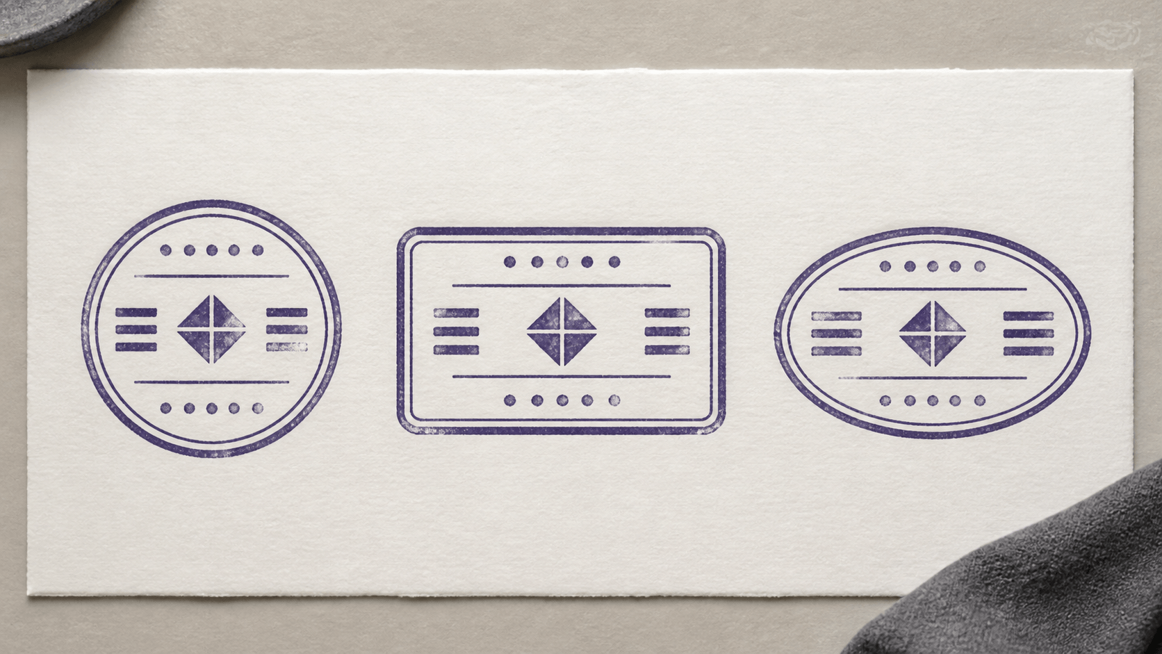
Use a neutral test page. Heavy background graphics can make every option look worse, while a dramatic mockup can make an impractical design look impressive. The decision should survive an ordinary white page, grayscale output, and a quick print.
Fit long names without sacrificing readable type
A long name creates pressure in every shape, but the solution is not always a larger stamp. First remove repeated information. If “North Harbor Engineering Limited” appears around the border, it may not need to appear again below a central symbol. If the legal suffix is optional for the intended use, confirm that with the organization before omitting it; do not make the legal decision during layout.
Next, split information by role. Put the primary name on the upper arc and a location or unit on the lower arc. In a rectangle, place the name on its own line and move the reference number beneath it. Keep related words together rather than breaking a phrase wherever the geometry happens to run out.
Try a typeface with naturally compact proportions before compressing text with aggressive horizontal scaling. Distorted letters may fit, but they look inconsistent and can become harder to recognize. A small reduction in font size combined with slightly wider tracking often reads better than severely condensed spacing.
Abbreviations are a content decision, not a design trick. Use only forms the intended reader will understand and the organization has approved. Saving three millimetres is not useful if the shortened wording creates ambiguity.
Let border count follow information density
Borders establish the outside edge and can separate an outer name from the center. They also consume space. A double ring around a round stamp may look finished, but it reduces the radius available to curved text. A thick rectangle border can overpower a small status word. Each added line should perform a job.
Start with one border. Add an inner line only if it clarifies a text band or is part of an approved design. Keep enough distance between parallel lines so they do not merge when the stamp is reduced or printed. If the center already contains a framed symbol, remove a surrounding ring before shrinking the main wording.
Compare the darkest areas. A bold border, bold name, filled center, and heavy texture create four competing anchors. Usually one or two are enough. Shape choice becomes clearer when the border supports the content instead of acting as the loudest element.
Check the space where the stamp will actually live
Measure the available area in the destination document. A wide rectangle may fit comfortably on a blank page but collide with a signature line or form label. A tall oval can interfere with the row above. A round stamp may cover adjacent text because its corners are transparent but its diameter is still large.
Think about repeated use too. A compact status stamp that appears on hundreds of forms should align easily with the same field. A ceremonial seal used once on a full-page certificate can occupy more space. Neither is inherently better; they solve different placement problems.
If the design is heading to physical production, ask the manufacturer for the usable artwork area and file requirements before final approval. Plate dimensions, housings, and production tolerances vary. A template size is a planning aid, not proof that every vendor will make the same result.
Proof the online stamp shape at actual size
Editor zoom in the online stamp maker is useful for adjusting details, but it can hide proportion problems. Export or capture a clean proof, place it on a page at the intended dimensions, and view the whole page. Do not judge only from a stamp that fills the screen.
Print one page with the preferred option and one alternative. Include a small ruler or stated dimensions outside the artwork so the reviewer knows the target size. Check the thinnest letters, the closest border gaps, and the smallest supporting line. If the design must also appear digitally, inspect it on a typical laptop view and a phone-sized preview.
Make one change per proof. If you alter the shape, font, size, spacing, and border simultaneously, you will not know which change improved the design. Keep the rejected version for comparison until the final choice is approved.
Run a message-density test before approving the outline
Two stamps can occupy the same area and carry very different visual loads. A 38 mm circle with one name and a short lower line may feel open. The same circle with a date, number, location, symbol, and three rings may feel packed. Shape dimensions alone do not describe density.
Temporarily turn every element black and remove texture. View the stamp at its intended size, then cover the center with your thumb or a small piece of paper. Can you still read the outer wording quickly? Next cover the outer band. Does the center still have a clear purpose? This simple isolation test shows where too many elements depend on the same limited space.
Now squint slightly or move the page farther away. The exact words will soften, but the hierarchy should remain visible. One region should lead; supporting regions should be quieter. If the entire stamp becomes one dark patch, reduce border weight, open the gaps, or remove a layer. If it breaks into several unrelated islands, strengthen alignment or group related text.
Use a duplicate, not the only working file, for this reduction pass. Delete the least important item and compare the two versions at the same size. Many designs improve after one supposedly necessary separator, ring, label, or repeated line disappears. If the simpler version communicates the same message faster, the removed item was decoration rather than information.
Finally, show the two options to someone who knows the document but did not build the stamp. Ask what they read first and what they think the mark is for. Do not explain the intended hierarchy in advance. Their first answer is useful evidence. It does not replace organizational approval, but it can reveal that the designer has become too familiar with cramped text to notice the problem.
A practical shape-selection checklist
- Use the final wording, not placeholder text.
- Identify one primary line and reduce unnecessary supporting detail.
- Choose round for a centered hierarchy with useful upper and lower arcs.
- Choose rectangular for horizontal phrases, rows, dates, and fields.
- Choose oval when a circle needs modest extra width.
- Use special outlines only when their distinctiveness serves a real purpose.
- Compare alternatives with the same words, size, typeface, and color.
- Count borders as space-consuming elements.
- Test inside the destination document and at actual print size.
- Confirm production or recipient requirements before final use.
Refine one shape instead of five
Once one shape clearly fits the wording and destination, stop exploring and refine that version. Replace every sample line with final text, remove layers the message does not need, and adjust size, spacing, and borders while the design is still being judged at realistic scale.
The right online stamp shape makes the content feel inevitable. The reader notices the name, status, or instruction before noticing the geometry that holds it. Choose from the message outward, prove the result in context, and let the simplest successful container win.