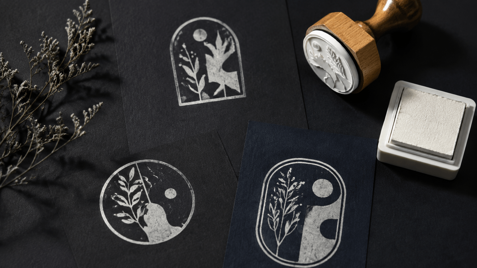
A reverse stamp can make dark paper look striking: the background appears as ink while letters or a symbol stay open. With a pale or metallic opaque ink, the result can resemble a compact printed label. On screen, this is easy to mock up. In a physical impression, it is one of the less forgiving stamp styles.
The open letters are not printed. They survive only because the inked area around them does not spread into their counters and gaps. Large solid areas must transfer evenly. The ink has to cover the chosen stock well enough to create contrast. Some stamp producers accept reverse artwork with wider minimum spaces; others discourage or reject it for a particular product. That makes the production check part of the design, not a task for the final afternoon.
This guide shows how to plan a reverse stamp for dark paper without confusing a digital color inversion with a guaranteed physical result. You will make a go-or-no-go decision early, build a sturdier design, and test the actual paper and ink before committing to a plate.
1. Understand what a reverse stamp actually prints
In an ordinary positive stamp, the letters and lines receive ink. The spaces around them remain paper. In a reverse, knockout, or inverted design, a larger surrounding shape receives ink and the important letters or symbol are cut out of that shape. The paper showing through creates the message.
This changes the weak points. In a positive word, a thin stroke can disappear because it does not receive enough ink. In a reverse word, a narrow open stroke can fill because ink reaches across the gap. The design may fail even though the digital silhouette looks perfectly crisp.
Make a quick black-and-white proof. Draw a solid rectangle or circle in black and cut the wording out to white. Shrink it to the intended impression size. The white areas are the spaces you are asking the physical process to protect. Inspect the inside of e, a, o, and p, the spaces between letters, and any tiny cutout in the icon.
Reverse art also increases the amount of ink transferred. A broad background can print patchily if the pad is uneven, the stock is textured, or pressure is concentrated at an edge. The clean digital block is an intention, not a prediction.
Be clear about the visual goal. If you simply want white lettering on a dark digital document, you may not need a physical reverse stamp at all. If you need a hand-stamped pale mark on dark cards or packaging, the plate, ink, paper, and operator all become part of the result.
2. Check production limits before designing
Ask the intended stamp manufacturer whether it accepts reverse artwork for the exact product and size. Do this before polishing the logo. Supplier guidance is not uniform. One production manual may permit inverted designs when lines and gaps are widened substantially. Another may advise against large inverse areas or refuse reverse artwork for its rubber-stamp process.
Request answers to four questions:
- Is reverse artwork supported for this plate material and size?
- What minimum open line, gap, and type sizes apply to reverse designs?
- How large can one solid printed area be before uneven coverage becomes likely?
- Which file format, color mode, orientation, and proof does the supplier require?
Keep those answers with the project. Do not treat a number from a blog, another stamp shop, or a different plate size as a universal specification. Even when two suppliers use similar words, their equipment and products may not share the same limits.
If the producer cannot give reverse-art guidance, prepare both a reverse concept and a positive alternative. That is not wasted work. It lets the supplier respond to a concrete design and gives you a safe route if the open details are too small.
Define the final impression dimensions at this stage. Minimum gaps are physical measurements. A reverse design approved at 50 millimetres wide may not remain viable when reduced to 25 millimetres.
3. Choose the ink and paper as a pair
Dark paper does not automatically make pale ink visible. Dye, pigment, solvent base, opacity, absorbency, finish, drying, and application all affect the impression. Product makers offer dense pigment and opaque ink lines for dark or non-absorbing surfaces, but their suitable materials and instructions differ.
Start with the paper. Note its color, texture, coating, and weight. A smooth black card, recycled charcoal stock, coated gift tag, and kraft paper can produce very different edges with the same plate. Obtain enough sheets from the real batch to run several tests.
Then choose an ink whose manufacturer names that surface or application. Read the current drying, cleaning, ventilation, and handling instructions. Some opaque products are designed for porous and non-porous materials but can lose opacity as an absorbent surface pulls ink inward. Some pigment inks are promoted for dark paper but dry differently on coated stock. Do not infer compatibility from the color name alone.
Test contrast after the impression is fully dry, not while the wet ink looks brightest. View it under ordinary room light. Metallic particles and pearlescent finishes can change with the angle, so a design that seems clear under a lamp may become quiet when held flat.
Record the exact paper and ink. “White on black” is not enough. If the stock changes, repeat the test. The reverse artwork relies on the physical combination to create both coverage and clean open detail.
Include the other printing on the piece. A pale reverse stamp may sit beside white screen printing, foil, a glossy label, or a strongly colored illustration. Those neighboring finishes change the apparent contrast. Place a dry sample in the complete layout and judge the hierarchy as a customer would see it, not as an isolated test square.
Check handling after drying. Rub a plain sheet over the impression with normal contact, stack a few cards, and follow the ink maker’s directions before treating the result as ready. A beautiful mark that transfers to the next card creates a packing problem. If the required drying space or time does not fit the workflow, another compatible ink, stock, or positive design may be the more practical choice.
4. Simplify the artwork into a strong silhouette
A reverse stamp works best when the containing shape is deliberate. A compact rectangle, oval, circle, or broad custom silhouette gives the inked area a clear edge. Random patches behind individual letters can look broken and are harder to load consistently.
Begin with the one element people must recognize. That may be a short name, two initials, or a simple icon. Place it inside a solid field with generous open space. Add supporting words only after the main element works at actual size.
Remove gradients, soft shadows, semitransparent texture, and photographic detail. A physical stamp divides the artwork into printed and unprinted shapes. If the identity depends on tonal variation, prepare a one-color small-format version instead of trying to force the full logo into a reverse block.
Be cautious with a large filled background. More black area in the production art means more plate area touching the ink pad and paper. Consider a thick frame or smaller badge rather than an edge-to-edge slab. The right choice depends on the visual goal and physical tests, but reducing uninterrupted solids can make hand pressure less demanding.
Avoid distressed texture until the clean proof succeeds. Artificial holes in the background compete with the open wording. On dark paper, they can make the pale impression look weak rather than intentionally worn.
5. Protect counters and interior gaps
The smallest open spaces determine whether the reverse survives. Inspect every counter inside a letter, every slit in the icon, and the gap between the message and its surrounding border. Widen them before making the outer shape more decorative.
For a logo, start from the simplified process described in the guide to adding a logo without losing detail, then apply a stricter test: every essential feature must work as an unprinted hole inside a printed field. A mark that succeeds as positive line art may still be too tight when reversed.
Choose typefaces with open counters and sturdy negative strokes. Very bold type is not automatically safer. In a reverse, an extremely heavy letter can leave narrow internal holes. A regular or semibold face with generous forms may preserve the open shape better.
Increase letter spacing where neighboring shapes nearly touch. Pay attention to pairs such as rn, cl, tt, and tightly joined scripts. If a script word depends on hairline openings between loops, make a separate simplified lettering treatment for the stamp.
Small punctuation deserves suspicion. Periods and dots become tiny open circles or gaps, while commas can lose their shape. Remove punctuation that is not necessary. Shorten a URL, slogan, or legal suffix only when the content owner approves; do not edit official wording merely to make the composition fit.
Print the reverse proof and fill the white openings lightly with a pencil. If a small amount of intrusion makes a letter unreadable, the gap is too fragile. Enlarge it, simplify the character, or increase the entire plate size.
6. Build reverse artwork online without losing the master
Keep a clean positive master before creating the reverse version. The positive file is useful for ordinary paper, vendor comparison, and future sizes. Name the files clearly so nobody sends the wrong one to production.
In an online stamp maker, set the physical plate dimensions and create the containing shape first. Use a solid high-contrast color for the printed area and treat the background color only as a preview of the paper. Add the message and motif as separate layers so their spacing can be adjusted independently.
If the editor uses light text over a dark shape to represent the reverse, confirm how the exported vector describes those areas. A visual white object is not always the same as a knocked-out hole. The production supplier may need compound paths, outlined text, or a specific black-and-white file. Ask what it accepts before final export.
Keep three working views. The first is the black production logic: printed area black, open paper white. The second simulates the intended pale ink on the actual dark paper color. The third is a plain positive alternative. Comparing all three prevents the attractive mockup from hiding a structurally weak plate.
Do not mirror the art unless the manufacturer requests it. The supplier usually manages the plate reversal, but its own specification controls. Include a readable orientation proof with the final file.
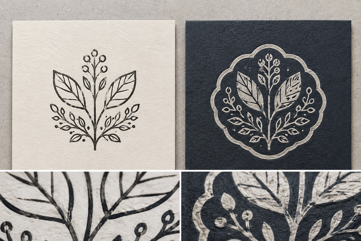
7. Test a screen proof and a physical impression
The screen proof answers composition questions. The physical test answers production questions. You need both, in that order.
For the screen proof, view the design at actual size on a calibrated or ordinary display and print it on paper at 100 percent. Check the silhouette, reading order, letter spacing, and outer margin. Turn it upside down and sideways; the background shape should still look intentional, not lopsided.
For the physical proof, use the intended plate or a supplier sample that reflects the same reverse features. Test on the actual dark paper with the chosen ink. Make several impressions with normal hand pressure, not one carefully coached press. Include a lighter load and a heavier load so you can see the failure range.
Let every sample dry as directed. Label the back with paper, ink, load, date, and any setting method. Judge the open details first, then the solid coverage. A perfect background with filled letters is not a successful result. A slightly textured field may be acceptable if the message remains crisp and the texture suits the job.
Place the sample where it will be used: on the tag, card, sleeve, or mailer. Contrast can change beside other printing. The reverse mark also needs enough empty paper around it; pressed against a photograph or dense pattern, its outer silhouette may disappear.
Ask two people to read a mixed set of samples without knowing which one is the favorite. Include the positive alternative. Have them identify the wording first, then say which mark looks intentional. This separates legibility from designer attachment. A reverse can win on appearance and still lose on reliable reading; the decision should acknowledge both.
Keep one sample from each pressure level. The acceptable range matters more than the best impression. If normal variation moves quickly from patchy to flooded, the design gives the operator too little room. Widen the open details or reduce the solid area before trying to train everyone into one exact hand movement.
8. Fix the failures that appear first
Open letters fill with ink
Widen counters and spaces, reduce unnecessary weight around them, and check whether the pad is overloaded. Do not start by making the entire design smaller. Smaller usually makes the open areas more vulnerable.
The solid field is patchy
Check pad coverage, paper texture, the firmness of the stamping surface, and the size of the uninterrupted solid. A smaller containing shape, thick border, or divided background may transfer more consistently. Accept natural hand-stamped variation only if it does not weaken the message.
The pale ink looks dull
Confirm that the ink is intended for the paper and that it has dried fully. Test another compatible opaque ink or a smoother stock. Adding more ink can increase blur without solving opacity.
The edges form a heavy halo
Excess pressure, rocking, or too much ink may push material toward the outer edge. Use a straight press and lift, then compare normal and lighter pressure. If the border still dominates, reduce its area or ask the plate supplier to inspect the design.
The mark is readable only under bright light
Metallic or pearlescent ink may depend on viewing angle. Test a matte opaque alternative or stronger paper contrast. The chosen finish should work where the customer or staff member will actually see it.
9. Decide when a positive stamp is the better answer
A reverse stamp is not a badge of better design. Choose it when the light-on-dark effect supports the material and the production test is reliable. Choose a positive stamp when the message must be highly repeatable, the mark is very small, the logo has fine internal detail, or the supplier cannot support the open gaps.
You can also change the paper. A positive dark impression on a pale label applied to dark packaging may produce clearer information with fewer variables. A pale belly band, sticker, or tag can carry the ordinary mark while the package keeps its dark surface.
Another option is a hybrid: a positive outline or symbol made with opaque ink rather than a filled reverse badge. It uses less solid area and may be easier to print consistently. Test it beside the reverse, not only as a fallback after production fails.
Let the use decide. A decorative limited-run card can tolerate more texture than a small batch code or handling instruction. If the wording must be read quickly and accurately, prioritize the positive design that remains clear under ordinary pressure.
Keep the reverse concept in the design family even if the physical plate becomes positive. It may still work as a digital asset or a professionally printed packaging element. The stamp does not have to carry every visual expression of the brand.
10. Prepare the final file and supplier questions
Once the physical samples pass, clean the production file. Remove hidden layers and mockup backgrounds. Confirm the final dimensions, convert type as requested, and make the printed/open logic unmistakable. Include an actual-size orientation proof showing the intended readable impression.
Use the broader production-ready rubber stamp checklist for line, spacing, vector, and proof questions, then add a reverse-specific note naming the smallest protected gap and the tested paper-and-ink pair. Ask the supplier to confirm that the production file matches the approved reverse method.
Your handoff should contain the editable master, positive master, reverse production file, actual-size proof, dimensions, supplier specification, and photographs of acceptable dry impressions. Give each version an unambiguous name.
Add a one-page production note that identifies printed areas in black and open areas in white, names the approved orientation, and states that the dark color in the mockup represents the stock rather than extra printed ink. This prevents a vendor, colleague, or future designer from rebuilding the visual simulation as a multi-color file.
If the plate will be reordered, record the manufacturer, product, plate size, approval date, and file checksum or version. The reverse-specific clearances may not survive an informal recreation. Reopen the design only when the stock, ink, size, wording, or supplier changes, and repeat the relevant physical test when it does.
Do one last practical check before ordering multiples. Make five normal impressions in a row. Read them at arm’s length under ordinary light. If the same letter fills twice or the solid field repeatedly breaks across the message, revise the design or choose the positive version. A reverse stamp earns approval through repeatable contrast, not through the cleanest image in the test sheet.