
A perfectly clean digital stamp can look more like an icon than an ink impression. Add too much wear, though, and the business name breaks apart, the date becomes uncertain, and the border turns into dirt. The useful way to make a digital stamp look real is to preserve the design first and introduce only the irregularity the final size can tolerate.
Realism is not a contest to add the most scratches. It comes from restrained variation in edges, ink coverage, and opacity while the important information remains easy to read. This guide explains how to build that balance, compare texture levels, and keep a clean master for uses that should not look distressed.
Make a digital stamp look real by starting clean
Approve the untextured stamp before touching an aging or wear control. Check spelling, hierarchy, border spacing, line weight, logo clarity, and intended physical size. If the clean design is crowded, texture will not make it more convincing; it will make the crowding harder to diagnose.
Save or duplicate the clean version. Treat it as the master from which textured variants are made. A clean file is useful for production handoff, small-size use, later edits, and situations where a crisp digital mark is preferable. Do not overwrite it because one document benefits from a worn look.
View the clean version at the size where it will appear. Thin strokes that already vanish, tight counters that already close, and words that already need zoom are not ready for texture. Simplify or strengthen those parts first.
Separate visual realism from authority. A distressed image may resemble physical ink, but that appearance does not establish approval, identity, authenticity, or legal validity. Those questions depend on the process, the people involved, and applicable rules—not on a rough edge.
Identify the features that texture must protect
Make a short protected list. It usually includes the primary name, critical numbers, dates, short status words, distinguishing logo features, and the border segments that define the shape. If a random gap changes one of those items, reject that texture instance or reduce the effect.
Small punctuation needs special attention. A period can disappear into a speckled pattern. A hyphen may break and look like two stray marks. A decimal point, apostrophe, or narrow slash can change meaning when removed. Zoom in to locate them, then judge again at normal size.
Protected does not mean perfectly untouched. A tiny edge variation can cross a large letter without harming recognition. The standard is readable identity, not pixel-level purity. Ask whether a person seeing the stamp for the first time can read the content without guessing.
For a detailed symbol, decide which silhouette and interior cuts carry recognition. If that preparation is the main problem, use the existing guide to add a logo without losing detail before applying wear. Texture should not be used to disguise a source image that was never suitable at stamp size.
Place wear where physical variation feels plausible
Variation along outer edges often reads as more natural than random holes distributed equally through every element. A physical impression may show imperfect contact around parts of a ring or a slightly lighter corner. It is less convincing when identical speckles cut through every letter with the same density.
Protect the centers of small characters and narrow numbers. Allow more variation across broad filled regions, thick borders, and larger letters. A tiny gap in a wide stroke suggests ink variation. The same gap through a thin 1 can erase the character.
Avoid patterns that look tiled or repeated. If the same cluster appears around the circle at regular intervals, the effect reads as a digital brush. Rotate or regenerate the texture when possible, but do not keep changing it after a clean, readable result appears.
Do not add unrelated paper fibers, coffee stains, folds, or shadows directly to a reusable transparent stamp file. Those effects belong to a specific scene or document mockup. The stamp asset should remain flexible enough to sit on the real destination background.
Use opacity for ink strength, not disappearance
Lowering opacity can reduce the harshness of a solid digital color and let a little background show through. It can also make fine type too weak on white paper. Adjust opacity while viewing the complete document, not against a checkerboard or dark editor surround.
Keep enough contrast for the primary wording. A subtle reduction may be all the design needs. Large reductions create a faded watermark, which is a different visual role from a stamp impression.
Uniform opacity and irregular wear solve different problems. Uniform opacity changes the strength of every pixel. Wear removes or varies selected areas. Try them separately before combining them. If the design is already textured, a large opacity reduction may make the gaps dominate.
Test on the lightest and darkest backgrounds you expect. A blue stamp at moderate opacity can look clear on white and muddy over a gray form line. If the destination varies widely, keep a stronger general-use version and prepare background-specific variants only when necessary.
Compare three texture levels at final size
In the online stamp maker, create a clean version, a subtle version, and a deliberately stronger version. Place all three on one page at the same physical dimensions. Label them outside the artwork. A side-by-side comparison prevents the editor's large preview from making the strongest effect feel more impressive simply because its texture is easier to see.
The clean version establishes the information. The subtle version should add edge variation without changing reading speed. The stronger version shows where damage begins. You may never use it; its value is to make the acceptable boundary visible.
Step back from the page or reduce screen zoom. If the subtle and strong versions collapse into similar dark noise, the texture scale is too fine for the output. If no difference is visible, the effect may be decorative work that does not survive use.
Ask a reviewer to read dates and names before asking which version looks most realistic. Readability is the release gate. Preference matters only among versions that preserve the content.
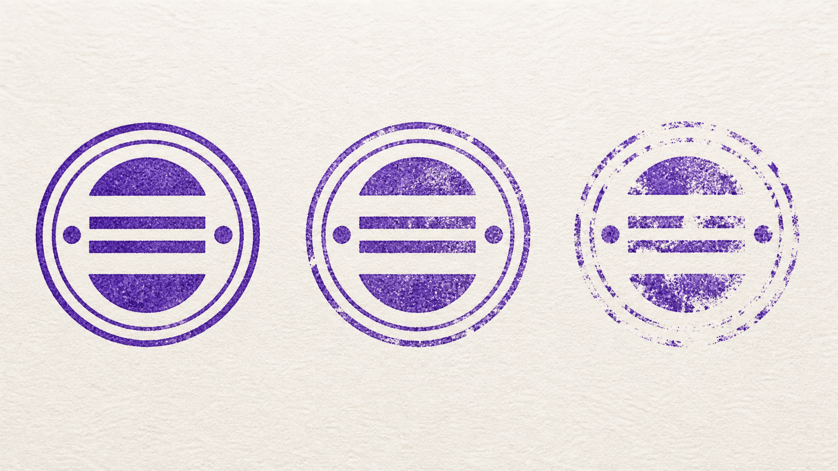
Match texture strength to the job
A small approval mark in an invoice table needs restraint. Its text is already compact, and the surrounding document has lines and numbers that compete for attention. Use a clean or lightly varied version.
A larger craft label, packaging mockup, or historical-style graphic may tolerate more visible wear because the mark occupies more space and the distressed appearance contributes to the visual direction. Even then, protect the business name and any information a customer must read.
A formal certificate or client-facing document may need crisp edges rather than simulated wear. “Realistic” does not always mean “better.” Match the style to the communication context and the organization's approved use.
For physical production, ask the manufacturer whether to supply clean vector artwork. Real plate material, ink, pressure, and paper can create variation on their own. Sending artificial distress may permanently cut gaps into the manufactured impression when that was not intended.
Keep the border from becoming a ring of debris
Borders carry a large portion of the stamp's silhouette, so texture is very visible there. A few interruptions can suggest uneven contact. Too many breaks make the outline look like scattered fragments and weaken the shape.
Check the longest uninterrupted gap. One large missing section is often more damaging than several tiny variations because it changes the perceived geometry. Regenerate or reduce the effect if a circle no longer reads as complete or a rectangle loses a corner.
Double borders need less texture than a single heavy ring. Wear applied equally to both can create a dense, vibrating band. Consider keeping one ring cleaner or simplifying the border before adding any effect.
Inspect the space between border and text. Random marks should not bridge that gap and make letters appear attached to the ring. Open white space is one of the strongest signals that the design remains controlled.
Protect curved text and small center lines
Curved text contains letters at changing angles, so missing strokes can look more irregular than the same damage on a straight line. Pay attention to the sides of the arc, where letters may already be smaller or closer to borders.
Lower arcs are often supporting text in a smaller size. Apply texture while checking them independently. If the upper name survives but the lower location breaks apart, the overall texture level is still too strong.
Center lines such as dates or status words may be visually simple but operationally important. Protect digits, narrow vertical strokes, and punctuation. A date that can be misread is not acceptable texture, however convincing the rest of the mark appears.
If one line consistently fails before the others, strengthen or enlarge that line slightly in the clean master, or exempt it from the strongest effect when the editor allows. Do not darken every element to compensate for one fragile item.
Test the stamp on real backgrounds
Place the transparent stamp on a plain white page first. This reveals the actual ink shape without help from a dramatic mockup. Then test on a light document grid, a faint colored form, and one representative background from the intended workflow.
Watch for interactions. Texture gaps can align with printed form lines and make a border look broken. Partial opacity can blend the ink with gray text underneath. A dark background can reverse the apparent strength of pale wear marks.
Do not test with confidential documents. Build a neutral sample page that uses similar line weight, background color, and placement. The visual decision does not require real names, signatures, account details, or customer records.
If the stamp will appear over varied backgrounds, avoid tuning it to one perfect mockup. Approve a robust general version and document any limited-use variant separately.
Print, scan, and photocopy a proof
Digital texture can change when printed. Fine speckles may disappear, merge, or become more prominent depending on the printer and paper. Print the stamp at its intended size using ordinary settings, then inspect the smallest text and the main border.
If scanned copies are part of the workflow, scan the proof and view the file at normal document size. A scanner may increase contrast or soften small marks. A photocopy can further simplify the impression. The goal is not perfect reproduction of every speck; it is preserved wording and a coherent silhouette.
Compare the clean and subtle versions through the same route. If both acquire enough natural variation during printing and scanning, the digital texture may be unnecessary. Use the simpler source.
Record the successful texture level and export, but keep the proof tied to the printer or workflow used. Another device may behave differently, so avoid turning one test into a universal claim.
Recognize common texture failures
The stamp looks dirty rather than worn
Reduce the number of small isolated specks and restore larger continuous areas. Keep variation connected to the stamp's edges and broad strokes. Remove marks that float outside the intended ink shape.
The text is readable only when zoomed in
Judge at final size and reduce wear immediately. Increase type clarity in the clean master if necessary. Exporting at a higher pixel count will not restore letter parts that the texture deliberately removed.
The border is much rougher than the lettering
Lower the effect or simplify the border. A distressed outline around untouched text can look like two unrelated styles. Aim for related variation while keeping the name protected.
The effect looks repeated
Change the texture instance or reduce its strength until the pattern stops calling attention to itself. Do not add a second pattern on top; overlapping repetition usually creates more noise.
The stamp disappears on the document
Restore opacity and reduce missing areas. Test a stronger ink color approved for the context. Check that the background is not competing with the stamp, and move the placement if it covers dense content.
Save clean and textured variants deliberately
Use filenames that state the difference, such as `approval-clean`, `approval-subtle`, and `approval-heavy-proof`. Mark the approved use and dimensions in a short note. Do not rely on thumbnail appearance to identify the correct file months later.
Keep the editable source with texture turned off or in a reversible state. A future wording change should start from sound geometry, not from a flattened worn image. Reapply and recheck texture after every content change because random gaps may land on different features.
Limit the number of official variants. A folder with twelve almost identical worn stamps encourages arbitrary choice. Keep the clean master, the approved general-use texture, and any genuinely required special version.
When a team shares the files, include a small contact or approval note outside the artwork. State who can authorize a new textured variant and where the editable source is stored. This avoids a quiet drift in which each document owner adds a little more fading, blur, or damage. The visual system stays useful because changes return to one clean source and pass the same readability test.
Review the approved textured copy after a major layout change. A new border, longer name, different date format, or smaller plate alters the amount of detail the effect can safely remove. Previous texture settings are a reference, not a permanent recipe. Repeat the clean, subtle, and strong comparison whenever the design's information density changes.
Approve realism through restraint
Put the clean design beside one subtle variant and reduce both to final size. Read the name and numbers before comparing style. If the clean copy communicates faster, that is the approved answer; no texture is required.
The reliable way to make a digital stamp look real is to stop before the texture becomes the subject. A believable impression still reads quickly, keeps its shape, and survives the document route. Add variation with a light hand, preserve the master, and let the intended use decide how much wear is enough.