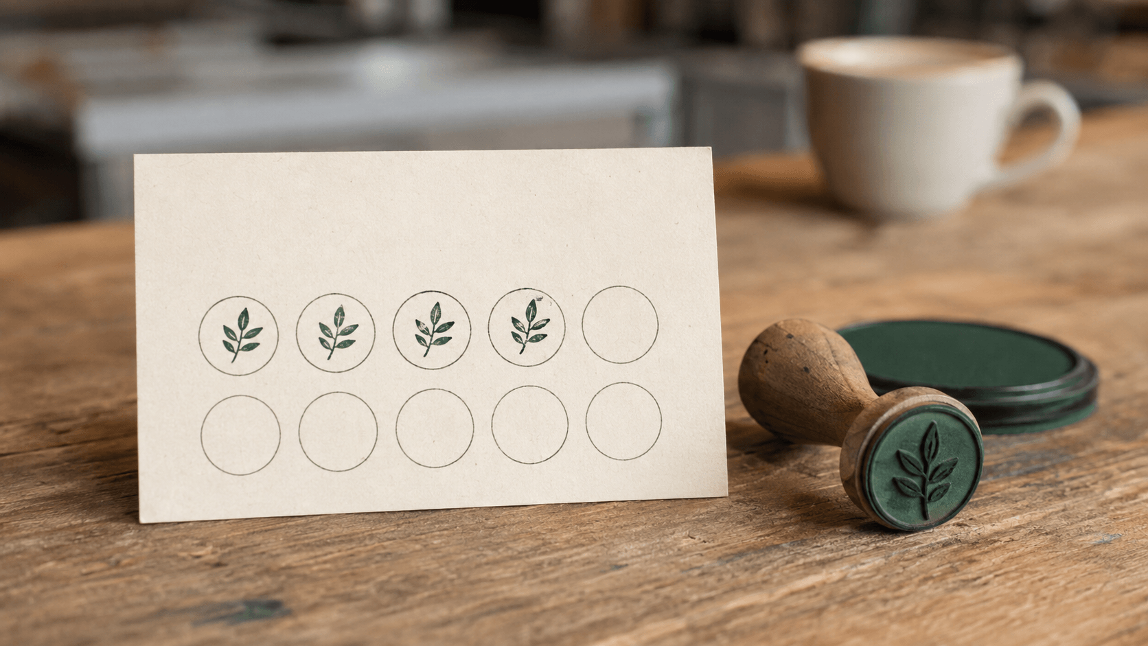
A loyalty card can look lovely on a screen and become awkward the moment somebody tries to stamp it. The spaces are too small. The mark lands across two circles. After a few visits, neither the customer nor the person behind the counter can tell how many spaces are filled.
A useful loyalty card stamp makes one thing obvious: this space has been earned. The card does the explaining; the stamp records progress. Keeping those jobs separate gives you much more freedom to make both clear.
Start with the real interaction, not the decorative border. Someone will hand over a card, an employee will check the purchase, and a small mark will need to land in an open space without a long pause. This guide walks through the artwork, receiving grid, paper, proofing, and everyday handling that make that exchange easier. The examples are planning examples, not promises about sales or customer behavior.
Decide exactly what one impression means
Before drawing a stamp, write one sentence defining what earns it. One qualifying item, one qualifying visit, and one spending threshold are different rules. If the owner means one of those and the counter team assumes another, a perfectly clear stamp will still record inconsistent progress.
For a simple hypothetical coffee-card scheme, suppose each qualifying drink earns one mark and a completed card can be redeemed for a specified drink. The owner still needs to decide what counts as a qualifying drink, whether multiple drinks earn multiple marks, and what happens when the card is redeemed. The artwork cannot make those decisions.
Choose the number of required purchases before arranging the cells. Eight spaces and ten spaces place different demands on a small card. Do not choose ten merely because a template happens to have ten circles. Equally, do not quietly change an agreed reward threshold because a different grid looks tidier.
Write the reward and essential conditions in plain language on the card. Give them enough room to be read at the finished size. Avoid hiding a meaningful restriction in tiny print beside the trimming edge. If the wording needs specialist review for your location or business, resolve that before printing.
Also decide whether the reward gets its own distinct space or whether every cell represents an earned mark. A decorative gift symbol in the final circle can look like progress already granted. Ask somebody who has not seen the design to explain the card back to you. Their answer will reveal ambiguity faster than another round of color choices.
Give the card and the stamp different jobs
The card carries the business name, the reward explanation, and the spaces to be filled. The stamp needs to make a compact, recognizable mark. It usually does not need to repeat the address, website, opening hours, or the entire reward sentence.
This distinction matters most when a large business seal is being reused as a loyalty stamp. Shrinking a ring of company text into a tiny cell does not turn it into a suitable small mark. The outer name may become a broken band, while the central artwork loses the detail that made it recognizable.
Instead, select an element that can stand on its own: a simple leaf, a compact monogram, or a bold symbol already associated with the business. Keep the full identity on the card. Use only artwork you have permission to reproduce.
Decide what the mark should look like when rotated. A circle or uncomplicated symbol can remain recognizable at several angles. A letter or directional icon may need a clear orientation cue on the handle. Neither choice is automatically better; it depends on what the staff can place consistently.
There is also no need to print the complete stamp image inside every empty cell. A lightly outlined receiving space makes an added impression easier to distinguish from the preprinted card. If you do use a background motif, test a partly filled card: the earned marks should remain immediately countable.
Keep decorative branding away from the working area when it competes with the marks. A clean patch of paper is doing useful work here. It is not unfinished design.
Choose loyalty stamp artwork that survives being small
Look at the mark at the size it will actually print. A generous screen preview can flatter fine leaf veins, thin script, and closely spaced initials. On a card, the reader has far less room to distinguish those details.
Start in one color. Test the silhouette before adding an inner line or decorative edge. If removing a detail makes the symbol clearer without changing what people recognize, leave it out. A small loyalty stamp is not the right place to demonstrate every feature of the brand identity.
The stamp template collection can help you compare compact layouts, but judge each candidate as a small marking tool. A template designed for a large company seal may need most of its text and decoration removed before it is relevant to this job.
Pay attention to the white areas inside the design. An open gap between two leaves, or the opening inside a letter, needs to remain visible in the impression. A thicker stroke is not always the answer; it can close the very gap that gives the symbol its shape.
Decide whether initials earn their space
Initials can distinguish similar motifs, but only if they are readable without explanation. Try the actual letters, not a more convenient sample. A short name containing wide or similar-shaped characters can be harder to fit than a longer-looking word with narrow letters.
Do not add microscopic text as a security feature. A distinctive mark can help staff recognize the intended stamp, but a paper stamp card is not made fraud-proof by a tiny slogan or a special color. If the value or risk calls for stronger controls, treat that as a separate operational decision.
Save the simplified loyalty version separately from the main logo. Give it a descriptive filename so nobody later restores the full artwork because the little version appears to be missing detail. The reduced design is a deliberate adaptation for a different job.
Size the receiving spaces around the impression
Measure the printed impression, not the outside of the stamp handle. A housing can be much wider than its mark, and a product's advertised dimensions may need clarification. Ask the supplier which dimensions describe the printable area.
The receiving cell needs clearance around that area. Making the cell exactly the width of the mark demands unusually precise placement on every visit. Leave some room for an impression that is slightly off-center while still belonging unambiguously to one space.
A worked spacing example
Suppose you are testing an 8 mm circular impression in a 12 mm receiving circle. When perfectly centered, the nominal clearance is 2 mm on each side: half the difference between 12 and 8. A 1 mm sideways placement error would leave roughly 1 mm of that clearance on the nearer side. These are illustrative geometry values, not a promise about manufacturing tolerances or hand placement.
Five 12 mm cells with four 3 mm gaps occupy 72 mm across. That is 60 mm of cells plus 12 mm of gaps, before you allow space at the card edges. If that does not fit the printer's usable area, you can change the arrangement, use another card size, or test a smaller mark. Do not simply remove all the gaps.
For a square or an irregular symbol, compare its complete footprint with the cell. Rotation can change how its corners fit. Ask for a real impression and try it at the angles an employee is likely to use, rather than checking only a perfectly aligned digital mockup.
Leave practical space to grip the card without covering the next empty cell. Keep the grid clear of folds, rounded corners, and trimming boundaries. Use the printer's actual template for bleed, safe area, and finished size; there is no single margin that this article can approve for every supplier.
Finally, check a nearly full card. The last empty space should be as easy to spot and reach as the first. A neat empty grid is only one state of the design.
Choose the card stock and ink as a pair
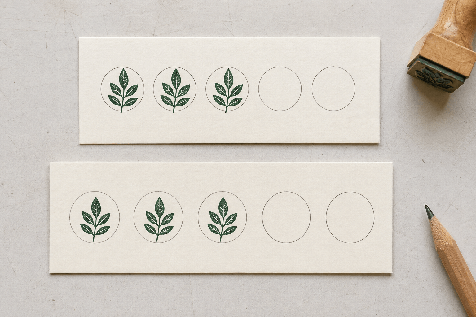
A heavy card is not necessarily a suitable stamping surface. Its coating, texture, printed background, and finishing treatment all matter. Choose a sample with the same finish the customer will receive and test it with the intended stamp and ink.
If your ink is specified for absorbent paper, a suitable uncoated stamping area is a sensible starting point for trials. That is not a guarantee: very textured or absorbent stock can introduce different problems. If a protective finish is important elsewhere on the card, ask the printer whether the working area can remain suitable for stamping.
Do not substitute an arbitrary “permanent” ink because one sample smears. Verify that the formula suits both the card and the stamp construction. Some inks intended for non-absorbent materials have different handling and material-compatibility requirements.
Run a small handling check after the manufacturer's stated drying guidance. Pass a sample across the counter, put it against another card, and place it in the kind of wallet or sleeve a customer might use. These are practical trials, not a durability certification. Keep an untouched sample for comparison.
Choose an ink color with a clear visual difference from the empty grid. A dark mark on a pale receiving area gives you a straightforward starting point. Do not depend on color alone to distinguish an earned stamp from decoration; the shape and filled state should communicate that too.
Record the approved stock and ink combination before ordering more. If either changes later, run another sample check. “The same green” or “similar card” does not establish that the new materials behave the same way.
Prototype the whole card, not just the nicest corner
Use the online stamp maker to prepare and refine the stamp artwork, then check it in a separate full-card mockup or the printer's layout template. The stamp artwork and the printed card are separate deliverables. Confirm the physical stamp manufacturer's file requirements before sending the final design.
Print the card mockup at its intended size and measure it. A print dialog that scales the design to fit a page can make your spacing calculations meaningless. A paper printout of the mark is useful for an early layout check, but it does not replace an actual stamped proof.
When a sample stamp is available, work through a complete card. Fill the first row, reach the corners, and use the final empty space. Keep some impressions deliberately a little off-center within normal use. The point is not to sabotage the design; it is to discover how much accuracy the layout demands.
Ask someone else to use it
Give the prototype to an employee who did not design it. Ask them to find the next space, make a mark, count the completed spaces, and explain when the reward becomes available. Watch where they hesitate before explaining your intention.
Try the same tasks under the normal counter lighting and with the objects that usually occupy the workspace. If the design only feels simple when the desk is empty and the card is held carefully with both hands, you have learned something useful before committing to a print run.
Check the empty, partly completed, fully completed, and redeemed versions together. Each state needs to be understandable. A bold final-cell illustration might look attractive on a blank card but make a completed card difficult to count.
Separate the findings into artwork, card layout, and working method. Enlarge a receiving space when placement is difficult. Simplify a mark when it becomes an indistinct blob. Clarify the printed sentence when someone misunderstands the reward. Do not try to solve every problem by changing the stamp's size.
Keep the marked-up prototype and a clean approved copy. A brief note explaining the chosen clearance or simplified symbol helps prevent an apparently harmless redesign from putting the problem back.
Make everyday stamping and mistakes easy to handle
Choose a regular place for the stamp, pad, and cards. Keep it clear of drinks, loose receipts, and items that might touch a fresh impression. A small defined working area is often easier to maintain than a decorative display spread across the counter.
The marking routine should follow the business rule: check the qualifying transaction, identify the next empty space, stamp it once, and return the card after the necessary handling pause. Discuss multiple-item purchases explicitly so employees do not have to invent an interpretation while a customer waits.
Decide how to record a weak impression. Repeatedly stamping near the same cell can make one earned mark look like two. A simple correction policy gives staff a way to resolve that without arguing over the artwork. The exact policy belongs to the business; test its visual result on the prototype.
Put an approved sample where staff can compare it with an uncertain mark. That is especially useful after a pad change, when a fresh impression may appear darker than an older one. Keep the original design consistent rather than treating every small variation in ink coverage as a different stamp.
A distinctive stamp is still a tool that needs sensible control. Store it in the staff working area, decide who can use it, and record replacement or retirement. Do not leave the usable stamp beside an unattended stack of blank loyalty cards and expect the design alone to protect the scheme.
If several employees or locations use the same design, give them the same approved artwork and practical instructions. Differences in unofficial replicas, pad colors, or card versions can make genuine marks harder to recognize. Any deliberate differences should be understandable to the people who redeem the cards.
Leave a spare test card near the supplies. It gives someone a place to check an uncertain impression before marking a customer's nearly completed card.
Plan redemption and future changes before printing
A completed card needs an obvious next step. Decide whether staff retain it, cancel it, or record redemption another way. If you intend to stamp a separate redemption mark, give that mark its own location and make it visibly different from an earned-progress stamp.
Test what the customer sees after the reward is given. A card covered in the same small symbol may communicate “complete” but say nothing about whether it has already been used. Do not rely on an employee remembering the interaction several days later.
Think through lost cards, partially filled older versions, and a change in the offer. You need a consistent response rather than a tiny printed clause for every imaginable situation. Keep the essential customer-facing explanation readable, and give staff the fuller working guidance separately.
A subtle version identifier on the card can help distinguish print runs when something material changes. Do not make the loyalty stamp itself carry a new long code simply because the reward wording changed. The mark's main job is still to show earned progress clearly.
Approve replacement artwork and replacement cards together. If the new mark is larger, old cards may no longer have enough space. If the grid changes, staff may count it differently. Keep a sample of each version still in use so you can spot those conflicts before ordering.
These are design and operating checks, not a substitute for reviewing the rules that apply to your offer. Get any necessary advice before making promises customers will rely on.
Send a clear production brief, then try a small batch
Prepare separate files for the stamp artwork and the card. Give each an unmistakable name and version. Include the approved finished dimensions and clarify which file is a visual reference rather than the production original.
The stamp supplier needs to know the intended impression size, stamp construction, ink setup, and receiving material. The printer needs the finished card size, stock, finishing requirements, layout, and safe-area checks. If they are different suppliers, show each the part that must work with the other.
- Confirm that the quoted stamp size means the impression area you approved.
- Ask for a proof at the intended size and confirm any artwork changes.
- Keep the stamping area free of an untested coating or overprint.
- State the exact approved card and stamp versions in the order notes.
- Agree on a sample check before a larger run when practical.
When the samples arrive, repeat the full-card trial with the actual products. Check alignment, open gaps in the motif, drying during normal handoff, and the readability of a nearly completed card. A correct digital proof does not tell you all of that.
Keep notes from the first small batch. If employees repeatedly miss a particular space or customers ask the same counting question, revise that part before producing more. Do not treat an avoidable difficulty as something everyone simply has to get used to.
Your next step is modest: choose one compact loyalty card stamp, place it in a measured receiving grid, and have someone else complete and redeem a prototype. If they can do that without help, you have a much better basis for approving the design than a polished picture of an empty card.
Only then should you approve the loyalty card stamp, the card artwork, and the counter routine as one working set.