
A received stamp looks like a small office tool, but it quietly defines a record. Someone opens the mail, takes in a hand-delivered form, or accepts a document at a counter. The impression tells the next person when the item entered the organization and, sometimes, where it should go. If that mark is hard to read or tries to record too much, the document still needs explanation.
The useful way to design a received stamp is to start with the intake routine rather than a border style. Decide what event the mark records, which details must be written or selected, and who will use the information later. Then give those few items enough room to work on real paperwork. This guide takes that order seriously. It will help you build a clear layout, test it on difficult documents, and hand it to staff with a simple operating rule instead of an attractive stamp that nobody uses consistently.
1. Start with the record the stamp must create
Before drawing anything, finish this sentence: “This stamp records that…” A good answer is narrow. It might be “the mailroom physically received this document,” “the front desk accepted this application,” or “the accounts team received this supplier invoice.” Those are observable events. “This document is valid” or “this request is approved” is a different and much larger claim.
That distinction matters because a received stamp is not automatically an approval, verification, or legal finding. The meaning comes from the organization’s procedure. A date on paper may support a record, but the stamp alone does not settle every question about deadlines, authority, or compliance. If the document is regulated or time-sensitive, the responsible team should define which date counts and what other record must accompany it.
Write down who applies the stamp, at what point, and what happens immediately afterward. If the mailroom stamps an envelope before opening it, the available space and information differ from a process that stamps the first page after scanning. If a receptionist handles walk-ins, an arrival time may matter. If a shared service receives hundreds of routine invoices, the office name and one routing code may be enough.
Do not use the stamp to repair an undefined workflow. If nobody can agree whether “received” means arrival at the building, entry into a system, or delivery to a department, settle that question first. A clean impression of an ambiguous event is still an ambiguous record.
2. Choose the fields before choosing the shape
List every field people initially request, then challenge each one. Common candidates include the word RECEIVED, a date, an office or department name, initials, an internal reference, an action, and a routing destination. Every added field consumes room and creates another chance for incomplete handwriting.
A simple filter helps. Keep a field only when someone uses it to answer a real follow-up question. The date answers “when did this arrive?” Initials can answer “who handled it?” A routing field can answer “where did it go next?” A decorative company slogan answers none of those questions and usually belongs elsewhere.
Look at several structures in the editable stamp templates, but compare them as field arrangements rather than finished solutions. A broad rectangle may suit one heading, one date line, and a short department name. A round mark can make an office identity prominent, yet it leaves less natural room for handwriting. A tall rectangle may fit a routing checklist but become awkward in a crowded document margin.
Separate fixed text from variable information. Fixed text is cut into the stamp plate: RECEIVED, the office name, labels such as DATE or BY, and perhaps a fixed reference prefix. Variable information is written, selected, or applied by a separate date mechanism. Make this distinction in the first sketch. Otherwise a label may look generous on screen while leaving only a narrow gap for the value.
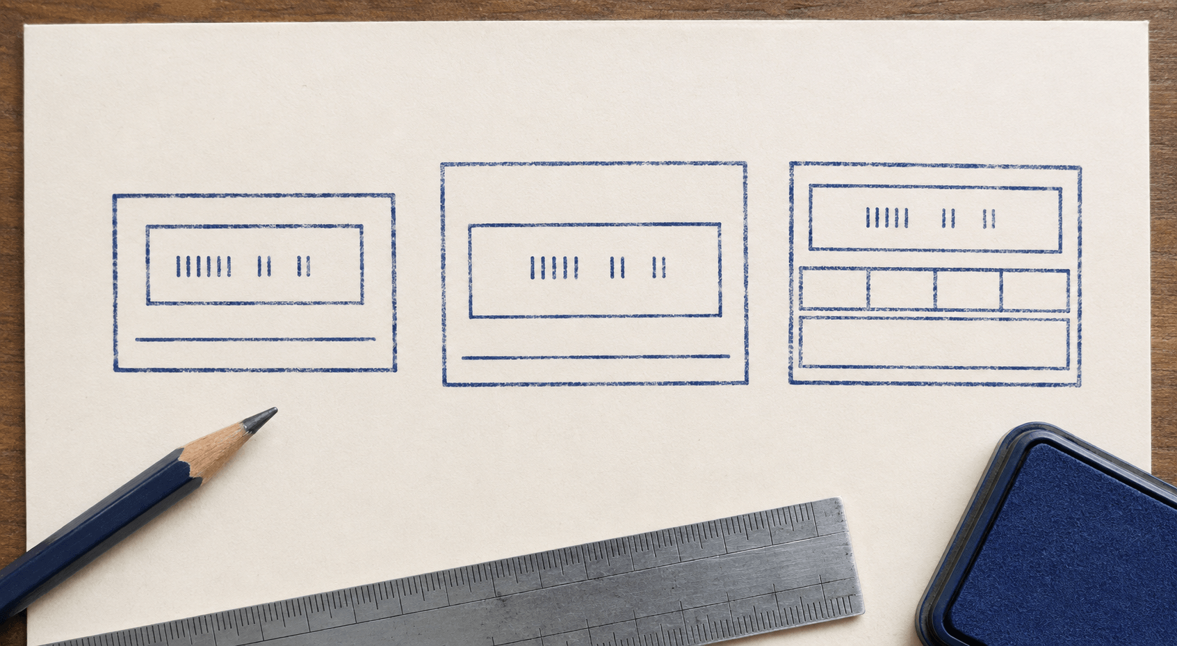
Try three versions before polishing. Version A should contain only the status word and date. Version B can add the office or team. Version C can add one operational field such as initials or route. Put them side by side at the same physical size. The leanest version that supports the routine is usually the strongest.
3. Give the date the strongest hierarchy
In most received-stamp workflows, the date is the value people search for later. Do not bury it between labels of equal weight. Build a clear reading order: status first, date second, and supporting details after that. The eye should not have to inspect every line to find the date.
If the date will be handwritten, treat the writing area as a real object. A thin underline that looks elegant on screen may be too short for different handwriting styles or a longer local date format. Test the longest allowed format, not the neatest example. If staff might write either 06 SEP 2026 or 2026-09-06, choose one standard and size the field for it.
If the physical stamp will include a mechanical date band, obtain the manufacturer’s actual model dimensions before finalizing the artwork. The date window is not an abstract box that can be resized freely. Decorative borders, department names, and labels need to fit around the working mechanism. A digital mockup should not pretend to prove that fit.
Use labels only when they prevent confusion. The large word RECEIVED already explains the date in many simple layouts. Adding “DATE RECEIVED” directly above the only date space may repeat what the impression says. In a more complex form stamp with dates for receipt and logging, explicit labels are necessary because the two values mean different things.
Keep date typography plain. Narrow decorative numerals, distressed digits, and tightly tracked text make a routine fact slower to read. The stamp may land lightly, unevenly, or on top of background printing. Strong forms and open spacing survive those conditions better.
Decide how the date will be checked. A fixed rubber plate with a blank line depends on handwriting. A self-inking dater depends on someone advancing and verifying the bands. A separate date stamp used beside a RECEIVED mark creates two impressions that can drift apart. None of these systems is automatically best. Choose the one that matches volume, available space, and the office’s ability to perform a quick daily check.
If time of day matters, do not squeeze it beside the date as an afterthought. Define the permitted format, decide whether minutes are necessary, and give the entry its own labeled space. Many intake jobs do not need a time at all. Adding one without a downstream use only creates an empty field that makes otherwise complete records look unfinished.
4. Leave handwriting fields enough room
Handwritten fields fail when the design treats them as decoration. The line is carefully centered, but a person holding a pen has nowhere to write. Start with the hand movement instead. Print the stamp outline at actual size, place it on the desk, and ask someone to enter the longest plausible value without slowing down.
Initials need less width than a full name, but they still need height. A routing destination may require several characters. An action field such as “scanned,” “logged,” or “forwarded” may work better as a few labeled choices than a blank line, provided the physical method for marking the choice is clear. Tiny checkboxes are not helpful if the stamp impression fills their centers with ink.
Give writing areas visual priority through open space, not heavy rules. One light line or a clear blank rectangle is often enough. Several boxed cells can turn a small stamp into a miniature form. On textured paper, every extra rule competes with the handwritten value.
Consider the pen as part of the system. Glossy coated stock may not accept the same pen as ordinary office paper. Fresh stamp ink can smear when someone writes through it immediately. The safe sequence may be stamp, allow the impression to settle, then write in the open field—or write first and stamp around the entry. Test the actual ink, pen, paper, and working pace before deciding.
5. Keep the mark clear of barcodes and document data
A received stamp is often applied to documents the designer never saw. Some arrive with a generous blank corner. Others have barcodes, signatures, account numbers, hole punches, or printing close to every edge. Your layout cannot create space, so the procedure needs to define safe placement.
Collect awkward samples: a dense invoice, a folded letter, a form with machine-readable marks, a narrow receipt, and an envelope if envelopes are stamped. Print a paper version of the proposed mark, cut it out, and move it over each sample. You are looking for a repeatable zone where the impression does not cover information and remains easy to find.
Do not assume the top-right corner is always available. Machine processing, scanning, or another department may reserve that area. One current government intake procedure, for example, specifically tells staff to keep its receipt mark away from barcodes and location markers. That is not a rule for every office; it is a useful reminder that placement belongs to the workflow, not to personal habit.
If no reliable blank area exists, consider a smaller mark with fewer fields or a separate intake cover sheet. Shrinking the same crowded design rarely solves the problem. It makes every field harder to read while preserving the conflict.
6. Choose plate size from real paperwork
Screen dimensions are misleading. A rectangle that feels compact on a laptop may be large enough to cover a signature line, while a neat circular mark may reduce its inner date field to a cramped slot. Work in millimetres or inches from the beginning and keep an actual-size print beside the editor.
Measure three things: the smallest dependable placement area on the document, the space needed for the variable fields, and the outside size available for fixed wording. The plate must satisfy all three. If it cannot, remove content before reducing type.
Leave a quiet perimeter inside the plate edge. Text or rules pressed against the boundary can look tense on the proof and may be less forgiving when the physical impression lands with slightly heavier pressure on one side. The exact production clearance depends on the stamp system and supplier, so ask for the plate template or safe area before ordering.
Make two proofs: a clean digital version and a rougher simulation. The clean proof checks alignment and hierarchy. The rough proof checks whether the information remains recognizable when an edge is light, ink spreads a little, or the paper has background print. Do not use artificial wear to make a weak design seem authentic. Use it to reveal which parts already depend on perfect conditions.
A useful received stamp can be visually plain. It earns its place by being fast to position, fast to complete, and clear when the document is scanned later.
Include scanning in the size test. Make an ordinary office scan or photocopy of the stamped sample, then inspect the date, initials, and narrow rules. Color impressions may become similar shades of gray, while faint handwriting can lose contrast. If a field matters in the digital record, it needs to survive the organization’s normal capture process without special image editing.
Think about cumulative marks too. Documents may already carry a sender’s stamp, a courier label, a payment mark, or later approval initials. Place several realistic marks on the same sample. The received impression needs to remain identifiable without claiming the entire page.
7. Build the design in a stamp maker
Once the workflow and dimensions are settled, open a stamp maker and build the plate as separate elements. Keep the status word, field labels, rules, border, and office name on distinct layers. That makes it easier to compare versions without rebuilding the entire mark.
Set the final plate dimensions first. Add the largest operational element—the date field or date mechanism area—before the headline. Then place RECEIVED and the supporting details around it. This order prevents the title from taking all the useful room.
Use alignment deliberately. Left alignment works well for a compact form with stacked labels. Centered alignment can suit a status word over a single date. Mixed alignment can work, but only when it follows the fields; random centering usually creates uneven gaps that are hard to write in.
Keep the color decision separate from the artwork structure. A digital editor can preview different ink colors, but the physical result depends on the pad, paper, and handling. Build a high-contrast master first. Color can help staff distinguish a received mark from an approval mark, but it should not be the only cue. The wording must still identify the action in grayscale.
Save clear versions as you work: minimal, department, and routed. Avoid filenames such as final-final-2. A practical name includes the function and version, such as received-accounts-v03. The approved proof should state the exact plate size and identify which variable fields remain blank.
8. Test the workflow with awkward documents
A perfect impression on clean copier paper proves very little. Run a short intake test using the people, documents, and pace the stamp is meant to support. Include thin paper, recycled stock, a busy printed form, and a document that arrives folded. If the office receives coated receipts or thermal paper, test those separately and follow the material and ink instructions.
Watch the whole motion. Can the user find a safe placement area quickly? Does the impression require rocking or extra pressure? Can the date be entered without touching wet ink? Does the next person understand the mark without asking who applied it? A problem that adds five seconds to every document may matter more than a one-pixel alignment issue.
Compare the design with the organization’s other status marks. A received stamp should not be easily confused with PAID, APPROVED, FILED, or INSPECTED. If you are also designing decision marks, the guide to a quality control stamp for daily use explains how to separate status, traceability, and authority. For intake, keep the promise narrower: this item arrived, at this place or team, at this recorded time.
Ask a person who did not help design the stamp to interpret five test impressions. Show them quickly, as they would see documents in a work queue. If they miss the date or misread the status, change hierarchy rather than explaining the design.
Record the failures without trying to solve all of them at once. If handwriting does not fit, enlarge the field or shorten its expected entry. If the mark collides with document data, revise placement guidance or reduce the content. If fine rules break, simplify them. The test should lead to a smaller, clearer design—not a longer list of usage warnings.
9. Turn the approved proof into a staff routine
The best received stamp still needs one shared rule. Write a brief instruction that names the trigger, the date source, the placement zone, the person or role allowed to apply it, and the next action. This can fit on a one-page desk note.
Be precise about dates. Staff should know what to do with after-hours drop boxes, weekend deliveries, forwarded mail, and items discovered after a delay. Those decisions belong to the organization’s policy. The stamp design should support the answer, not invent it.
Give the stamp a home. A date device left on yesterday’s date creates a predictable error. A loose rubber stamp stored beside unrelated pads may pick up the wrong color or dry out. Keep the tool, pad, and instruction together where the intake happens. If several offices use similar stamps, put the office identifier on the handle or storage point as well as the plate.
Include a correction method. Crossing out a mistaken date, stamping again, and adding initials may be appropriate in one process and unacceptable in another. Staff should not improvise after the first error. Agree on the method with the record owner and include it in the operating note.
Set a short review point after the first week or defined batch. Count how often fields are left blank, how often the mark is placed over useful information, and which questions still reach the intake team. Those observations reveal whether the design or the procedure needs a change. Do not add a new field for a rare exception when a note in the tracking system would handle it more clearly.
When the workflow changes, retire the old plate visibly. A stamp with an obsolete department name or routing code can keep circulating because it still makes a clean impression. Mark it as withdrawn, remove it from the desk, and update the approved proof before issuing the replacement.
10. Make the final handoff explicit
Prepare a small approval package before ordering or distributing the design. It should include the clean artwork, an actual-size proof, the intended plate dimensions, a note identifying fixed and variable fields, the agreed ink or color family, and the placement instruction. Add the name or role of the person who approved the workflow meaning.
If a manufacturer will produce the physical stamp, ask it to confirm the safe area, minimum reproducible detail, required file format, and any space needed around a date mechanism. A supplier proof is a production check, not permission to skip the office test.
Finally, place the proof on three real documents and read only the impression. The status should be immediate. The date should be easy to find. Any handwriting field should be large enough for an ordinary hurried entry. If the mark passes those simple tests, lock the version and train the routine. If it does not, remove one thing and test again.