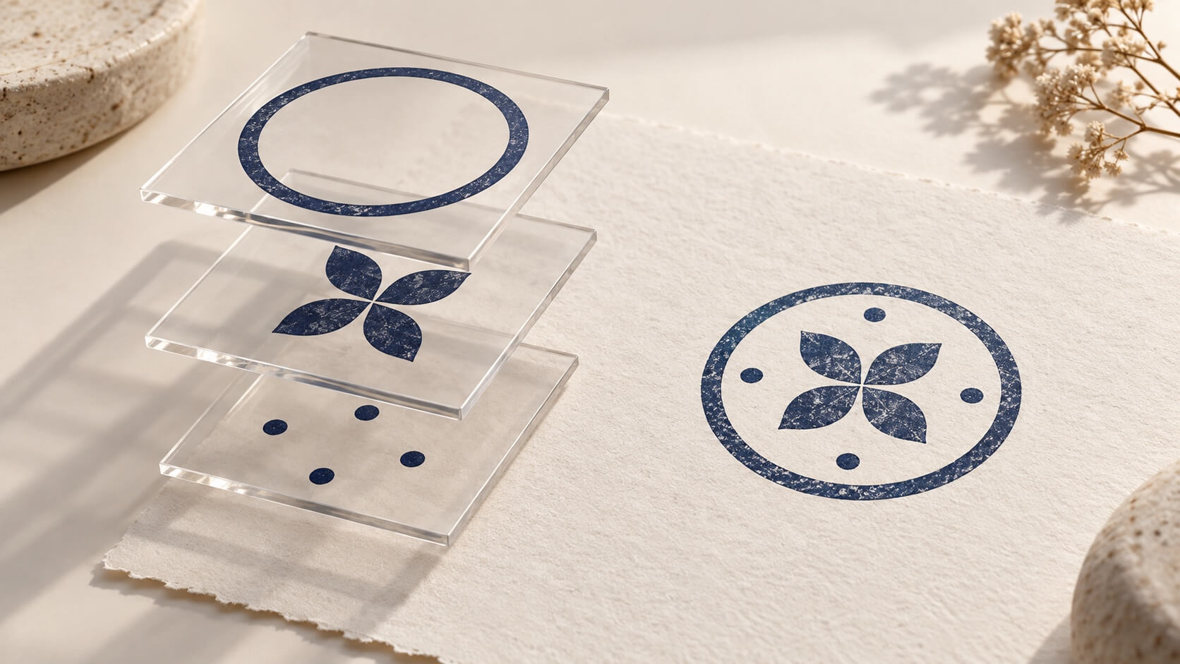
The most revealing test of a stamp maker comes after the design looks finished. Change one word. Replace the center symbol. Move the address from a straight line to an arc. Watch what happens to the parts you did not intend to change.
If the stamp exists only as a flat image, those revisions can become small repair jobs. If the design retains separate text, border and artwork elements, you can work on the relevant component. That is the practical advantage of an editable stamp maker: the design remains understandable when the brief changes.
Stamp Creator Online is built around this kind of element-based editing. Its value is easiest to judge through an ordinary revision exercise rather than a long feature list. The examples below explain what you can evaluate in the browser, what still needs your judgment, and where an exported image differs from the working design.
Give your editable stamp maker a revision brief
Imagine a small workshop preparing a stamp for its paperwork. The first version has a circular border, the workshop name along the top, a simple symbol in the middle and a location underneath. Then the owner requests a longer name, a different center symbol and a version for a narrow document field.
This is an illustrative exercise, not a customer case study. It is useful because each change tests a different property. The longer name tests text editing. The new symbol tests how independent the artwork is. The narrow field tests whether the layout can be adapted without pretending that every shape fits every destination.
Write down what should remain unchanged for each revision. When the name changes, perhaps the ink color and center symbol should stay fixed. When the symbol changes, the wording should remain identical. When the destination changes, the content may stay the same while its arrangement needs to change.
That list turns “easy to use” into something observable. You are checking whether you can find the right object, make the intended adjustment and inspect its effect. A tool does not need to make every decision automatically to be useful; it needs to expose the decisions you actually have to make.
Begin with a modest design. A complicated emblem with imported artwork, several rings and tiny secondary text makes it harder to see which part of the workflow helps. Once the simple revision behaves as expected, apply the same questions to a more demanding design.
Keep a view of the original version for comparison. It gives you a reference for things that should not change. The exercise is about controlled revision, so do not judge success solely by whether the new version looks attractive in isolation.
Include the destination in that brief: for example, a mark that must fit a specific box on an existing form. Use the real form as a separate reference during evaluation. Otherwise you can spend time perfecting a flexible layout that is still too large for the actual job. Editability is valuable when it helps meet a requirement, not simply because a control is available.
Understand what is editable before you import anything
In an element-based stamp design, a text item, a shape and an imported image can be separate objects. Selecting one object gives you controls relevant to it. This is different from treating the complete stamp as a single photograph, even when both versions produce a similar final picture.
There is an important limit: an imported image remains an imported image. If a PNG contains a business name and symbol together, placing it in the editor does not turn the name into a text field. You can work with that object as artwork, but correcting its lettering may require editing the source or rebuilding the text separately.
The same caution applies to file extensions. An SVG can contain paths, text or embedded raster material. Its extension alone does not establish that every visible piece becomes an independent native editor element. Inspect the behavior of the actual imported file before planning a series of revisions around it.
The website's existing templates provide a useful starting point because their design elements can be adjusted in the editor. Their advantage is structural: the border, text and other components have already been arranged into a working composition. Your wording may still demand a different arrangement.
Notice how the selection behaves. Use the canvas or the available element controls to identify the item you mean to change. If objects overlap, confirm the active object before editing a value. This is a small habit that prevents an apparently random change to the wrong ring or text line.
For your own evaluation, try selecting the outer border, one line of text and the center artwork in turn. If a component cannot be selected independently, find out whether it belongs to an imported image or another combined source. That knowledge matters more than how many decorative templates appear on the opening screen.
Change the name and inspect what stays put
Open the Stamp Creator Online editor and use a simple layout with a clear text item. Replace the sample wording with the exact text you need. Then make the text longer by adding a realistic second word or department name. This exposes the practical limits of the available space.
Changing the text should not require painting over the old letters. You are editing the wording that creates them. The surrounding design remains available for separate adjustment, which is particularly useful when a name changes but the overall identity should stay recognizable.
Longer wording is still a design problem. It may crowd a separator, push toward the border or create an awkward rhythm along an arc. The useful question is not whether the editor can ignore geometry. It is whether you can inspect and adjust the relevant text properties without reconstructing the entire stamp.
Read the new wording literally before judging its shape. A layout can look balanced while containing an extra space, missing punctuation or a transposed number. Editing the text as text makes those errors easier to correct, but it does not prevent them automatically.
Compare the changed version with the original. Did the border remain the intended size? Is the center artwork still appropriate? Does the longer wording now make a secondary line too weak? These are consequences to review, not necessarily failures of the editing tool.
If the new name cannot fit comfortably, change the composition rather than continuing to shrink it. A second line, a different placement or a less crowded border may serve the task better. An editable design makes those options available; deciding among them remains part of the work.
The advantage becomes clearer on the next revision. A one-character correction should be a text change followed by a proof check. If your workflow instead requires erasing pixels, matching a font by eye and repairing the background, your source may be too flattened for the kind of work you need to do.
Try a different text arrangement without changing the message
Some revisions concern position rather than wording. A line that works horizontally on a rectangular stamp may need to follow a curve on a circular layout. Conversely, a short curved label may become easier to read as a straight line when the design moves to a narrow field.
The editor includes text placement presets for supported text elements, including straight and curved arrangements. These provide a starting position and structure. They are useful when you want to compare a small number of sensible alternatives without rebuilding the lettering from scratch.
Apply a preset to the intended text item and inspect the complete result. The preset does not know the visual importance of every word or the exact empty space your symbol needs. You may still need to adjust size, spacing or placement after the conversion.
Use the same wording during the comparison. If one option contains a shorter name and another includes a tagline, you cannot tell whether the arrangement or the content made the difference. A controlled comparison changes the layout while keeping the message stable.
Pay attention to the reading direction of a lower arc. A design can look symmetrical while asking readers to tilt their heads or decode an unfamiliar orientation. Judge it as a person receiving the document, not only as the person who has stared at the design for twenty minutes.
When you choose an arrangement, inspect nearby elements again. A move that improves the text may leave an unused gap or crowd a separator. The ability to revise one element independently does not mean the overall composition stops being connected.
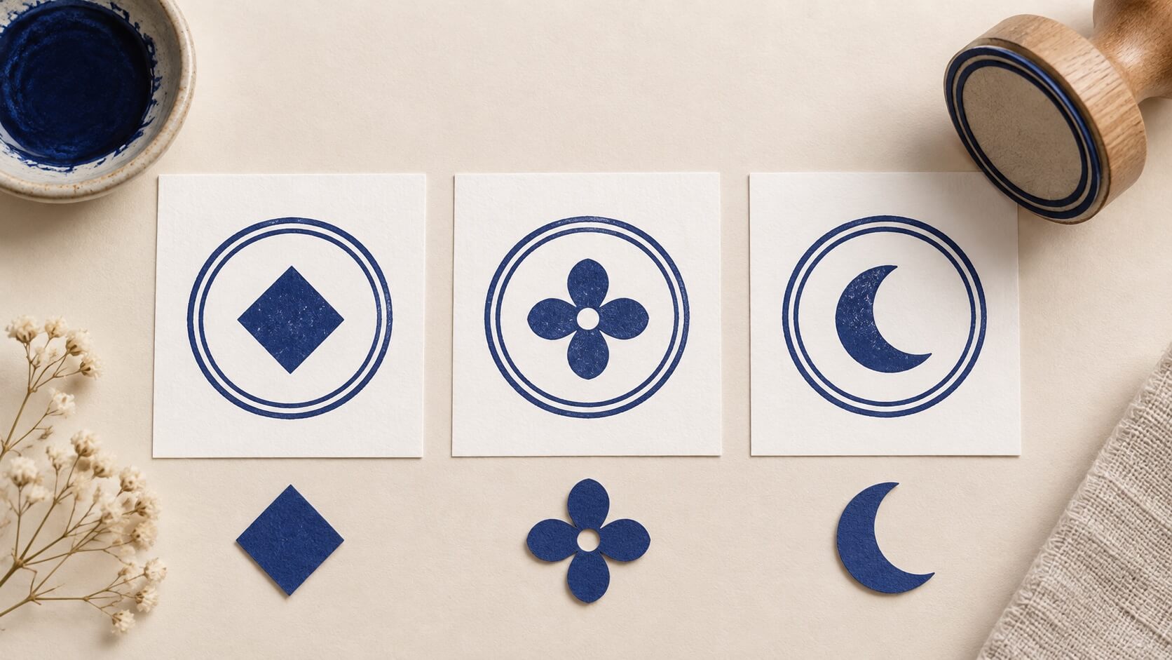
Replace the logo without rebuilding the surrounding stamp
A change of center artwork is a good test of object independence. Keep the approved wording and border, then replace or adjust the artwork in the middle. The website provides an image-upload path for SVG and PNG assets, so you can start with artwork you are permitted to use.
Choose a source appropriate for the task. A high-detail marketing logo may include a tagline, gradients or delicate marks that do not help at stamp size. The editor can position an image, but it cannot make every source suitable simply by reducing it.
Check the visible bounds, not just the image box. An uploaded asset may contain empty margins. Centering that box can leave the actual logo looking displaced. Similarly, two files with identical canvas dimensions may contain very different amounts of visible artwork.
Keep the replacement close to the visual weight of the original while you compare it. A dense black emblem can dominate a layout that worked well with an open symbol. The problem may be the chosen artwork rather than its numerical position.
Now make one small revision to the surrounding text. If that can happen without reopening the logo source, the separation is doing useful work. The border, wording and imported artwork remain distinct parts of the design process instead of becoming a chain of image repairs.
Do not assume that a logo import grants usage rights or establishes brand approval. Use an approved asset and verify any restrictions through the relevant owner or provider. This is especially important when the image came from a third-party library or was supplied by someone outside your organization.
The practical benefit of the website is that these choices can be reviewed in the same stamp composition. It does not remove the need for a suitable logo source, and it does not replace a dedicated illustration tool when the source itself needs substantial redrawing.
Let digital and physical uses share the design, not every effect
A business may want a digital mark for documents and related artwork for a physical stamp. Those uses can share wording, proportions and a symbol while requiring different output choices. A useful editor keeps the core design accessible so you can make those choices deliberately.
For a document image, you may want a modest ink effect or a particular visible color. For a manufacturing handoff, the supplier may prefer clean artwork without decorative wear. Do not assume that the effect which looks convincing on a screen belongs in the printing surface.
Keep the essential design readable before adding visual effects. Then inspect what the effect changes. Does it interrupt an identifying character? Does a textured edge reduce the apparent weight of one side? If an effect makes required information harder to read, reduce it or leave it out of that version.
The website's editing controls are useful for preparing these variations, but an online preview cannot establish how a particular ink transfers onto a particular material. A manufacturer or physical test still has a role. The file is the design handoff, not evidence that a finished rubber stamp has passed a print test.
Use clear variant names when both outputs are needed. A digital document version and a clean supplier version should not be indistinguishable in a folder. Keep a brief note explaining which visual treatment belongs to which destination.
A website advantage worth valuing is continuity: you can work from the same understandable set of design parts while adapting the output. That continuity is weaker if the only retained source is a screenshot of the last preview. Confirm the saving method you intend to rely on before closing the work.
Distinguish the working design from the exported file
The working design and its exported image are different objects. A PNG is useful for many document workflows, but it does not retain the editor's text controls. A vector export can be useful for other destinations, but it should not be assumed to preserve every application-specific editing feature.
Stamp Creator Online provides raster and vector export options through its download choices. Select the option required by the destination and the access available to you. Do not choose a package simply because it contains the greatest number of file types.
Open a downloaded file in the application that will receive it. Check dimensions, visible content and background behavior. A successful download confirms delivery of a file; it does not establish that a particular document program or supplier will interpret every feature as intended.
If you need to revise the design later, retain an editable source through the available saving workflow as well as the exported output. The site includes local working-state and account-library mechanisms, but their presence should not be treated as a promise that any session can be recovered on any device under every account condition.
Test the saving workflow you actually use. Reopen the saved item and confirm that the wording and relevant elements can still be changed. A thumbnail alone proves that a preview was stored, not that you have checked the working state you need.
For a supplier handoff, ask for the requested format before paying for an output that may not suit the job. For daily documents, test a sample in the receiving software. This keeps the export decision connected to a real use rather than an abstract argument about which extension is best.
Evaluate the cost at the point where you need the output
Design access and final-file access are different questions. Being able to explore a layout does not mean every finished format is available under the same conditions. Review the site's current stamp download and access options when you know which output you need.
A one-time job and repeated design work may justify different choices. The practical comparison includes the required file format, the number of planned projects and the ability to return to editable work. Avoid guessing from a remembered price or a promotional screenshot.
For the revision exercise, note the point at which a payment or account requirement appears. Does it affect the output you need, the ability to save, or another feature? Understanding that boundary before a deadline is more useful than discovering it after you have sent the final proof for approval.
Do not count hypothetical time savings as proven money saved. Instead, observe your own task: how many elements required attention, which changes were straightforward and where you needed another tool. Those observations provide a grounded basis for choosing the service.
If a purchase or an existing order behaves differently from what you expect, resolve the account-specific question through the site's support process. Recreating the design repeatedly is unlikely to clarify an access issue, and it can leave several slightly different versions in circulation.
The website's advantage is strongest when its editing structure and available outputs match a real recurring need. A person who only needs to preserve one historical impression may reasonably prefer a scan. A person who frequently updates stamp wording has more to gain from keeping the design editable.
Decide with three changes you can explain
Finish the evaluation with the same three changes from the opening brief: replace a name, change its arrangement, and swap the center artwork. For each, state what changed and what remained under control. A short record is enough; you are deciding whether the editor fits your work, not conducting a software benchmark.
For the wording change, success means the correct characters appear and the resulting layout is readable. For the arrangement change, it means you can compare the intended structures without losing the message. For the artwork change, it means the surrounding text and border remain available for separate adjustment.
Then note any limit you encountered. Perhaps the imported logo was too detailed. Perhaps the longer name needs a different composition. Perhaps a supplier requires a file check outside the editor. A useful evaluation includes those facts alongside the features that worked.
Stamp Creator Online is a good candidate when you want browser-based control over the parts of a stamp and a clear path toward a suitable export. Its editable structure matters most when the design changes. Take a layout that resembles your actual job, make one realistic revision, and judge the result at the size and destination where someone will use it.