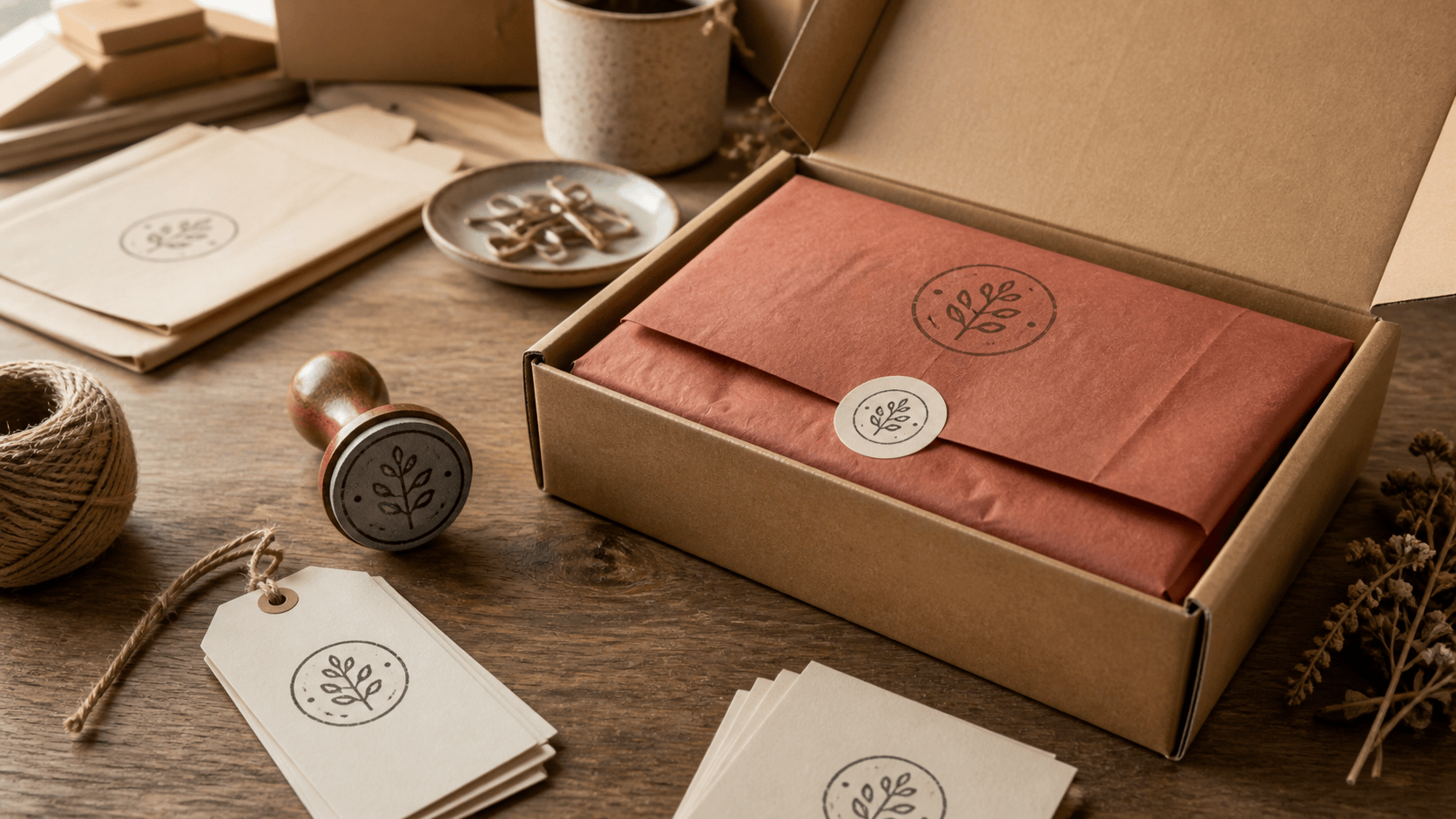
A packaging stamp has a deceptively simple job: make a plain surface feel intentional. The difficulty appears when that surface changes. A mark that looks balanced on the lid of a mailer can overwhelm a narrow hang tag, while the same fine lines may break up on soft tissue. Trying to force one untouched design onto every material usually produces a weak compromise.
A better approach is to build a small, related stamp system. Start with one recognizable idea, then prepare only the size and detail variants the packaging actually needs. The box can carry the fullest version. Tissue may need a bolder, more open form. A small tag might keep the name and remove the outer wording. These are not three unrelated logos; they are practical versions of one visual voice.
This guide works from the package inward. It helps you decide what the stamp must communicate, organize the wording, choose useful sizes, proof the artwork on real materials, and save a clean set of production files. You do not need to fill every empty area. Good packaging often feels confident because it knows what to leave alone.
Start with the complete packaging system
Put every item that may receive the stamp on one table: outer box, paper bag, tissue, belly band, hang tag, insert card, receipt envelope, sticker sheet, or shipping carton. If some items are not available yet, cut plain paper to their expected dimensions. Seeing the surfaces together stops the largest item from dictating every decision.
Write the purpose beside each surface. The outer package may need quick brand recognition from a few feet away. Tissue usually creates a pattern or a small reveal when the customer opens the box. A tag may carry product information on one side and the brand mark on the other. An insert card may already contain printed copy, leaving the stamp as a quiet sign-off rather than the main headline.
Mark the usable stamping area, not just the overall dimensions. A box lid may have a crease, tape line, label, or shipping mark. A tag needs room for a hole and string. Tissue folds unpredictably, so the design should not depend on an exact edge. This simple map shows where a stamp can live without fighting functional details.
Now remove low-value placements. A stamp does not have to appear on every component. Repeating it on the box, tissue, card, and tag at the same scale can feel mechanical. Choose the moments that matter: perhaps one strong box impression and one smaller mark inside. Restraint saves production time and gives each impression more presence.
Choose one primary job for the stamp
A packaging stamp can identify the maker, add care instructions, close a parcel, mark a product line, or create decorative texture. Pick one primary job before arranging the artwork. When one small stamp tries to perform all five, the type shrinks and the customer has to work too hard to understand it.
For an identity stamp, the name or distinctive symbol should win immediately. Supporting wording might be a short location, product category, or founding year, but it should remain clearly secondary. For an instruction stamp, the action comes first. A decorative pattern can be more abstract because it does not carry essential information. The role determines the hierarchy.
Use the one-second test. Show a rough layout briefly, hide it, and ask what was remembered. If the answer is a border, a star, or an unreadable cluster rather than the name, the visual priority is wrong. This test is useful because packaging is handled quickly. The mark needs to register while someone opens, stacks, photographs, or recycles the package.
Keep changing details out of the main identity stamp. Product flavors, batch notes, dates, and care instructions often deserve separate small stamps or handwriting areas. The core brand mark should remain useful when the inventory changes. A stable identity paired with flexible operational marks is easier to manage than a new combined stamp for every variation.
Build a clear information hierarchy
List the exact words in order of importance. Most packaging stamps need surprisingly little: a business name, a concise descriptor, and perhaps a location or year. Contact details, long slogans, registration information, and social handles may already exist on a printed label or card. Repeating them in a small impression adds density without adding much value.
Choose a structure that naturally fits the wording. Short names can sit confidently in a circle or square. A long name often works better in a horizontal rectangle. An emblem with a small line beneath it needs open space more than an elaborate border. Browse the editable stamp templates for structural ideas, then judge each option with your real wording rather than the sample text.
Set the first reading level with size, not decoration. The name can be larger, heavier, or placed in the clearest position. Supporting text should be readable but quieter. Avoid using bold type, all caps, dividers, ornaments, and double borders at once. When every element demands attention, none of them establishes order.
Read the layout from the least favorable angle. Tags twist, boxes turn, and tissue crumples. If the name can only be understood while perfectly upright, the design may be too delicate for packaging. A simple centered wordmark or compact emblem often tolerates rotation better than several lines with a strict top and bottom.
Create a size family instead of shrinking one file
Begin with the largest real placement, not the largest stamp you can buy. Measure the box panel and leave comfortable breathing room around the proposed mark. A stamp that nearly touches every edge looks accidental when its position shifts slightly. A smaller mark with a deliberate margin usually appears more considered.
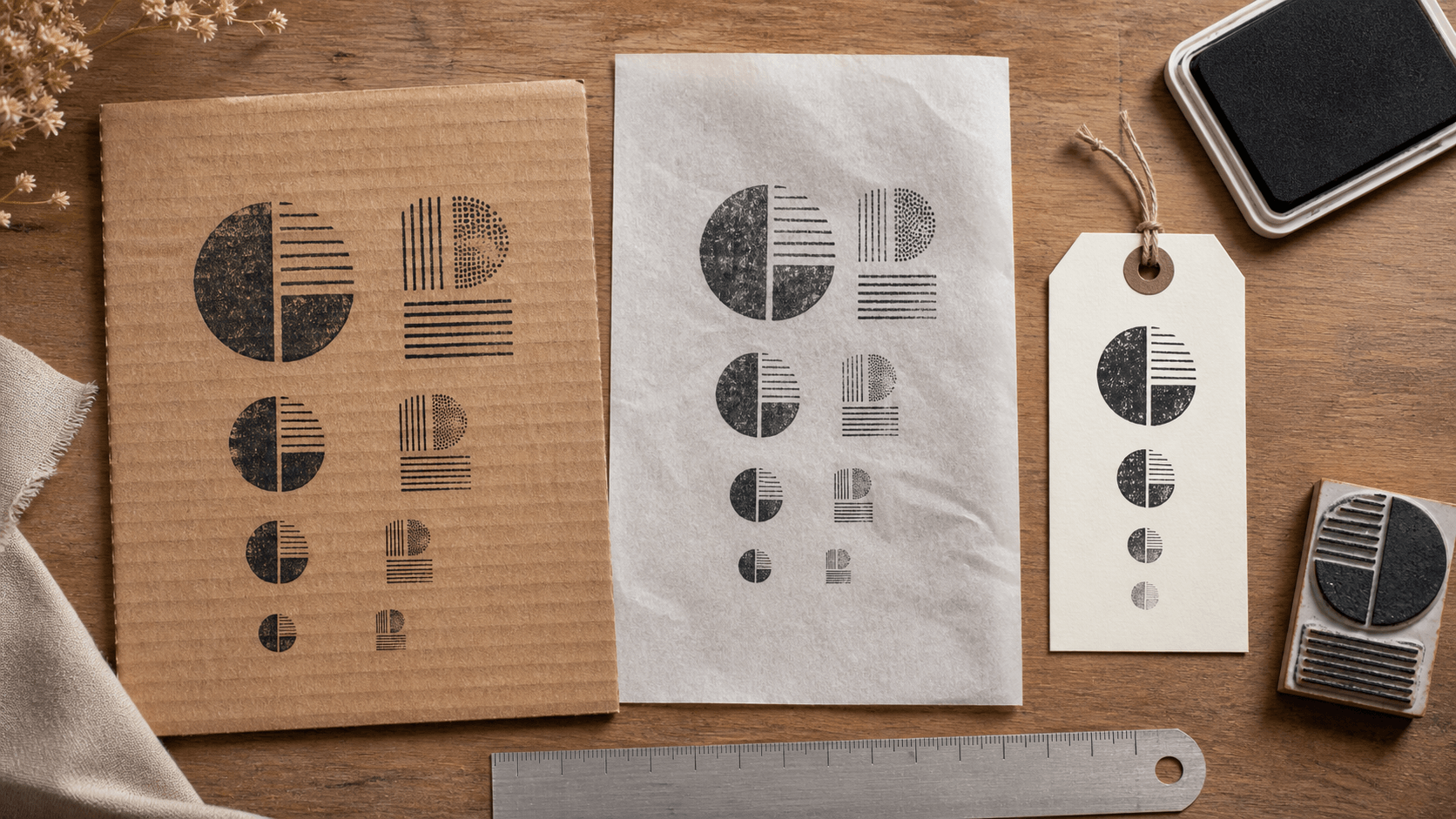
Next, print the same artwork at several sizes on ordinary paper. Do not rely on zoom. Cut out the proofs and place them on the package. The screen makes thin type and tiny gaps look more generous than they are. Actual-size paper quickly reveals whether the outer ring dominates or the supporting line has become visual noise.
When the small proof stops working, edit rather than continue shrinking. Remove a border, shorten the descriptor, enlarge internal gaps, and strengthen fragile strokes. The small version may contain only the symbol and name. It should still feel related to the larger version through shape, type character, and overall weight.
Limit the family to versions with a real purpose. For many small businesses, one main stamp and one compact stamp are enough. A third version is useful only when a surface has genuinely different constraints. Too many near-identical sizes create ordering mistakes and make it hard to remember which artwork was approved.
Simplify artwork for one-color impressions
Packaging stamps work best when the design makes sense as solid ink and open material. Gradients, faint shadows, photographic detail, and subtle color differences do not translate into a normal one-color impression. Convert the idea mentally into dark shapes and empty shapes. If an important boundary disappears, the artwork needs a clearer separation.
Inspect the smallest enclosed spaces: the center of an e, the gap inside an emblem, the distance between a border and curved text. These areas can close when ink spreads or pressure increases. Opening them slightly may look exaggerated on a large monitor, yet correct at the real stamp size.
Thin lines deserve the same attention. A hairline botanical drawing or intricate texture can break across corrugated board and soft paper. Strengthen the lines that carry the silhouette and remove marks that merely decorate the interior. The goal is not to make the design crude; it is to decide which details truly define it.
Keep a clean master even if the brand prefers a distressed appearance. Paper texture, uneven pressure, and repeated use already create natural variation. Artificial wear baked into the artwork can combine with those effects and erase more than expected. Add distress only when it is a deliberate part of the identity, and proof it at final size.
Proof on the real materials
Different packaging materials change the impression. Smooth uncoated card accepts edges differently from rough kraft board. Tissue flexes and may show through. Coated surfaces can resist the chosen ink or require more drying time. The artwork alone cannot answer these questions, so test with the actual combination of stamp, ink, material, and handling routine.
Make a small proof grid. On each material, try normal pressure, slightly lighter pressure, and the pressure you expect during a busy packing session. You are not searching for a perfect hero impression; you are checking how forgiving the design is. A useful packaging stamp should remain recognizable when the operator is working at a normal pace.
Look for patterns in the failures. If the center consistently fills, open the design rather than training everyone to press unnaturally lightly. If one edge disappears, the package may not provide a flat support beneath the stamping area. If tissue tears or smears, a different placement, backing surface, or process may be more important than an artwork revision.
Allow every sample to dry under realistic conditions. Stack it, fold it, rub it lightly, and place it next to printed packaging elements. Confirm ink suitability and drying guidance with the material or ink supplier before production. A beautiful first impression is not enough if it transfers to the product or the customer's hands.
Plan position and repetition before packing day
Decide whether placement should be exact, approximate, or intentionally varied. A formal box lid may benefit from a simple corner guide. Tissue patterns can look better with loose spacing and rotation. A tag needs a clear zone away from its hole. Writing the rule down prevents each packer from inventing a different composition.
For a precise placement, build a low-tech jig from scrap board. Cut or mark an L-shaped corner that locates the package and another edge that locates the stamp mount. Test the guide with waste packaging first. The aim is repeatability, not machine-level perfection. Slight movement still feels human when the overall position is controlled.
For a repeated tissue pattern, test the full sheet rather than a single impression. Vary the rotation within a narrow range and leave more space than seems necessary around the first mark. After folding, the pattern becomes denser. A small number of well-spaced impressions often looks richer than a field packed with overlapping logos.
If you need to revise the artwork or create the compact variant, keep both versions in the same stamp-making workspace while comparing actual-size proofs. The relationship is easier to judge when the master elements, colors, and proportions can be reviewed together.
Prepare clean files for production and reuse
Save an editable master with separate text, border, and symbol elements. Convert or outline type only in the production copy if the maker requests it; keep a version in which spelling and spacing can still be corrected. Name the files by purpose and size, such as Packaging Main 45 mm and Packaging Compact 25 mm.
Include only the artwork intended for the plate. Remove proof notes, measurement lines, paper mockups, alternate colors, and hidden experiments. Set the final artboard or canvas to the correct proportions and keep the background transparent when the production workflow requires it. Ask the stamp producer which file type, dimensions, and line specifications they prefer.
Export a proof sheet as well as the production artwork. Show each version at actual size, identify its intended use, and include the key dimensions outside the art. This gives the producer and the person approving the order a common reference. It also helps you recognize the physical stamps when they arrive.
Archive rejected concepts away from the approved folder. A directory full of files named final, final-new, and final-2 is an invitation to order the wrong version. Keep one approved master, one production delivery set, and a dated proof. If the wording changes later, retire the old set clearly rather than overwriting it without a record.
Turn the stamp into a packing routine
Decide where stamping happens in the sequence. Flat boxes are usually easier to stamp before assembly. Tags can be prepared in batches. Tissue may be stamped and dried before it reaches the wrapping station. Moving the step earlier often improves consistency and prevents wet ink from contacting finished products.
Store the stamp, approved ink, cleaning materials, positioning guide, and a current proof together. A packer should not have to guess which blue pad belongs with which material. Add a small physical sample showing acceptable variation. It communicates more clearly than a paragraph about pressure.
Review the first production batch under normal lighting. Check several pieces, not only the neatest one. If the same problem repeats, adjust the artwork, support surface, placement guide, or workflow. Do not blame normal human variation for a design that only succeeds under perfect conditions.
Clean and store the stamp according to its material and ink system, and replace proof samples when packaging changes. New board, recycled content, coating, or supplier stock can affect the result. Treat the stamp as one part of the packaging process, not as a decoration that exists independently of the materials.
Use a short approval checklist
- The stamp has one clear primary job.
- The business name or symbol is recognizable in one second.
- Every word has been checked against the approved source.
- The main and compact versions share the same visual character.
- Small counters and gaps remain open at actual size.
- Lines are strong enough for the roughest intended material.
- Proofs have been made on the real box, tissue, and tag stock.
- Ink behavior and drying have been checked before packing products.
- Placement rules are simple enough for a normal working pace.
- The approved files and physical tools are clearly identified.
The strongest packaging stamp is rarely the most detailed one. It is the mark that survives a rough box, a soft sheet of tissue, a hurried packing session, and a change in scale without losing its identity. Build the system around real materials, edit the small version instead of merely shrinking it, and keep the production routine as deliberate as the design.