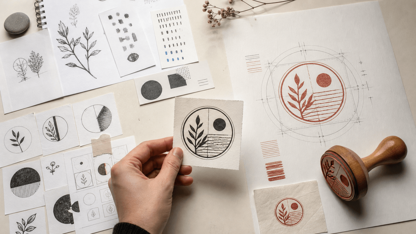
A stamp looks simple when it is finished. A border, a few lines of type, perhaps a small symbol, and one ink color seem to leave little room for technological upheaval. The work behind that compact object tells a different story. Someone still has to decide what the stamp should say, what it must not imply, how it should reproduce at its final size, and whether every small space will survive repeated impressions. Artificial intelligence can accelerate parts of that process, but it does not remove those decisions.
The most useful way to understand AI's effect on a stamp maker is to stop asking whether it can “design a stamp” and look at the individual jobs inside the workflow. It can help a person get past a blank page, compare visual directions, describe a style, or clean up a rough source image. It is much less dependable when the job calls for exact spelling, controlled geometry, a known physical diameter, sensible line weight, or proof that a mark is appropriate to use. The result is not a fully automated craft. It is a rearranged one, with more possibilities at the beginning and an even greater need for judgment at the end.
1. AI changes the blank page, not the responsibility
The first visible change is speed at the concept stage. A small business owner who once collected references for an afternoon can now describe a mood and see several rough visual directions in minutes. A designer can ask for a monogram that feels restrained rather than ornate, a border inspired by a particular period, or a group of simple icons connected to a trade. These results are useful because they make vague preferences easier to discuss. “I like the weight of this one, but not the leaves” is a better starting point than “make it look established.”
That speed is easy to overvalue. The person commissioning the stamp still owns the brief. They must know the exact wording, the purpose of the impression, where it will be used, and what an acceptable result looks like. A tool may produce twenty attractive variations without knowing that the company suffix cannot be omitted, that the date needs room to change, or that the mark will be stamped onto coarse recycled board. Quantity does not settle any of those questions.
This is why AI works best as a visual conversation partner, not an anonymous decision maker. Its output can expose choices that were hidden in a verbal brief: compact or airy, formal or friendly, geometric or hand drawn. A human then has to name the useful qualities and carry them forward deliberately. Without that step, a team can spend more time browsing plausible options than it once spent sketching three purposeful ones.
2. Templates become more valuable when ideas multiply
Generative tools are good at producing difference. A single instruction can return circular seals, rectangular address marks, loose emblems, vintage crests, and designs that do not fit any familiar stamp structure. That variety helps during exploration, but it also makes comparison difficult. If every option changes the border, type arrangement, symbol, and proportion at once, nobody can tell which choice actually improved the design.
A template supplies a control. Instead of treating it as a finished answer, use it as a known piece of architecture: a ring with outer text, a centered line of information, or a simple badge with a clear hierarchy. The team can hold that structure steady while comparing two symbols or two typographic moods. The collection of editable stamp templates is useful at this point because it turns free-form inspiration into a layout that can be inspected one element at a time.
This matters more in an AI-assisted workflow than it did before. When new directions are nearly free to request, constraints keep the project from expanding indefinitely. A template answers mundane but essential questions: Where does the primary name sit? How much room is available for secondary wording? Is the border decorative or functional? Which element should remain legible when the whole design is reduced?
There is no need to force an unusual identity into a generic frame. The point is to separate invention from construction. An AI image can inspire a flower, animal, monogram, or border rhythm. A template can then provide the stable system around it. The result is easier to edit, easier to compare, and far less likely to depend on a lucky image that cannot be reproduced consistently.
3. The polished preview can hide bad construction
A generated image is judged first as an image. It may have convincing ink texture, tiny scratches, soft paper, and the slight irregularity people associate with an old impression. Those qualities can make a concept feel finished before the underlying design has been examined. Zoom in and the illusion often breaks: a ring changes thickness, two letters touch, an ornament fades into the background, or a line terminates in an accidental blob.
For a digital mood board, those faults may not matter. For a stamp, they are construction problems. The texture in a preview is not the same thing as a clean shape that can produce texture naturally when ink meets paper. Artificial distress can be especially misleading. Hundreds of tiny white flecks may look authentic on screen but become weak islands, clogged pockets, or meaningless noise in a physical impression. A stamp maker needs a strong base design before deciding whether any controlled wear belongs in it.
Text deserves separate suspicion. Image generators can render letter-like forms that feel correct during a quick glance while spelling a name incorrectly or inventing characters. Even when the words appear right, their baseline, spacing, and stroke weight may change unpredictably around a circle. Business names, registration details, addresses, and formal wording should be typed and checked in an editor, not accepted from pixels in a generated composition.
The practical rule is simple: treat a generated preview as a reference, never as proof of construction. Ask what the design would look like with all texture removed and every shape filled solid black. If the hierarchy disappears, the concept needs work before any discussion of export format or production.
4. A better brief gives AI a smaller, more useful job
Loose prompts tend to produce loose projects. “Make a professional company stamp” asks a model to invent the audience, tone, structure, symbol, and definition of professional. The output can be pleasant, but it provides little evidence that it suits the real task. A working brief should be decided before any generation begins.
Start with facts that should not change: intended use, final shape, approximate physical size, exact wording, number of ink colors, surface, and any elements that must be excluded. Then identify the one decision for which exploration would help. It might be the relationship between two initials, a simple icon for a bakery, or three ways to make a border feel informal without becoming childish. That is a manageable assignment for an image tool.
It also helps to describe reproduction constraints in plain visual language. Ask for one-color artwork, bold connected shapes, open negative space, minimal interior detail, and no mockup texture. Those phrases do not guarantee usable art, because the model is still creating an image rather than engineering a stamping surface. They do, however, reduce the number of concepts that fail for obvious reasons.
Keep exact text outside the generative step whenever possible. Use a neutral placeholder in the concept phase, then rebuild the real wording in a controlled text layer. This keeps spelling and punctuation reviewable. It also prevents an attractive but malformed word from becoming so familiar that nobody notices it is wrong.
A narrow brief may return fewer dramatic surprises, and that is often a benefit. The purpose is not to see how imaginative a model can be. It is to obtain material that helps a person make one specific design decision.
5. Selection is now a design skill of its own
When generating options is fast, choosing well becomes the bottleneck. People are naturally drawn to the most detailed or immediately atmospheric image. A stamp usually rewards the opposite qualities: a clear silhouette, a recognizable focal point, deliberate negative space, and a hierarchy that remains obvious when the mark is small.
A useful review starts by hiding the prompt and judging each option against the brief. Does the concept fit the intended use, or does it merely match the requested style? Can its main idea be described in one sentence? Is there one element worth carrying forward, or is its appeal tied to lighting, paper texture, and presentation? If a concept only works as a polished mockup, it is not yet a stamp design.
Reduce the field quickly. Pick no more than two or three directions for closer study, and write down why each survived. One might have the best monogram structure, another the clearest balance between name and symbol. This record prevents the review from sliding back into endless preference changes. It also gives a designer a precise instruction when the final artwork is rebuilt: retain the interlocking initials from option B, not the entire option.
It is reasonable to reject all the generated directions. AI exploration is not valuable because one of its outputs must be used. Sometimes the exercise reveals that a simple typographic stamp is more credible than an illustrated badge, or that the original hand sketch already contained the strongest idea. A rejected batch can still clarify the decision.
6. Move the chosen idea into a controlled stamp maker
Once a direction has been chosen, the workflow should change character. Exploration gives way to construction. This is where a structured online stamp maker earns its place: the border, text, symbol, spacing, and overall dimensions can become separate, editable decisions instead of one flattened picture.
Do not mistake importing an AI image for rebuilding it. The useful part of a generated concept may be its general silhouette or the relationship between two forms. Trace or redraw that idea with as few purposeful shapes as possible. Recreate the wording in real text layers. Make the border geometrically consistent. Center elements by measurement and then adjust optically where necessary. If a decorative form cannot be simplified without losing its identity, it may be the wrong form for this application.
Layered editing creates accountability. A reviewer can check the company name without being distracted by the icon. The physical size can change without stretching everything unpredictably. The symbol can be removed to test whether the typography stands on its own. Color can be reduced to a true one-color proof. These are ordinary controls, but they are exactly what a generated composite lacks.
This step also protects useful originality. A person can combine a selected idea with their own lettering choices, proportions, corrections, and drawing rather than preserving all the arbitrary details of a generated frame. The work becomes a designed artifact with a documented chain of decisions. That is more valuable than a file whose only instruction is “use version seven.”
7. Human review has to cover meaning as well as appearance
A stamp is often used repeatedly and may be seen without surrounding explanation. Reviewers therefore need to ask what the mark communicates, not only whether it looks good. A round border and central emblem can resemble an official seal even when the owner intended a casual packaging mark. A laurel, crown, shield, or institutional phrase may carry associations the model did not understand and the user did not request.
Check every word and symbol against the actual purpose. Avoid government insignia, protected marks, copied brand elements, or claims of certification that the organization is not authorized to make. If the stamp is for internal approval, define who is allowed to use it. If it is decorative, make sure the wording does not imply legal validity. AI makes visual conventions easy to imitate, which is precisely why contextual review matters.
Ownership and permitted use also require care. Terms differ between tools, and intellectual-property rules differ between jurisdictions. Keep a record of the source material, the tool used for exploration, the date, the selected output, and the human edits that followed. Do not place confidential client information or an unreleased mark into a system until its data terms have been checked. For a commercially important identity, appropriate trademark or legal advice may be warranted.
None of this calls for panic around AI. The same questions apply when using stock art, a freelancer's sketch, or an archive reference. The change is scale: generative tools can produce plausible material so quickly that provenance and permission are easier to overlook.
8. Proofing at actual size remains stubbornly physical
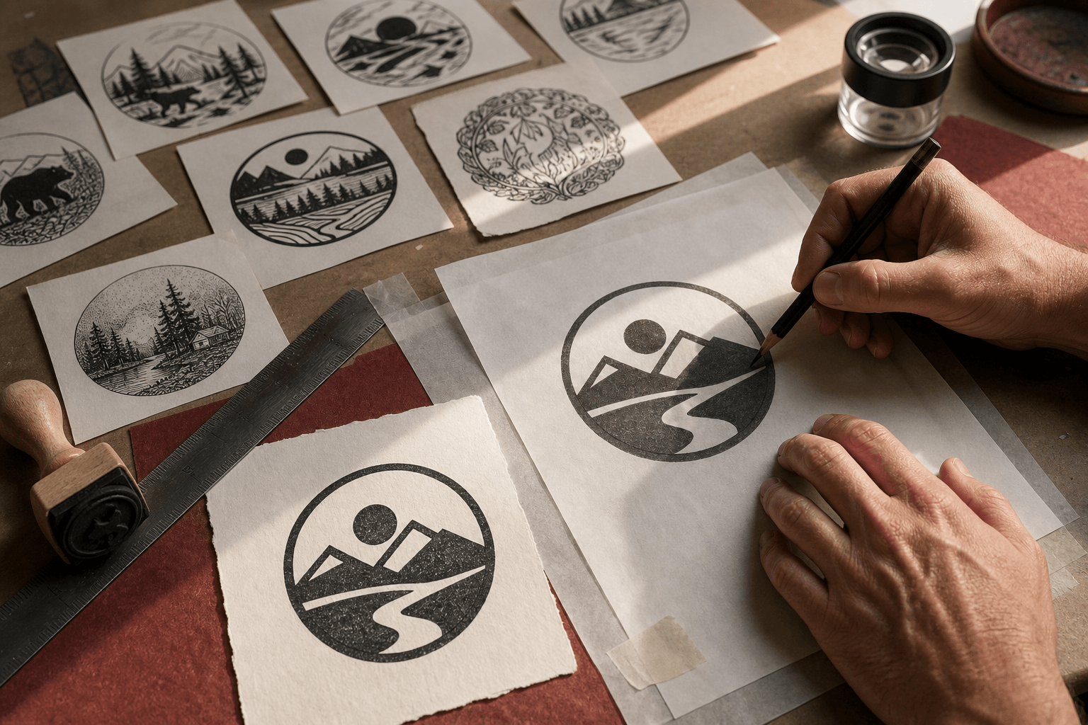
A large monitor forgives detail. A stamp impression does not. The final review should include a solid one-color proof at the intended physical dimensions, printed at 100 percent rather than fitted automatically to a page. Hold it at normal reading distance. Stamp-sized type that looked elegant while zoomed to 400 percent may now feel cramped; a subtle gap may close; a fine inner border may compete with the business name.
Test more than legibility. Look for balance after reduction. Does the darkest area pull the design to one side? Are open spaces distributed deliberately, or is one region clogged while another feels empty? Do adjacent lines have enough separation to remain distinct? Turn the proof upside down or view it in a mirror to make visual weight easier to see without reading the words.
If the design will become a physical rubber stamp, the manufacturer is the authority on its equipment, material, minimum line weight, minimum gap, and supported file formats. Those requirements vary. A clean vector file is useful, but the word “vector” is not a promise that every path can be manufactured. Ask for the current specifications and revise the art accordingly.
When possible, make a rough impression test or order a proof before committing to a large production run. Ink, paper coating, pressure, rubber, and user technique all affect the result. AI can simulate an ink impression beautifully, but a simulation cannot reveal how the chosen design behaves on the actual surface.
9. The fastest workflow has clear stop points
AI-assisted projects become slow when nobody declares a stage complete. Establish simple gates. The brief is complete when the exact wording, use, size range, and exclusions are approved. Exploration is complete when one direction and its useful characteristics are named. Construction is complete when the selected idea has been rebuilt in editable parts. Review is complete when wording, permissions, geometry, and actual-size proof have named approvals.
At each gate, discard what is no longer relevant. Hundreds of unused generations do not need to remain in the working folder. Keep enough of a record to explain the chosen direction and its provenance, but separate that archive from the active artwork. Name the master file clearly and distinguish it from export copies. Otherwise, the extra volume created by AI turns into version confusion.
It helps to assign roles even on a small project. One person may own the wording, another the design, and a final approver the business use. If one person performs all three roles, they can still review them at separate times. Reading the text aloud after a break catches different errors than adjusting spacing while zoomed in.
These gates make the real speed gain visible. The benefit is not the number of images produced per hour. It is the ability to reach a sound direction with fewer expensive reversals after artwork has been finalized or a stamp has been manufactured.
10. Some stamp projects do not need AI at all
An address stamp with four lines of exact text is primarily a typesetting task. A received-date mark with a prescribed format is a layout task. A faithful reproduction of an existing authorized logo is an artwork-preparation task. Adding generative exploration to any of these may create more review than value.
AI is most useful when a genuine visual question is open. It can help an owner compare emblem directions, explore how two initials might interact, or find words for a mood that is difficult to brief. If the answer is already known, go directly to construction. A disciplined workflow does not use a tool merely because it is available.
There are also projects in which source control is unusually important: confidential launches, regulated marks, official seals, security-sensitive internal stamps, or identities involved in a rights dispute. The appropriate choice may be a closed approved system, a traditional design process, or no generative step. The decision depends on the organization's policies and the terms of the tool, not on a general claim that AI is always safe or always unsafe.
Knowing when to skip generation is part of AI literacy. It keeps routine stamp work routine and reserves exploration for the moments when it can sharpen a decision.
11. The stamp maker's role becomes more explicit
AI does not make the compact constraints of a stamp disappear. It makes them easier to neglect because the first preview arrives so convincingly. The strongest practitioners will be the ones who can move between two modes: open exploration when the project needs ideas, and exact construction when the object needs to work.
That combination changes what clients should value. Generating options is no longer the scarce part. A clear brief, a critical eye, controlled typography, meaningful simplification, rights awareness, production knowledge, and careful proofing are. These skills turn a promising picture into a repeatable mark.
For a small business, the practical starting point is modest. Define the job in writing. Use AI only for the unresolved visual question. Select one idea for stated reasons. Rebuild it with editable elements, verify the language and permission, and inspect a one-color proof at real size. Keep the approved master and a short source record.
The future of the stamp maker is not a button that turns a sentence into a flawless stamp. It is a more fluid path from language to visual options, followed by the same demanding question the craft has always asked: will this exact mark say the right thing and make a clear impression, again and again?