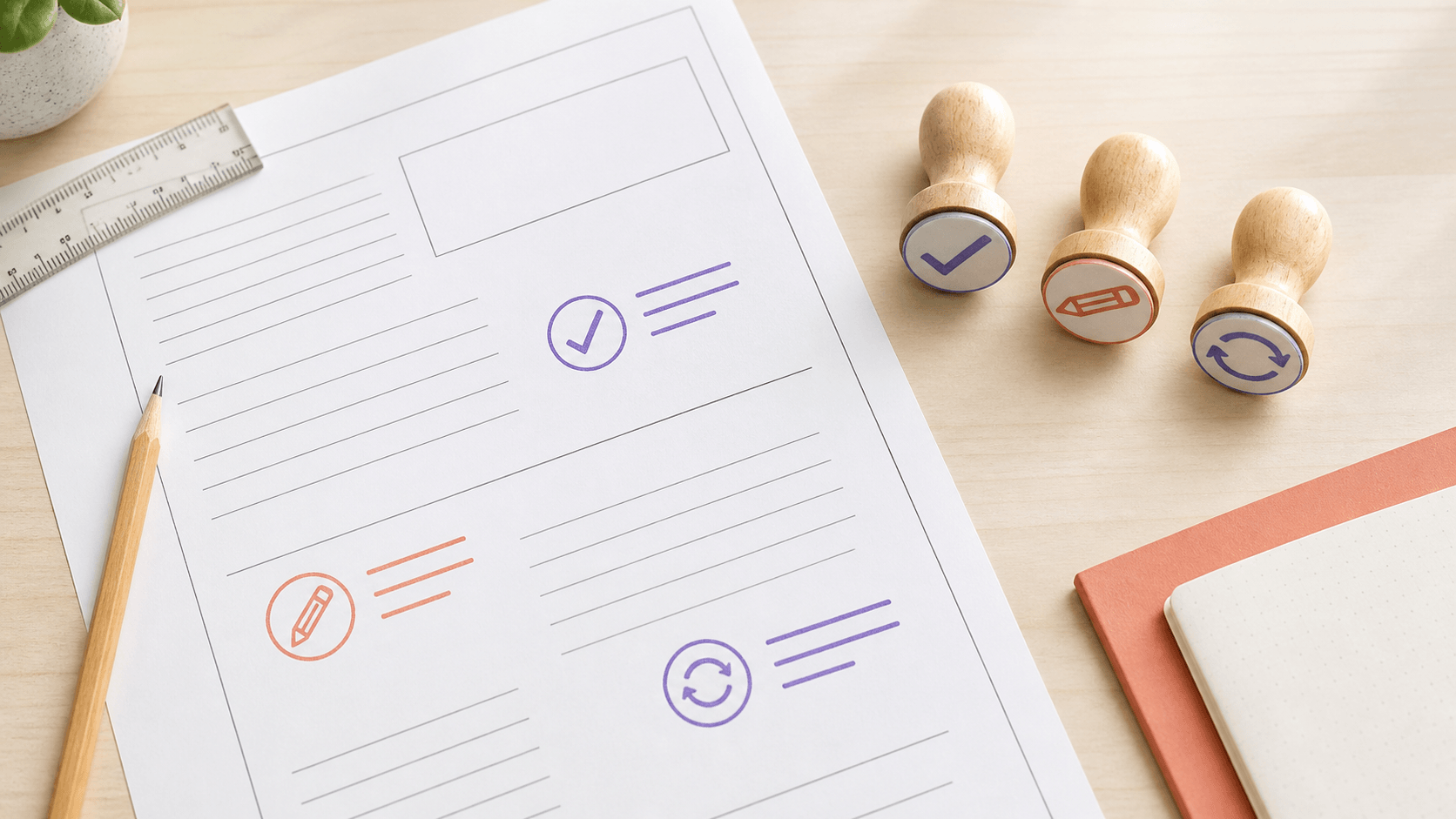
The fastest classroom stamp is not necessarily the shortest one. A tiny “Great work” may feel positive but offer no direction, while a packed circle with stars, a subject name, a teacher name, and three instructions can take longer to decode than a handwritten note. The mark succeeds when a student understands it quickly and can act on it. A teacher stamp maker online free editing stage gives you room to test that wording and hierarchy before choosing any export or physical stamp.
This guide treats classroom stamps as a small feedback system rather than a collection of cute graphics. You will choose one action per mark, make the language readable, create a consistent family, and test it on representative worksheets. It does not claim that a stamp improves learning by itself. The value comes from clear wording used within the teacher's broader feedback practice.
Start with a repeated classroom moment
List the comments you write often. “Check punctuation,” “Show your working,” “Add evidence,” “Read again,” and “Please correct” all point to different next actions. Group similar comments, then choose the ones that are frequent, short, and useful without a long explanation.
Do not begin with praise and correction as the only categories. A useful stamp can identify a process: review, explain, calculate, label, cite, or ask. Action-led language helps the mark stay specific. Praise can be part of the system, but it should name what was successful when space permits.
Choose one classroom moment for the first design. A stamp for early-draft writing can invite revision. A mathematics stamp can request shown work. A reading log mark can acknowledge completion. Trying to cover every subject in one design produces generic language and weakens the reason to use it.
Observe the moment before finalizing the phrase. Where would the mark sit? How much handwriting normally surrounds it? Does the student receive the paper during independent work, a conference, or a later review? A phrase that is clear during a conversation may be vague when the page returns the next day. Design for the situation in which the student actually encounters the feedback.
Write the shortest complete instruction
Short wording is not the same as clipped wording. “Evidence?” is compact but may feel ambiguous. “Add one piece of evidence” gives a clearer next step. “Redo” may sound abrupt, while “Try this step again” identifies the task without labeling the student.
Read each phrase aloud. Remove setup words that do not change the action. Keep the verb near the beginning. If the instruction needs a condition or explanation, the stamp may act as a heading beside a handwritten note rather than carrying the entire message.
Avoid small print that changes the meaning, such as a tiny “not” or exception. Essential words belong at the main reading size. Check the tone against the age group, classroom expectations, and school guidance. The same phrase can feel encouraging in one context and confusing in another.
Separate feedback from grading
A feedback stamp can point to a next step without representing a grade. Keep scores, levels, dates, and administrative codes out of a general feedback mark unless they are truly part of the intended workflow. Mixing an action phrase with a grade-like symbol may lead students to focus on the symbol rather than the instruction.
If the classroom uses a defined marking policy, make sure the stamp language fits it. A decorative online design should not replace required records, accommodations, or communication. It is a visual tool within the system, not the system itself.
Use blank space when a short handwritten detail is needed. A “Check line ___” stamp can be more flexible than a crowded list of possible errors. Make the blank long enough to write in at the size and with the pen you normally use.
Decide how the stamp relates to any rubric or comment code already in use. Duplicating a code with different wording creates two systems for the same action. If the stamp is meant to point toward a rubric row, use the exact classroom language students already know. Consistent words reduce the amount of interpretation required before revision can begin.
Choose a shape that matches how the mark is scanned
Rectangles suit short instructions because the words read in their normal direction. A square can hold a two-line action with a small icon. Circles work well for very short praise or completion marks, but curved instructions may slow reading. An oval can soften a compact phrase while keeping more horizontal room than a circle.
Place rough shapes on a sample worksheet. Notice whether the mark belongs in the margin, beside an answer, at the bottom of the page, or near a feedback box. A wide rectangle may block student work. A tall design may fit a margin but require an unnatural line break. The paper context should choose the starting format.
Do not turn every classroom stamp into a seal. Formal rings and dense borders can make an ordinary note feel administrative. The shape should help the student locate the feedback and read it, not imply an authority or status the mark does not carry.
Build hierarchy around the action verb
Make the action the most visible part. In “Add one example,” the word “Add” can lead while “one example” completes the instruction. In “Check capital letters,” both words may need similar weight because the object is essential. Test the phrase as a whole rather than automatically enlarging the first word.
Use no more than two clear levels in a small mark. A main instruction and a short supporting cue are usually enough. Three font sizes, an icon, a border, and curved secondary text create too many entry points. Students should not have to learn where to look on each new design.
Keep line breaks grammatical. “Show / your working” reads naturally. “Show your / working” may create an awkward pause. If a phrase refuses to break cleanly, widen the shape or rewrite it instead of tightening every letter.

Pick type that stays open on ordinary worksheets
Choose letterforms with clear counters and recognizable shapes. Fine scripts and novelty fonts may suit a display title but are unreliable for small instructions. A sturdy sans serif or simple serif gives the wording more tolerance when printed, scanned, or physically stamped.
Check letters students might confuse. Lowercase a, g, and l vary between typefaces. Capital I can resemble lowercase l. Numbers need distinct shapes if the stamp includes steps, dates, or point values. Use the exact phrase during comparison; a font that handles one word well may crowd another.
All caps can create a strong signal, but a full sentence in capitals may become a dense block. Mixed case provides familiar word shapes. Try both at the same physical size and ask which can be read faster, not which feels more energetic on screen.
Give multilingual learners and students with reading needs the same clarity check you would give any instructional material. Keep vocabulary familiar, avoid compressed abbreviations, and do not depend on a pun to carry the meaning. When school guidance calls for a particular accessible wording or alternative format, follow that guidance. The decorative mark should adapt to the instruction, not force the instruction into a visual theme.
Use icons as cues, not substitutes
A pencil can suggest revision, an eye can suggest checking, and a speech bubble can suggest explanation. These associations are not universal, so keep the written instruction when misunderstanding would matter. An icon is most useful as a repeated cue across a family of stamps.
Use one simple silhouette. Detailed mascots, faces, or objects compete with the wording and may reproduce poorly at small size. Keep a clear gap between the icon and letters. If removing the icon improves reading, the icon has not earned its space.
Consider whether the image feels age-appropriate without becoming patronizing. A restrained symbol can work across several year groups. If students help choose icons, frame the choice around clarity and meaning rather than popularity alone.
Compare templates with one difficult phrase
Choose several editable stamp layouts and replace their sample text with the longest phrase in your planned set. A layout that handles “Add one piece of evidence” can usually handle “Check punctuation,” while the reverse is not guaranteed.
Make a rectangle, square, and compact oval version. Keep font weight and overall size similar. Remove decorative elements that prevent a fair comparison. Place the three proofs on the same worksheet and look for the option that creates the least interruption while keeping the instruction immediate.
Reject templates that require different reading rules for every phrase. A useful family needs predictable placement: action in the same zone, icon in the same zone, optional note line in the same zone. The border or dimensions can vary, but the student should recognize the pattern.
Test the design on real-looking work
A clean white preview is too easy. Print the proof on a sample containing handwriting, ruled lines, diagrams, and ordinary printer variation. Place it in the margin and beside a response. Check whether the border collides with student work and whether the instruction remains distinct from worksheet labels.
Make a grayscale proof even if the final mark may use color. Contrast and hierarchy should work without hue. If several feedback categories depend on color, add a shape, word, or icon cue so the meaning is not lost in a scan, photocopy, or color-insensitive context.
Ask a colleague to read each mark without explanation, or review it after a break yourself. Record the actual problem: slow reading, unclear verb, crowded line, weak contrast, or poor placement. Specific findings lead to smaller, safer revisions.
Run a sequence test too. Place two or three different marks on a mock worksheet and check whether they compete. If every message uses a heavy border and large icon, the page can become visually noisy. The family should help the eye separate actions, not make the feedback look like a collection of stickers. Reduce border weight or omit icons from secondary messages when the page needs a quieter hierarchy.
Turn separate stamps into a restrained family
Once the first mark works, reuse its decisions. Keep a common font family, border logic, icon scale, and location for the main action. Change only what the next phrase requires. A long instruction may need a wider rectangle; a one-word completion mark may fit a circle. They can still belong together through typography and spacing.
Limit the initial set. Three well-chosen actions are easier to teach and use than fifteen overlapping messages. Watch which comments still require handwriting. Add a new stamp only when the need repeats and the wording can stand alone.
Create an inventory outside the artwork with each mark's purpose and exact wording. That prevents near-duplicates such as “Check again” and “Review this” from expanding the system without adding a new action. It also makes later corrections easier.
Review the inventory after a few weeks of real use. Note which mark is reached for often, which still needs a handwritten explanation, and which is interpreted inconsistently. Those observations are more useful than the number of designs in the set. Revise one weak phrase, retire an unused mark, or add a missing action only when classroom evidence supports the change.
Build and review the set before export
Use the teacher stamp maker online free workflow to rebuild the strongest layout with final phrases. Check one design at a time, then place the family together at actual size. Confirm that the same hierarchy holds and that no long phrase has been reduced below the rest merely to fit.
Inspect spelling, punctuation, number forms, and any blank writing lines. Remove student names and real work from design screenshots or shared proofs. If account, saving, download, or payment behavior matters to your next step, check the current product pages or support information rather than assuming every feature is included in the free editing stage.
Choose the required export or physical production route only after the paper proof passes. A vendor may have specific artwork, size, and line requirements. A digital file used in documents needs its own insertion test. Keep a clean master and record the dimensions for each member of the set.
Judge success by the next action
Place the final proof beside a representative piece of work and read it as a student would: notice the mark, understand the request, and know what to do next. If one of those steps breaks, revise the wording or hierarchy before adding decoration.
A classroom feedback stamp does not need to sound clever. It needs to be consistent, respectful, and easy to act on. The free design stage is the right time to compare phrases, test the difficult worksheet, and remove anything that slows the message.
Begin with one repeated comment, prove it at working size, and use it long enough to learn whether the wording truly helps your routine. Let the next stamp earn its place through another clear need rather than filling a themed set.
Store the approved wording and dimensions with a dated proof sheet. When a phrase changes, make a new proof instead of editing the only record. That gives you a clear reference if two similar versions appear in a download folder or physical set. It also makes a future handoff to another teacher easier: the mark's purpose, expected placement, and limits can be understood without guessing from the artwork alone.
The final question is ordinary but decisive: would a student know the next move without asking what the stamp means? If yes, the design can support the feedback routine. If not, return to the verb and the paper context before changing fonts or icons.
Clear feedback earns attention through usefulness, not visual volume. Keep the mark quiet enough to share the page with the student's own work.
That restraint also leaves room for the handwritten explanation or conversation that a short reusable mark cannot provide on its own.