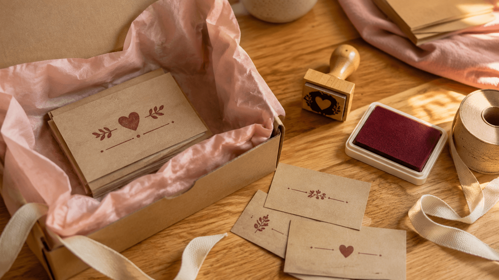
A thank-you stamp should feel like a small human gesture, not a slogan dropped onto every available surface. It might close a tissue wrap, sign the back of a packing card, or add warmth to a plain envelope. The mark has only a few seconds to work. If the message is long, the type is delicate, or the design competes with the order information, that moment disappears.
You can make the first thank-you stamp online for free by editing the wording, shape, spacing, motif, color, and size before choosing a download. That makes the design stage a useful place to compare options. It does not mean every finished export is free, so the sensible goal is to settle the design first and make the file decision only when the proof is ready.
This guide focuses on one compact customer-facing mark. It will help you choose words that sound like the business, build a readable layout, test it on real packaging, and avoid creating variants that add work without adding meaning.
1. Decide what the thank-you mark should do
Start with the moment when the customer will see the impression. A mark on the outer mailer is part of arrival. A mark inside the lid appears during opening. A small stamp on a packing card feels closer to a note. The same phrase can feel different in each position.
Give the stamp one primary job. It may acknowledge the order, sign off on careful packing, invite reuse of the packaging, or simply finish an otherwise blank card. Do not ask one small mark to thank the customer, explain care, promote social accounts, offer a discount, and list the website.
Write the job in plain language: “This mark thanks the customer when they lift the tissue,” or “This mark signs the back of the care card.” That sentence will guide the wording, size, and placement. It also makes it easier to reject attractive details that do not help.
Consider the rest of the packaging. If a card already carries a long printed note, the stamp may only need “Packed with thanks” and a small symbol. If the parcel is intentionally minimal, a slightly more personal phrase can carry more weight. The stamp should complete the communication, not repeat it.
Avoid promises you cannot keep. “Made just for you” is wrong for a standard stocked product. “Packed by hand” may be wrong if fulfillment changes. Gratitude is enough. You do not need to invent intimacy or production details to make the mark feel warm.
2. Choose words customers can read in one glance
Put every candidate phrase in a simple list before choosing a font. Read them aloud. Short phrases usually survive small sizes and hand stamping better, but the shortest phrase is not automatically the most natural.
Useful directions include “Thank you,” “With thanks,” “Packed with care,” “Made with care,” or a direct line such as “Thanks for supporting our small shop.” The right choice depends on what is true and how the business normally speaks. A formal stationery studio may prefer restraint. A cheerful craft shop may use a warmer phrase. Neither needs exaggerated enthusiasm.
Check the point of view. “Thank you for your order” speaks from the shop. “You made our day” centers the business’s reaction. “Made for you” describes the product. Choose one voice and keep it consistent with the card, invoice, and order email.
Remove duplicated ideas. “Thank you with gratitude” says the same thing twice. “A little parcel of handmade love, packed with care especially for you” is difficult to stamp and harder to believe. Tightening the sentence usually makes it sound more sincere.
Watch punctuation. An exclamation mark can fit an energetic brand, but three feel automated. An ampersand may save width but change the tone. A small apostrophe or dot can disappear in a physical impression. If punctuation does not add meaning, leave it out.
Type the phrase in uppercase, title case, and sentence case. The best version may surprise you. Uppercase creates a compact block but can sound forceful. Lowercase can feel quiet but depends on open letterforms. Judge the words at the intended size, not as a large headline.
3. Match the voice without overdesigning it
A thank-you stamp belongs to the same business as the product, but it does not need to reproduce the full visual identity. Start with one recognizable cue: the brand type style, a simplified motif, a border shape, or an ink color. One cue is often enough.
If the logo uses an intricate script, choose a sturdier related typeface for the message. If the brand has a complex illustrated mascot, reduce it to a simple head, outline, or characteristic object. If the packaging already uses a strong color, a one-color stamp can echo it without matching every shade.
Make a tiny mood board from the business’s own materials: a product label, a card, the website header, and the shipping box. Look for repeated qualities rather than copying elements. Are the forms rounded or square? Is the language formal or conversational? Is there generous white space or dense pattern?
Choose two design words, not ten. “Quiet and crafted” gives clearer direction than “friendly, premium, authentic, playful, elegant, bold, modern, timeless, personal, and unique.” When the draft becomes busy, those two words make editing easier.
Do not add a distressed texture just to make the stamp look handmade. The real impression will already have small variations. Artificial wear can damage the message at small size. Build a clean version first; add controlled texture only after a real-size proof shows that the letters remain clear.
4. Pick the shape from the message
Shape should support the words. A short “WITH THANKS” phrase can sit comfortably in a narrow rectangle or small oval. A two-line message may fit a compact square. A round stamp suits a short center phrase with a simple outer detail, but long wording around an arc can become small quickly.
Write the exact message in rough boxes before choosing a template. Try a wide rectangle, a compact circle, and a borderless layout at the same physical area. This reveals whether the words naturally want to be horizontal, stacked, or centered.
Think about the placement surface. A narrow paper band favors a horizontal mark. A small circular sticker area may suit a round impression. The back of a business-card-sized insert can take a wider message. A corner on a tag needs room for a slightly imperfect landing.
A border can make the mark feel complete, but it also uses space. Thin double rings and decorative corners often look good at editing size and weak at actual size. Compare a single border with no border. The words should not rely on the frame to remain coherent.
Do not stretch the message to fill a chosen shape. If a short phrase floats awkwardly in a large circle, use a smaller plate or a different structure. If a long phrase needs tiny letters to fit a narrow rectangle, shorten the phrase. The shape serves the communication.
5. Build hierarchy around one focal line
Most thank-you stamps need one focal line. That is usually “THANK YOU” or “WITH THANKS.” Supporting text such as the shop name, “for your order,” or “packed with care” should be quieter.
Set the focal line first at the final physical size. Give it enough weight and open spacing to survive the impression. Add the second line with a visible difference in size or position. If both lines have equal weight, the customer has to decode a small poster.
Use space to create hierarchy before adding rules. A generous gap around the focal line can be more effective than a heavy banner. If the shop name sits below, keep it distinct enough that it does not read as part of the sentence.
Curved text can create a friendly seal-like composition, but it needs careful radius and letter spacing. A short phrase on a tight arc may pinch at the center or spread too widely at the ends. Compare it with a straight line. The less decorative version often reads better on textured stock.
Turn the design to grayscale even if the intended ink is colorful. The hierarchy should come from scale, weight, and spacing, not color alone. This also protects the design if the shop later needs a black version.
Finally, blur your eyes or step back from the actual-size print. The thank-you message should be the first shape you recognize. If the border, motif, or shop name wins, reduce it.
6. Add a motif without turning it into clutter
A motif can make a generic phrase feel owned. Choose one simple object connected to the business: a leaf, star, thread spool, cup, flower, book, or abstract mark. It should be understandable as a small silhouette and should not require fine shading.
Test three roles. The motif can sit above the message as a signature, replace a punctuation mark, or anchor one side of a horizontal layout. Avoid using it in all three positions. Repetition makes a small stamp noisy.
If using the company logo, prepare a simplified stamp version. Remove taglines, tiny registered marks where they are not required, fine internal lines, and color-dependent overlaps. Keep the original logo untouched and save the simplified mark as a separate approved asset.
Leave clear space between the motif and letters. A leaf that nearly touches the T in THANKS may join after a heavy impression. A small star inside a letter counter can disappear. Print a roughened proof and check that the two elements remain distinct.
Consider no motif at all. Strong wording in a well-chosen typeface can feel more personal than a stock icon. If removing the symbol improves the mark, let the phrase carry it.
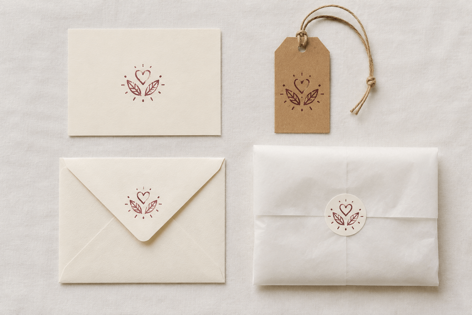
7. Make the first editable draft online
Open the stamp template library and choose a structure close to the message rather than a design with the most decoration. Every preview opens as editable layers, so the template is a starting arrangement, not a finished identity.
Replace all sample text immediately. Delete any field the thank-you mark does not need. Set the intended plate dimensions, then adjust the focal phrase, supporting line, border, and motif as separate layers. Working at the final size protects against a last-minute shrink.
Create three deliberate versions:
- A plain type-only version that proves the wording.
- A framed version that tests the shape.
- A motif version that tests one brand cue.
Do not change the typeface, border, motif, and message all at once between versions. Controlled comparisons make the decision visible. If the motif version is stronger, you should be able to say why: perhaps it improves recognition without reducing readability.
The editor lets you build and revise the design before payment. Use that freedom to finish the structure and proof it. When the design is ready, the export or access option is a separate choice. Do not call the final download free unless the current pricing explicitly says so.
Save the promising drafts with descriptive names. “thank-you-oval-type-v02” is more useful than “new-final.” Keep the chosen wording in the filename or notes so later edits do not quietly reintroduce an old phrase.
8. Check the stamp at actual size
Print every finalist at 100 percent. A screenshot or zoomed canvas cannot show how the type feels on a card. Cut out the proof and place it on the real box, insert, tag, and tissue wrap.
Read the mark at the distance where the customer will encounter it. A packing card is held close. An outer mailer may be seen from farther away. The same small script that feels charming on a monitor can become a gray line on kraft paper.
Make a rough impression simulation by slightly reducing contrast or printing on a lower-quality setting. This is not a replacement for a physical stamp test. It simply reveals which details depend on a perfect edge. The focal phrase should remain readable.
Measure the safe landing area. Hand stamping needs tolerance. If the mark fits only when perfectly centered between a logo and an address label, it is too large for routine packing. Give the operator room to land a few millimetres off without covering important information.
Ask someone who did not design it to read the actual-size proof for two seconds. Do not explain the motif or phrase first. If they read the shop name but miss the thanks, the hierarchy is wrong. If they mistake the motif for a letter, separate it.
Choose the smallest size that remains clear under these ordinary conditions, not the smallest size technically visible on a high-resolution print.
9. Plan placement, paper, and ink together
The finished impression depends on more than the plate. Kraft paper absorbs differently from coated card. Soft tissue shifts under pressure. Corrugated cardboard can create broken edges. A smooth uncoated insert is usually easier to stamp consistently than a seam or fold.
Select one primary placement and test it first. On an insert card, the back lower corner can leave the front clean. On tissue, a repeated pattern needs much more planning than one closure mark. On a mailer, keep the stamp away from addresses, barcodes, labels, and sealing tape.
Choose ink made for the surface and follow its current drying and cleaning instructions. A color that looks strong on white screen space may become quiet on brown stock. A pale ink on dark paper may require an opaque formulation and a longer or different drying process. Test the exact material instead of relying on a digital preview.
Make at least five normal impressions. Include the beginning and end of a short packing run. Watch for ink load, rocking, transfer to stacked cards, and fatigue from a plate that is too large. The right design should tolerate normal variation without losing the message.
Decide what level of variation suits the brand. Slight texture can feel warm. Missing letters, filled counters, or smeared words are defects. Keep one approved physical impression near the packing station as a realistic reference.
10. Make useful variants only when the job changes
A thank-you stamp can expand into a small family, but only when each version has a clear use. Before duplicating the design, map the real packaging tasks. The packaging stamp design guide explains why boxes, tissue, and tags often need related rather than identical artwork.
For this project, a useful family might contain one full thank-you mark for insert cards and one reduced type-only mark for narrow tags. The message and type treatment stay related. The second version exists because the available space changes, not because the first draft became boring.
Avoid creating a different phrase for every season, product, and order size unless the packing team can manage them. Too many similar plates slow the routine and make it harder to choose the correct one. A timeless core phrase is easier to keep in use.
If another language is needed, treat it as a real design, not a compressed translation. Have the wording reviewed by a fluent speaker, check the script at actual size, and adjust the shape if the phrase length changes. Do not shrink the second language until it fits the English frame.
Keep a simple variant table with name, dimensions, wording, placement, ink, and current status. Retire outdated plates clearly. An old slogan left beside the packing station will eventually return to a parcel.
11. Decide on an export after the proof is ready
Choose the file for the next job, not from habit. A transparent PNG is convenient for placing the mark in a document or showing a digital proof. A vector SVG or EPS is more suitable when a producer needs artwork that can scale without pixel edges. The selected stamp manufacturer may ask for a particular format, outlined type, one-color art, or its own plate template.
Before exporting, remove unused layers and confirm the final dimensions. Keep the editable master. Name the file with the message, shape, size, and version. Include an actual-size reference so the recipient can confirm orientation and scale.
If you plan to order a physical stamp, ask the supplier about minimum line weight, gaps, borders, and image preparation for that plate. Do not assume that a crisp screen preview guarantees the same impression on kraft, tissue, or card.
Your immediate next step is a three-surface proof. Print the chosen design at actual size and place it on the insert card, tag, and outer packaging. Pick the one primary position where it reads cleanly and does not compete with necessary information. Then run the physical ink test on that surface before buying extra plates or building more variants.