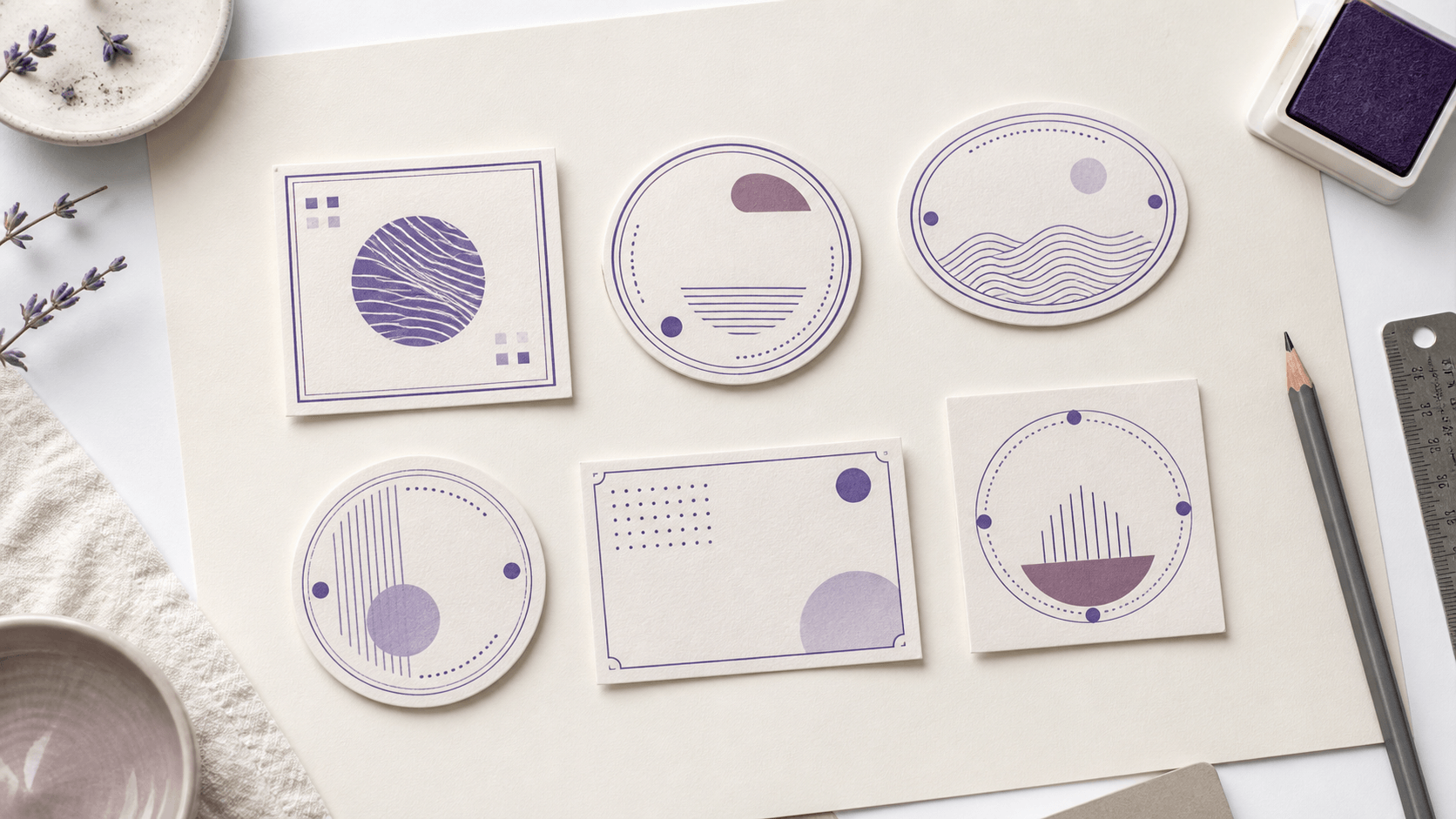
Gallery thumbnails are generous to stamp templates. Their sample text is short, centered, and chosen to flatter the design; your company name, address, date, club title, or personal phrase may be longer and less cooperative. A template can save setup time, but it can also hide a poor fit. Compare free stamp templates by replacing the sample content early, testing the intended size, and scoring the structure before getting attached to its decoration.
This decision guide gives you a repeatable shortlist process. It separates content fit, editing effort, real-size readability, and export needs so a template wins for a practical reason. It does not assume the most elaborate design is the best value or that free editing means every final file is included without payment. The point is to make the design decision before the purchase decision.
Start in the template library with a written job
Before browsing the free-editable stamp templates, write one sentence describing the finished mark. Include the user, the content, and the destination: “A two-line return address for small envelopes,” “A round company name and registration line for document mockups,” or “A personal library mark for paperback flyleaves.”
This sentence stops visual drift. A decorative circular seal may catch your eye, but it is not a useful candidate for a long horizontal address unless the wording can be reorganized without strain. A plain rectangle may look less exciting in the gallery and fit the job immediately.
Also list the non-negotiable content. Separate it from optional material. A business name may be essential; a slogan may not be. A personal stamp may need a name; a date or motif may be removable. Templates should be tested against the essentials first.
Add one constraint from the destination: maximum available width, need for a transparent background, expected physical size, or the recipient's requested file type. Do not solve the export requirement yet. Recording it now prevents a visually successful template from reaching the final round when it cannot serve the actual workflow.
Build a shortlist by structure, not color
Choose three to five templates with genuinely different structures. Include a shape that naturally follows the wording, one plausible alternative, and perhaps one wildcard. Five versions of the same circle with different flowers are not a structural shortlist.
Ignore color at this stage. Most stamp artwork can be recolored later, while the relationship between arcs, center space, borders, and long text is harder to change. Look at how many text zones the template provides, which zone is dominant, and whether optional elements can be removed without leaving a hole.
Take a quick note beside each candidate: “wide center line,” “good upper arc,” “address block too small,” or “motif can be deleted.” These observations keep the comparison tied to the job. They are more useful than a star rating based on the thumbnail.
Replace every sample word immediately
Do not spend time refining a template with placeholder wording. Enter the longest real line, shortest real line, punctuation, numbers, and any accented characters you need. A sample reading “YOUR COMPANY” tells you little about a multi-word organization name. A sample date may not reveal how your preferred date format behaves.
Keep spelling and capitalization consistent across candidates. Otherwise, you are comparing content changes as well as layouts. If you are still deciding between two wordings, make separate comparison rounds instead of giving different templates different phrases.
Watch what breaks first. Does the name touch a border? Does curved text require an uncomfortable radius? Does the central icon leave no room for a second line? Early breakage is valuable evidence. A template that needs major repair simply to accept the words is not saving much setup time.
Stress-test the longest and least convenient content
Templates are often judged with average content, but the difficult line controls the layout. Enter the longest street, organization name, professional title, or phrase you expect. Add the widest pair of initials. Use the full postal code or registration detail if it belongs in the design.
Then make a “bad day” version: one extra character, a longer month, or the longest likely branch name. You may never use that exact text, but the test shows whether the layout has tolerance. A design that collapses after one small change will be expensive to maintain as information evolves.
Do not fix the stress test by shrinking every line. First remove optional decoration, open the content area, reduce excessive tracking, or choose a naturally narrower typeface. Record how much intervention each template needs.
Repeat the stress test with the shortest likely content. A structure built around a long name can leave a short branch title floating in a large empty field. Check whether the template can rebalance through sensible spacing and element position rather than oversized letters. Good tolerance works in both directions.
Count useful editing zones
A useful zone is an area that can hold a complete piece of information without colliding with another. In a round design, the upper arc, lower arc, and center may be three zones. In a rectangle, a name line, details block, and side icon may serve the same roles.
More zones are not automatically better. A template with six tiny text areas may encourage unnecessary content. Count only the zones that match your information hierarchy. If the job has one name and one address block, a strong two-zone layout can be easier to read than a seal built for multiple formal details.
Try removing one optional zone. Does the remaining design still look complete? A flexible template lets whitespace close the gap or allows other elements to rebalance. A rigid template may depend on filler text to maintain its shape.
Inspect type controls with the real phrase
Compare fonts at the same working size. Look for open counters, distinct capitals, and natural width. Do not choose solely from the name of a type style. The real letters determine whether the line reads cleanly.
For curved text, check radius, start position, direction, and spacing. The arc should feel centered optically, not merely according to a control value. For straight text, check alignment and line spacing. A multi-line block needs enough separation to read without becoming disconnected.
Use bold and italics carefully. Weight can establish hierarchy, but heavy letters may close at small scale. Italics can add movement while consuming more horizontal room. Test one change at a time and keep the version that solves a named problem.
Check the character set you need before committing. Type every accented letter, numeral, ampersand, apostrophe, or symbol that belongs in the final text. If one character comes from a fallback font, its weight or proportions may look unrelated. Choose a face that handles the real wording consistently rather than patching a single letter with another style.
Remove decoration before you add more
Delete or hide the least important ornament and inspect the result. If the design becomes clearer, the ornament was not supporting the hierarchy. Repeat with extra borders, stars, dividers, and background texture. A template is a starting point, not a checklist of elements that must survive.
Evaluate the central motif separately. It should remain recognizable at intended size and leave enough space for the primary text. A detailed image that looks impressive in the editor can turn into a dark patch when reduced. Replace it with a simpler silhouette or remove it when the words already identify the mark.
Approve a clean version before adding worn effects. Texture changes appearance but does not rescue poor spacing. Preserve the clean master even if the final aesthetic calls for a distressed variation.
Compare every candidate at the same physical size
Large editor previews make dense templates seem more readable than they are. Put the shortlisted designs on one proof sheet at the same intended width or diameter. Print without automatic enlargement where possible and check the result with a ruler.
View the proofs at normal distance. Read the smallest line, inspect enclosed letters, and look for borders merging with nearby text. Place each proof on a representative envelope, page, label, or document. A template that reads well in isolation may be too dominant or too faint in context.
If physical production is planned, treat this paper proof as a design screen, not a production guarantee. The vendor, material, line weight, ink, and application method still need their own checks. The purpose here is to eliminate candidates with obvious scale problems before handoff.
Score editing effort honestly
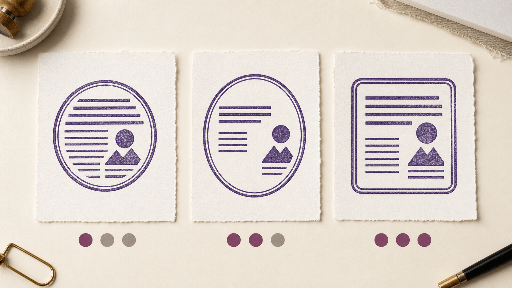
Create a simple effort score from one to five. Count how many structural changes were needed before the real content fit: moving zones, replacing the motif, changing the shape, rebuilding arcs, or deleting multiple borders. Routine text replacement and color choice should carry little weight. Structural repair should carry more.
A heavily edited template can still win if it creates an exceptional result, but recognize what happened: you used it as inspiration rather than as an efficient starting point. That distinction matters when you plan to build several related stamps. Repeating extensive repairs may cost more time than choosing a plainer base.
Note any element you do not understand how to edit. Do not assume it will become simple later. Check the current editor controls or choose a candidate whose important parts you can manage confidently.
Include review effort in the score. A design with many tiny zones requires more spelling checks, alignment checks, and variation checks. That may be justified for a formal, information-rich mark, but it is unnecessary for a two-word personal stamp. Fewer elements reduce both editing time and the number of places an error can hide.
Check variation tolerance
Duplicate the leading candidate and create one expected variation. Change a branch name, update a date, shorten the address, or remove a title. The second version should retain the original hierarchy without a complete redesign.
Look for stable anchors: a center line that stays in place, a border with enough clearance, or an icon zone that does not depend on a specific word length. These features make a template reusable. Fragile anchors include perfectly filled arcs, ornaments that only balance one name, and narrow text boxes with no extra room.
If you need a family of stamps, compare the variations together. They should share core choices while allowing different content lengths. Consistency does not require identical dimensions; it requires a recognizable logic.
Test one future update you can predict. Replace the year, location, department, surname, or short status word. Observe which manual corrections are required and write them down. A template is maintainable when those corrections are obvious and limited. If the update requires rebuilding arcs, repositioning every ornament, and choosing a new font size, the apparent convenience may not last.
Separate the template decision from the export decision
Once the design proof works, review the current stamp download and access options for the file or workflow you actually need. Do not let an assumed package decide the template before you understand the next application. Likewise, do not treat free editing as a promise that every final format is free.
Ask where the file goes next. An image for a document, artwork for a physical stamp producer, and an editable archive have different requirements. Confirm accepted formats and dimensions with the recipient. Avoid relying on a small raster file for future large use, and do not assume a vector format is accepted by every application.
Record the intended size, background treatment, and chosen color. Inspect the exported file itself before delivery. The correct template and the correct export are two separate decisions, and both deserve a final check.
Use a weighted scorecard when two templates are close
Score each finalist from one to five on content fit, readability at size, editing effort, variation tolerance, and visual suitability. Double the weight of content fit and readability. Those qualities serve the job; visual preference matters, but it should not outvote unreadable details.
Add a short reason beside every score. “Name fits without reduction” is evidence. “Feels professional” is too vague until you define what creates that feeling. Perhaps it is clear hierarchy, restrained borders, or consistent spacing. Name the property so you can preserve it during editing.
Do not average away a failure. A template that scores one for readability should be rejected even if its decoration scores five. Set minimums for the essential criteria before calculating totals.
Approve the simplest candidate that passes the real test
Return to the written job from the first step. Place the final proof in its destination and read every required line. Check that optional decoration stays secondary and that the design has enough tolerance for ordinary use.
If two candidates perform equally, choose the one with less structural repair and fewer fragile details. Simplicity leaves more room for later changes and reduces the number of decisions that can drift between versions. This is not a rule that every stamp must be plain. It is a reason to make complexity earn its place.
Free stamp templates are most valuable when they speed up informed comparison. Replace the sample wording, stress-test the difficult line, proof at size, and choose the export only after the structure works. The winning template is the one that carries your real content with the least explanation.
Keep the scorecard and final proof with your project notes. If the wording or destination changes later, you can see which assumptions selected the template and decide whether they still hold. That is more reliable than reopening the gallery and choosing again from memory. A template is not permanently right; it is right for a documented job, content set, size, and next step.
When those facts change, rerun the difficult-content test before reusing the old artwork. A quick proof is cheaper than repairing the wrong structure after delivery.
Archive the rejected candidates with their failure notes until the project is complete; the notes prevent the same attractive but unsuitable option from returning unnoticed.