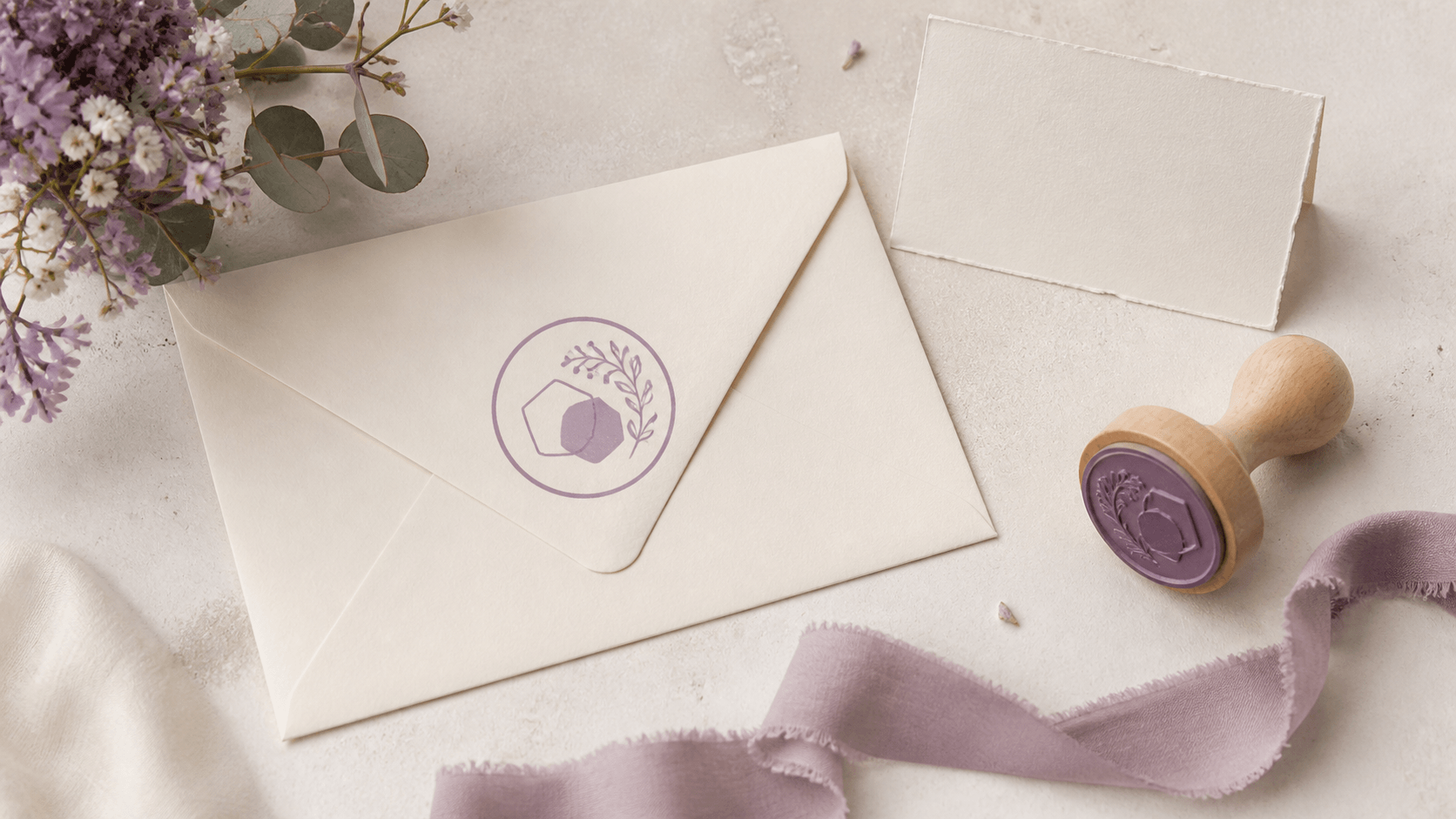
Put an elaborate wedding monogram on a small envelope flap and the romance can vanish into a dark knot. Two names, a date, a floral frame, initials, and a location may all fit in an enlarged editor view, yet the finished mark has to work on envelopes, tags, favor bags, and thank-you notes. A wedding stamp maker online free editing stage gives you room to compare ideas before choosing a downloadable file or physical production method.
The useful goal is not to create a miniature version of the entire invitation. It is to build one recognizable mark, then decide whether you need a few restrained variations. This guide walks through the wording, hierarchy, motif, proofing, and handoff decisions without assuming one wedding style or printing process fits every couple.
Give the wedding stamp one main job
List every place you might use the mark: outer envelope, return-address area, back flap, favor tag, menu, gift bag, thank-you card, or digital planning sheet. Then circle the most important use. The smallest or most frequently repeated surface is usually the best design constraint.
A back-flap stamp may focus on initials and a date. A return-address version needs practical address lines. A favor tag can carry a short shared phrase. Combining all three jobs in one mark creates too much information and weakens the central idea. Choose a primary job and allow other applications only when the same artwork fits naturally.
Write a simple success statement: “Our initials and date stay clear on a small envelope flap,” or “The return address reads first, with a subtle wedding motif.” This sentence helps settle later disagreements between attractive details and functional space.
Choose a template after writing the real names
Open several editable wedding and personal stamp templates, but replace every sample initial, name, and date before judging the layout. A balanced example with A and M may not work with W and I. Two short first names fit where a long shared surname will not, and the reverse can also be true.
Test three content levels. The minimal version contains initials only. The middle version adds a date. The full version uses names or a surname plus the date. Look at each at the same intended size. If the full version requires fine type, decide whether the missing information is already available elsewhere on the stationery.
A template should reduce setup work, not dictate the final hierarchy. Move, resize, or remove parts that do not serve the real wording. If a design becomes unstable as soon as the sample text changes, choose a structure with more tolerance instead of forcing the names into it.
Decide between initials, names, and a shared surname
Initials create the most compact mark. They work well when the couple and event are already obvious from context. Their main design challenge is order and visual balance. Decide whether the initials follow invitation wording, alphabetical order, or another convention meaningful to you. Make that choice deliberately; do not let the template decide by default.
First names feel personal and easy to recognize, but their combined length can vary sharply. A shared surname can be concise or very long. It may also be inappropriate if the couple will not use one shared name. The artwork should reflect the names people actually use rather than an assumption built into a traditional sample.
Try the chosen wording in plain type before adding a monogram. If it already feels crowded, a decorative script will not create space. A short ampersand or small divider can connect names, but it should not become the main symbol unless that is intentional.
Use the date only where it remains legible
A wedding date gives the mark a specific memory, yet its numbers can become fragile at small sizes. Write the date in several forms and compare their width. A fully written month is warm and readable but long. A compact numeric date saves space but may be interpreted differently by readers accustomed to another order. An abbreviated month can be a practical middle ground.
Keep separators simple. Tiny dots and decorative marks may disappear. If the date sits on a curve, check the spacing around every number rather than judging only the center. A straight baseline below the initials is often easier to proof.
Ask whether the date belongs on every variation. It may be perfect for favors and thank-you notes but unnecessary in a return-address stamp intended for use after the event. A small system can include one date version and one durable no-date version without changing the central monogram.
Pick a shape that follows the stationery
Round wedding marks suit initials, wreath-like borders, and short curved phrases. Rectangles accommodate addresses and longer names. Ovals provide a softer outline with more horizontal room. A small square can make a simple monogram feel modern, but it offers little tolerance for long text.
Place rough outlines on photographs or paper samples of the intended stationery. A circle may echo an envelope seal, while a narrow rectangle may align better with a return-address block. The goal is not to match every shape on the invitation. It is to occupy the available area calmly.
Leave room around folds, edges, and nearby print. If the stamp is for a physical impression, placement will vary slightly from item to item. A design that requires perfect alignment against an envelope flap is harder to use consistently.
Keep romantic type readable
Script can bring warmth to a short pair of initials or first names, but it becomes risky when every line uses flourishes. Connections may close, capital letters may be mistaken for one another, and long swashes can collide with borders. Use the expressive face for one short element and support it with a clear typeface for dates or address lines.
Judge letters, not font names. Type the real initials and look for confusing pairs. An ornate capital may be lovely in isolation and unreadable beside another. Check the ampersand, apostrophes, accents, and hyphens required by the names. Preserve correct spelling even if a different character would be easier to style.
At small size, spacing often matters more than ornament. Open the space between initials, give the date its own baseline, and protect a gap around any surrounding frame. If a flourish needs to cross another line to fit, remove it.
Test the monogram without the rest of the design. Ask two people who know the couple to identify the initials at intended size. If they hesitate, the problem may be the capital shapes rather than the overall composition. Try a clearer typeface before making the initials larger. A monogram that requires explanation will not become more readable after it is surrounded by a wreath and date.
Also compare the mark with the invitation typography. The stamp can complement the stationery without copying the same script. Repeating an ornate face at a much smaller size may expose its weak details. A simpler stamp typeface can create a useful contrast while preserving the same overall mood through spacing, shape, or motif.
Choose one motif with a clear silhouette
Leaves, flowers, rings, stars, hearts, geographic outlines, and simple objects can make the mark personal. Pick one motif family rather than filling separate gaps with unrelated symbols. A single branch can frame initials. Two small leaves can act as separators. A simple flower can anchor the center of a round mark.
Avoid tiny botanical detail that turns into texture when reduced. Test the motif as a solid silhouette. If it is unrecognizable without internal veins and petals, simplify it. Keep it separate from the letters so the name does not appear to grow out of an accidental stroke.
Do not use symbols that imply an institution, certification, or official approval. A wedding stamp is personal stationery artwork. Its charm comes from the couple's choices and repeated use, not from looking governmental or authoritative.
Make a flexible core and controlled variations
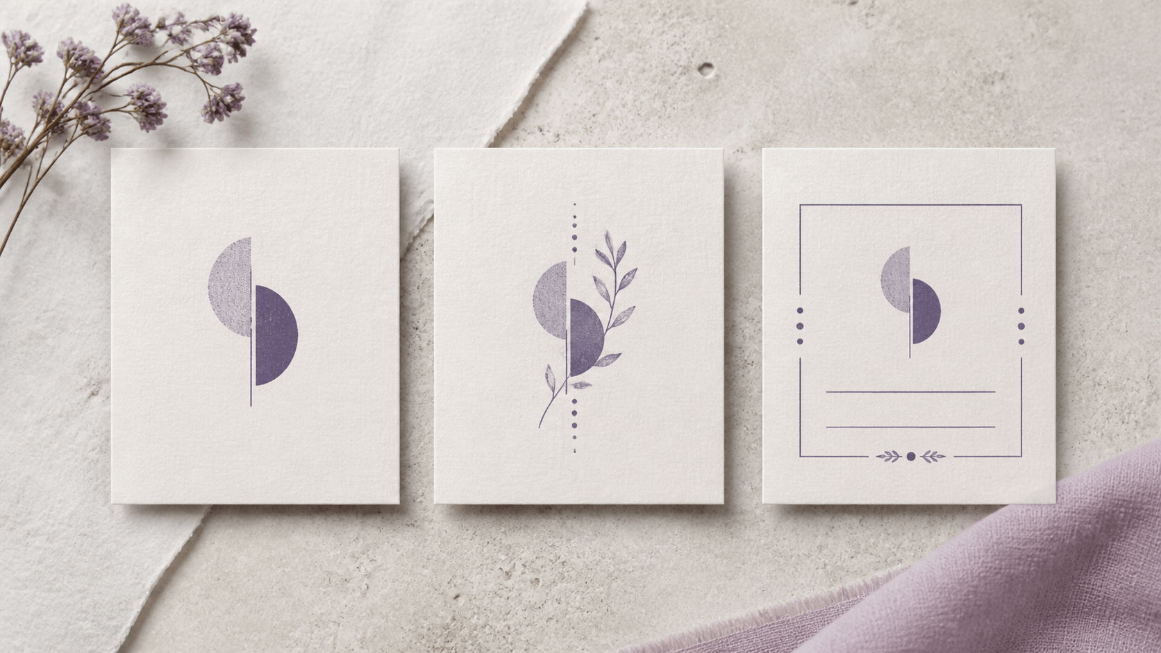
Build the core from the element that should repeat everywhere, usually the initials, names, or monogram. Approve that first in one color and without a background texture. Then duplicate the design for defined variations: add a date, add a return address, or remove the outer border for very small tags.
Keep the core proportions stable. If the initials change size and position in every version, the set will not feel related. Supporting information can move to fit each surface, but the main mark should remain recognizable.
Limit variations to ones with a real use. A dozen color and border combinations create more review work and increase the chance of sending the wrong file. A core mark, a dated version, and an address version are often enough to cover distinct tasks without becoming a design catalog.
Make a small specification card for the set. Record the approved spelling, initial order, date format, core typeface, dominant motif, intended dimensions, and where each variation belongs. This is not a formal brand manual. It is a practical guardrail when a planner, printer, family member, or vendor needs to recognize the correct artwork. The card also helps when thank-you stationery is prepared months after the invitations.
Proof on the actual paper context
Print the mark at intended size and place it on an unused envelope, tag, or paper offcut similar to the final material. Do not judge it only on a white screen. Colored, textured, or patterned paper changes perceived contrast. Nearby invitation typography can make a border feel heavier or a script feel more elaborate than expected.
For a digital mockup, use a photograph of the real stationery and preserve the mark's relative size. For a physical stamp, test the produced tool and chosen ink on spare material before using finished pieces. Paper coatings, fibers, pressure, drying time, and ink behavior vary, so follow the supplier's guidance and make your own sample.
Check a run of several impressions if physical production is involved. One perfect result does not reveal how easy the mark is to place repeatedly. Leave enough margin and line weight tolerance for ordinary use rather than designing for a single careful demonstration.
Make the test quantity realistic but modest. Try enough spare pieces to observe placement and drying behavior without risking the finished stationery. If the material curls, smears, absorbs unevenly, or shows through, stop and ask the relevant paper, ink, or production supplier for guidance. Changing the digital artwork cannot solve every material problem, and changing materials can alter the look enough to require another proof.
Decide which export matches the next step
Once the paper proof works, review the current options on the stamp export and access page. Choose based on the next application rather than buying a package before the workflow is clear. A file placed in ordinary documents has different needs from artwork sent to a production vendor.
Ask the recipient or producer which format, dimensions, color treatment, and background they require. Do not assume every application accepts the same file or that enlarging a small raster image will remain clean. Keep a master version with editable decisions recorded, even if the immediate use needs a final fixed file.
Use clear filenames that distinguish core, dated, and address variations. Add the intended size or purpose when it helps, but keep personal addresses out of filenames shared widely. Inspect each exported file before sending it. A correct editor preview does not replace a final-file check.
Run a calm final review before production
Set the design aside for a few hours, then read it from the beginning. Check names, initials, date, address, punctuation, and any accents. Confirm the intended initial order. Remove placeholder text and make sure the approved motif is the one in the final version.
Print the final core and every required variation together at actual size. They should feel related, but each must still serve its own surface. Look for a date that became too small, an address that touches the frame, or a no-border version that now feels visually unbalanced. Correct the specific fault instead of reopening every style decision.
Finally, give each file and version one owner in the planning process. Decide which is approved and which are experiments. That small administrative step prevents an early draft from being sent to a vendor or copied across hundreds of items.
Use a visible approval label in the working folder and move experiments into a separate subfolder. Do not depend on “final,” “final-new,” and “final-really” as version control. A filename that names the purpose, such as core, dated, return-address, or small-tag, is easier to verify. Keep private addresses out of broadly shared preview names and packages unless the recipient needs them.
Let the smallest successful use approve the stamp
A wedding mark earns its place by working on real details, not by carrying every detail. Test it on the smallest intended tag or envelope flap. If the initials read immediately, the date remains distinct, and the motif supports rather than interrupts them, the core is ready.
If the test fails, simplify in the order that protects meaning: remove extra decoration, open spacing, shorten optional wording, then reconsider the overall shape. Do not shrink essential names until they become an afterthought. The event identity should survive even when the design becomes simpler.
Using a wedding stamp maker online free is valuable because it lets you make those decisions before export. The result should be a compact, personal system with a clear core, a few purposeful variations, and proof that it works where guests will actually see it.
Keep one printed approval sheet with the final set. It gives the digital files a physical reference and makes last-minute substitutions easier to spot before production.
Write the approval date and intended use on that sheet so later variations are compared with the correct source rather than an attractive experiment.