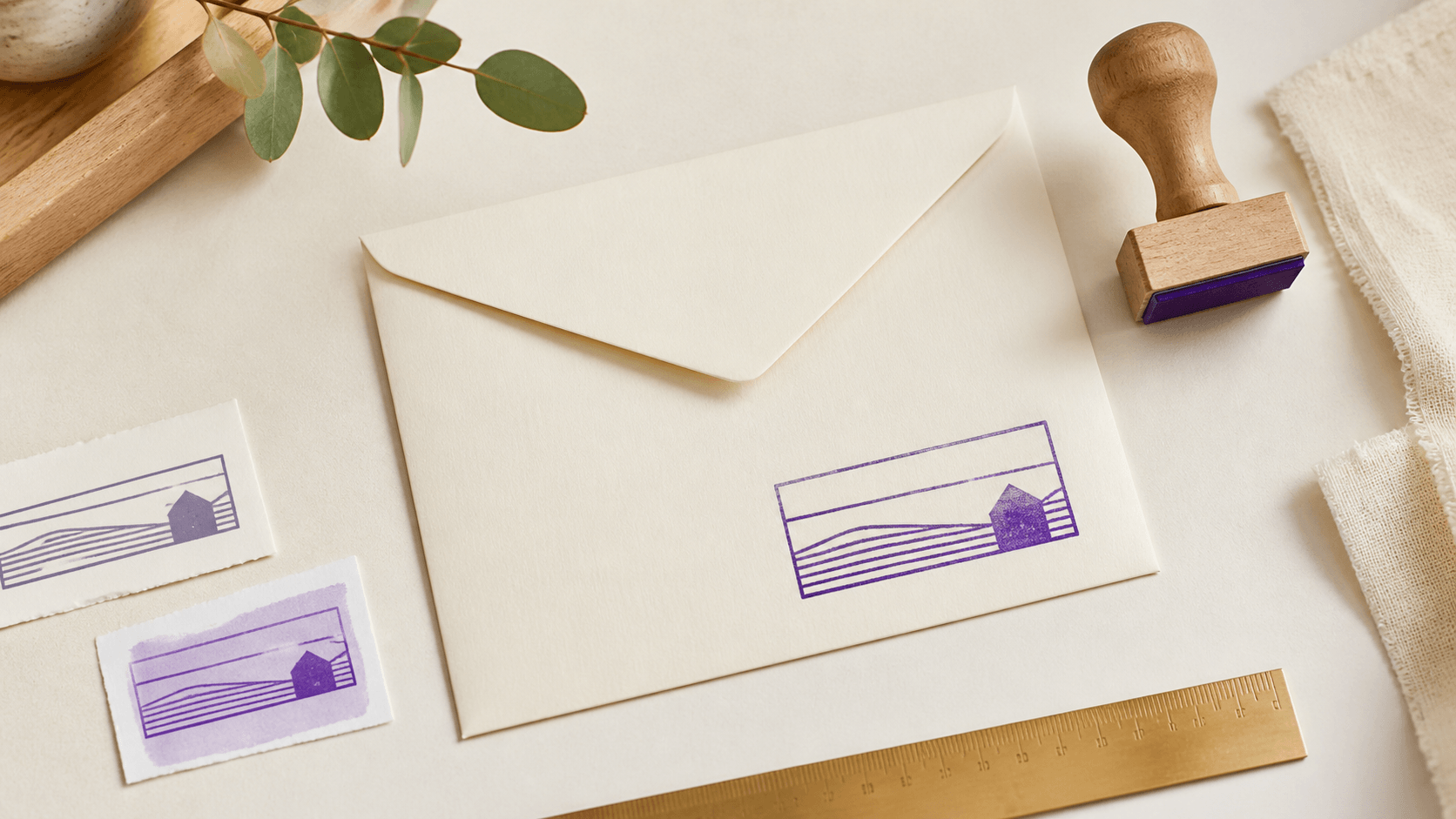
A return address stamp looks simple until a real address has to fit inside it. A long street name pushes against the border. An apartment line steals space from the city. A decorative initial becomes the loudest thing on the envelope while the postal information turns into fine print. The useful way to make a return address stamp online free is to treat the first version as a working proof. Build it, test the longest line, compare it with the space on an envelope, and decide what deserves emphasis before paying for an export or ordering a physical stamp.
This guide focuses on that proofing stage. It will help you turn an address into a clear hierarchy, choose a practical layout, and find problems while changes are still easy. It does not assume one shape, typeface, or physical size works for every household or mailing system. The final design should be checked in the context where you plan to use it.
1. Start with the place the stamp will actually go
Do not begin by choosing a border. Begin with an envelope, label, card, or package similar to the one you use most often. Mark the area available for the return address and notice what surrounds it. A small envelope corner calls for a compact mark. A wide shipping label may allow a longer rectangle. A stamp for the back flap can be more decorative, but it still needs enough contrast and clearance to read.
This destination-first approach prevents a common mistake: designing at a comfortable editor zoom and discovering later that the finished mark dominates the stationery or becomes unreadable when reduced. Write down the approximate width and height available. These are design boundaries, not a promise that a particular physical stamp or printing process will reproduce every detail. If a vendor will produce a rubber stamp, ask for its artwork and size requirements before final export.
Also decide whether this is one all-purpose mark or a design for a narrow job. A stamp used on everyday letter envelopes needs quick recognition. A mark used on thank-you cards might carry more personality. Trying to make one layout serve every surface often creates a crowded compromise.
2. Decide exactly which address lines belong
Copy the address from the source you trust, then break it into logical lines. A typical draft might contain a name, street line, and city or locality line. Some addresses need a unit, building, region, or postal code. Do not remove a necessary part simply because it makes the design harder. Solve the layout instead.
Now question every optional word. A family label, business descriptor, slogan, website name, phone number, and decorative phrase can all compete with the address. A return address stamp has one main job: identify the sender and return location. Extra information belongs only when it supports that job and stays readable at the intended size.
Create a plain-text master before you style anything. Check spelling, abbreviations, punctuation, spacing, and line breaks. Ask another person to read it from a printout rather than from your notes. Familiarity makes errors easy to overlook, especially in a name or postal code you have typed hundreds of times.
3. Let the longest line choose the starting shape
A rectangular layout usually gives a long street or locality line the most natural home. It allows the eye to move across the address in the same direction it reads ordinary text. A round layout can work when the wording is short enough to curve around a central initial or small motif. An oval adds horizontal room while retaining a seal-like character. The best starting shape is the one that holds the real text without forcing awkward reductions.
Measure the problem line by characters and by visual width. A line filled with wide capital letters occupies more space than a line with many narrow letters, even when both contain the same number of characters. Test the actual wording rather than relying on a sample name in a template.
If a circular concept is important, consider splitting information by role: a name on the upper arc, a short city line below, and the street across the center. If that arrangement requires tiny text or confusing reading order, return to a rectangle. Shape should support the address, not make the reader solve a puzzle.
4. Build a hierarchy before choosing a style
Hierarchy tells the eye what to read first, second, and third. For a personal address stamp, the name may lead and the location may follow. For a small business, the business name might lead while the complete return address remains quieter but clear. Choose one primary line. If every line is bold, large, curved, or boxed, none of them is truly primary.
Use size, weight, and spacing as separate controls. A name can be slightly larger without becoming heavy. Address lines can share a size but use more open spacing. A divider can separate identity from location, although whitespace often does the job more cleanly. Keep the hierarchy visible in a one-color proof; it should not depend on several colors to make sense.
Read the design in the order a stranger would. Cover the primary line and see whether the remaining address still works. Then cover the address and check whether the name or symbol feels balanced rather than stranded. This simple test catches layouts that look centered as a group but contain weak relationships between parts.
5. Handle long names without crushing the type
Long family names, company names, and street names create the hardest decisions. Shrinking the entire design is usually the least helpful response. Start by giving the longest line more horizontal room. Reduce unnecessary letter spacing. Try a typeface with moderate character width. Move a secondary phrase to another line. Change the border only after the text has a fair chance to fit.
Avoid stretching or squeezing letters out of proportion. Distorted type may technically fit but often looks uneven and becomes harder to recognize. A modestly condensed typeface is different from manually compressing ordinary letters until their shapes change. If the editor offers several fonts, compare them with the longest line at the same size.
Do not solve one long line by making all other lines excessively wide. The block still needs a coherent silhouette. In a rectangle, aim for line endings that feel intentionally related rather than perfectly identical. Natural variation often reads better than a rigid box made by extreme tracking.
6. Choose type for repeated small use
Return addresses reward plain, sturdy letterforms. Fine hairlines, tight counters, and dramatic script connections may look elegant when enlarged, then disappear or merge at working size. A restrained serif, a clear sans serif, or a simple humanist face usually gives the address more tolerance. Decorative type can still appear in a short name or initial if the practical lines remain straightforward.
Test capital letters and lowercase rather than assuming one is more formal. All caps creates a consistent band but can become dense. Mixed case offers more varied word shapes and may be quicker to scan. The right choice depends on the font and the actual address.
Watch punctuation. Commas, periods, ampersands, and small separators can become dark knots or faint specks. Remove punctuation that serves no reading purpose, but preserve anything required for the address format you use. Leave enough space around a postal code so it does not visually attach to the preceding word.
7. Use borders and icons with restraint
A border gives the stamp a finished edge, yet it also consumes space. One clear border is often enough for a compact return address. Multiple rings or frames reduce the room available to letters and can make a small impression feel heavy. Test the address without a border first. Add one only when it improves containment or helps the design sit on the envelope.
An icon should have a job. A small house, leaf, animal, or monogram can identify the sender's style, but it should not interrupt the address or resemble an official symbol. Choose a simple silhouette with open interior spaces. Detailed illustrations are vulnerable when reduced and can pull attention away from the information.
Protect a clear gap around the icon. If text almost touches it, the mark may look accidental even when no shapes overlap. The same rule applies to borders: visible air is part of the design. A layout that fills every available millimetre tends to feel smaller, not more generous.
8. Build three free proofs instead of polishing one idea
Early comparison is more valuable than early perfection. Choose three promising starting points from the editable stamp templates, or create three simple arrangements from the same wording. Keep the content identical so the layout is the only meaningful variable.
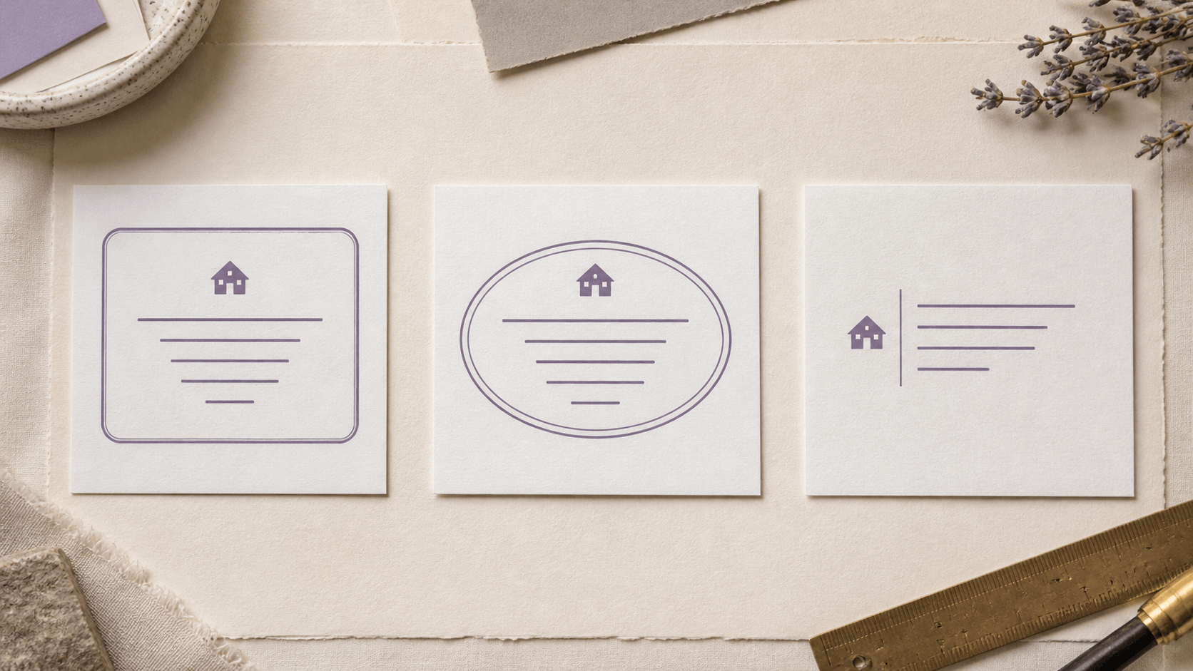
Version A might be a horizontal rectangle with the name above two address lines. Version B could be an oval with a short name on the upper curve. Version C might place a monogram beside a compact text block. Spend only enough time to make each readable. Do not perfect textures, ornaments, or colors yet.
Place the three versions side by side at approximately the same intended width. Ask practical questions: Which one reveals the sender fastest? Which protects the postal line? Which survives the longest street name without special treatment? Which leaves the most comfortable margin on the envelope? Eliminate a layout when its structure is wrong; do not keep rescuing it because the border is attractive.
9. Test at the size people will see
Editor zoom is useful for placing elements, not for judging final readability. Make a proof sheet that shows the design at its intended physical dimensions and at one slightly smaller size. Print it using settings that preserve the scale you chose. If you cannot print immediately, view the design on an envelope mockup at a realistic relative size, then print before committing to production.
Read the proof at arm's length. Look for closed counters in letters such as e, a, and o; crowded pairs; weak punctuation; border collisions; and address lines that become a gray strip. Check it in ordinary room light rather than only on a bright screen. If the mark will be applied in ink, remember that the physical result also depends on the stamp, ink, paper, pressure, and technique. A clean digital proof is necessary, but it cannot guarantee every physical impression.
Use the same proof on the smallest and busiest surface you expect. A design that works on a large card may fail in the top-left corner of a small envelope. Approve the difficult case first.
Make notes directly beside each proof. “Street line too tight” is more useful than “version B feels wrong.” Specific observations tell you what to change and help you avoid reopening decisions that already passed. After one revision, print the old and new versions together. A side-by-side comparison exposes tiny improvements in spacing that are hard to remember from separate screens. It also shows when a supposed improvement merely moves the problem from one line to another.
10. Check the whole envelope, not an isolated mark
A return address does not appear alone. The envelope may also carry a recipient address, postage, handling marks, a colored flap, or printed artwork. Place your proof where it will be used and look at the complete composition. The stamp should be noticeable enough to serve its purpose without competing with the recipient information.
On a front-corner placement, favor compact clarity. On a back flap, verify that the design does not cross folds, adhesive areas, or edges. For cards and packaging, confirm that nearby graphics do not create a false border or make a small icon look like part of another logo.
If the design uses color, make a grayscale version too. Hierarchy that survives without hue is generally more dependable across screens, office printers, and one-color stamp production. This is a design check, not a guarantee of reproduction; the final output still needs to match the method you choose.
11. Protect personal information while you review
An address is personal data. Use care when sharing screenshots, asking for public feedback, or storing proofs in a shared folder. A review image can use a substitute address with similar line lengths until the layout is settled. Replace it with the correct details in a private working copy, then proof every line again.
Keep track of which version contains real information. Clear filenames such as address-stamp-layout-A and address-stamp-final-proof are safer than a folder full of unnamed downloads. If you create versions for an old and new address, archive or delete the obsolete one according to your own storage needs so it is not used by mistake.
Before export, inspect the exact final artwork rather than assuming a late text replacement preserved the spacing. One longer apartment number can shift the balance of the entire mark.
12. Make the free editing stage answer a real question
A free design session is most useful when it ends with a decision. Open the online stamp maker with the final address text ready, rebuild the strongest proof, and answer one remaining question at a time: rectangle or oval, name above or beside, icon or no icon, one border or none. Changing several variables at once makes the comparison hard to trust.
Stop editing when the hierarchy, spacing, and real-size proof all work. Then review the current export choices and any physical production requirements that apply to your next step. Keep a note of the intended dimensions, wording, chosen font, and preferred color so you can recognize the approved version later.
Give the final proof a simple acceptance list: every address line is correct, the smallest text reads without zoom, the design fits its placement area, personal information appears only where intended, and the next recipient can use the chosen file. Mark each item after inspecting the final version, not an earlier screenshot. A short written approval is useful when several similar layouts remain in the working folder.
The strongest return address stamp is rarely the most decorated option. It is the one that reads quickly, fits its envelope, handles the longest line without strain, and contains exactly the information you meant to send. Build that evidence during the free stage, and the download decision becomes much less uncertain.