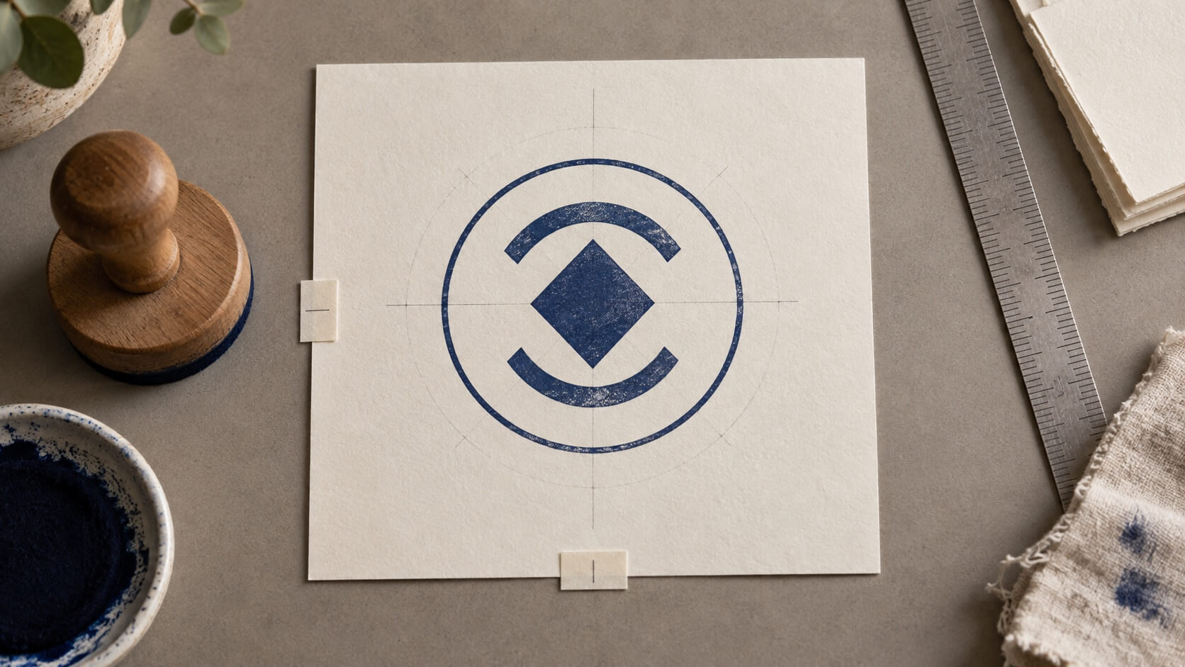
A stamp can be perfectly centered by the numbers and still look as if it is sliding toward one edge. The file box may be symmetrical, the logo may sit on the exact midpoint, and the text may use identical margins. Yet one heavy letter, an open side of a symbol, or a curved line can pull the eye away from the middle.
The fix is not to keep pressing the center button. A balanced stamp comes from comparing the visible ink, the empty space around it, and the hierarchy of the whole impression. A stamp generator gives you useful position and size controls, but you still need to decide what the viewer should perceive as the center.
This guide shows how to make that decision. You will set the final footprint, separate geometric alignment from optical balance, center text as a block, combine it with a logo, and test the result at its real size. The examples use simple abstract marks so the method works for a business stamp, personal mark, round seal, or compact label.
Define what “centered” needs to mean in this stamp
Start by naming the element that should feel stable. In a simple name stamp, that may be the line of text. In a round design, it may be the relationship between a center symbol and the surrounding ring. In a rectangular mark, the whole text-and-logo group may need to sit comfortably inside the border even when the logo itself is off to one side.
Do not try to center every object independently. If a small icon sits above a two-line name, centering the icon on the canvas and each line on the canvas can produce three correct coordinates but one disconnected composition. Treat related elements as a visual group. The group is what needs to look settled inside the available space.
Write down the reading order before moving anything. Perhaps the business name should be noticed first, the logo second, and a short location line last. That order affects balance. A dark logo naturally attracts attention, so it may need less size or a little more surrounding space than a lighter text line. Equal dimensions do not create equal visual weight.
Choose one reference boundary. It might be the outer edge of a round border, the intended plate dimensions, or a reserved box on a product tag. Switching between the canvas edge, border edge, and visible design edge leads to misleading comparisons. A transparent canvas may contain unused space that has nothing to do with the finished impression.
Make an initial screenshot or export before adjusting the layout. It gives you a neutral starting point. Later, compare each revision with that version and describe the change in plain language: the symbol now looks less low, the left margin feels less tight, or the text block has stopped leaning toward the long word.
Set the final footprint before fine-tuning the center
Centering depends on the space the stamp will occupy. A layout built on a wide temporary canvas may look balanced because there is generous room on both sides. When it is cropped to a narrow plate or placed inside a small document box, the same design can feel crowded and off-center.
Choose the intended outer dimensions first. If a physical supplier will produce the stamp, confirm how it defines the impression area and what clearance it needs. If the design will be used in documents, measure the space where it normally appears. Avoid assuming that the visible page preview represents physical size.
Draw or enable a boundary that represents the final footprint. Keep it visible while composing, but do not mistake the guide for printable artwork. If your chosen template includes a border, decide whether that border is part of the visual center or simply a production edge. A heavy border strongly influences balance; an invisible crop boundary does not.
Remove accidental empty canvas around imported artwork. A logo file can contain transparent padding on one side, causing its selection box to sit in the middle while the visible mark does not. Crop or prepare the source deliberately, then place it again. Compensating with unexplained offsets makes future edits harder.
Create two proofs: one showing the whole footprint and another cropped close enough to inspect the shapes. The first reveals margin problems; the second reveals alignment between individual elements. Working from only the close view can hide an overall drift, while working only from the full view can hide a small collision.
Separate geometric center from optical center
Geometric center is a coordinate. Optical center is the position that looks balanced to a viewer. They often agree when a shape has even mass on all sides. They diverge when the artwork contains diagonals, open areas, uneven letters, or a dense feature near one edge.
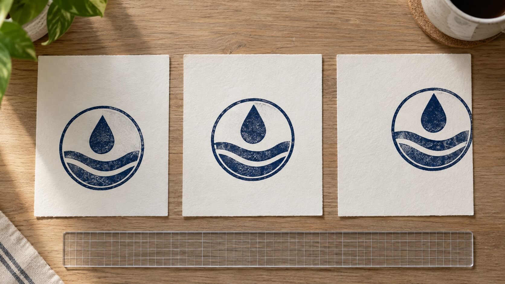
Imagine a simple teardrop inside a circle. Its bounding box can be centered exactly, but the broad lower half may make it look low. Moving the visible shape slightly upward can produce a calmer result even though the coordinates are no longer identical. The adjustment is not arbitrary if you compare it against the surrounding space.
Use a temporary center cross or guide to establish the geometric starting point. Then hide the guides and look at the stamp as an impression. Squint, reduce the preview, or step back from the screen. These checks reduce your attention to small construction details and make the distribution of dark and light areas easier to judge.
Rotate the page or view it upside down for a moment. You are not approving the design in that orientation. You are interrupting your habit of reading the words, which helps you see the text as shapes. If one side suddenly looks much darker, the layout may be technically aligned but optically unbalanced.
Make small movements and compare versions. A large correction often creates a new problem on the opposite side. Save a centered baseline, then try one controlled offset. Label the proofs internally by version rather than calling one “fixed” before it has passed the actual-size check.
Center the text block before judging the whole design
Text should first be treated as a complete block. If the design contains a company name and a short supporting line, establish their relationship before placing the logo. Decide whether the lines share a center axis, a left edge, or another deliberate alignment. Avoid nudging individual letters simply to make the outside edges look equal.
Words create uneven silhouettes. A line beginning with a wide capital may appear heavier on the left. Punctuation can extend beyond the part people perceive as the word. All capitals form a different visual block from mixed case. Use the actual approved wording, because a sample name will not create the same shape.
Turn on the text box or selection boundary to find the geometric center, then look at the visible letters without the box. If the box includes extra font space above or below the letters, the displayed boundary may not match the inked area. Judge the real glyphs and their relationship to the border.
The outer shape also changes how centered text feels. A short line that is comfortable in a rectangle may look lost inside a wide oval. A long line placed in a circle may seem to push against the sides even when its midpoint is correct. The guide to choosing an online stamp shape can help when the container itself is creating the imbalance.
For two or more lines, compare the left and right visual edges of the complete group. The longest line usually sets the width, but the shorter line should not float without a relationship to it. You might center it beneath the main line, align it with a meaningful letter group, or use spacing that makes the two lines read as one unit.
Check the gaps between lines as carefully as the side margins. If the lower line sits too close to the main name, the group can feel bottom-heavy. If it sits too far away, the design splits into unrelated parts. Move the line vertically before changing its font size; the problem may be spacing rather than scale.
Balance the logo and wording as one composition
Place the logo only after the text block works on its own. Start with the cleanest practical version of the mark and compare its visible mass with the wording. A compact solid icon can outweigh a much wider line of letters. Matching their widths is rarely the right test.
Decide whether the logo leads or supports. A leading logo can occupy the central position while the wording wraps around or sits below it. A supporting mark may sit beside the name at a smaller scale. If both compete for first attention, reducing one is usually more effective than moving both repeatedly.
Inspect the source before centering it. Logos often include transparent margins, registration space, or an artboard larger than the visible mark. The guide to adding a logo without losing important detail explains how to simplify and prepare the source. For centering, the crucial point is that the visible logo—not an accidental file boundary—must enter the comparison.
Try grouping the logo and text, then center the group inside the final footprint. This gives you a useful baseline. Ungroup only when you can describe why one element needs an optical correction. Record that correction so a later editor does not assume it is an error and return everything to its mathematical midpoint.
Look at negative space between the logo and the nearest letters. A diagonal or pointed logo may need more breathing room than a flat-sided symbol. The measured gap can be identical on two sides while one looks tighter. Adjust the relationship by eye, then confirm that the result still has adequate practical clearance.
Hide the border and compare again. If the composition suddenly feels balanced, the border may be too dark, too close, or unevenly spaced around the group. If the imbalance remains, simplify the logo-text relationship before adding decorative rings, dots, or separators.
Use guides to compare margins, not to avoid judgment
Guides are most useful when they answer a specific question. A vertical center line tells you whether elements share an axis. Equal inset guides reveal whether the group has comparable room on opposite sides. A baseline helps align text. Too many guides can turn the canvas into a technical drawing without making the impression easier to read.
Add a temporary rectangle around the visible group. Compare the space from that rectangle to the final boundary. If one side is clearly tighter, determine which element creates it. You may need to move the group, crop the imported source, shorten optional wording, or change the scale. Do not automatically shrink everything.
For a circular stamp, compare space at several points rather than only left and right. A tall central symbol can crowd the upper arc while leaving generous side margins. A low line of text can make the bottom feel heavy. Look around the circle as if you were checking the clearance of a moving hand on a clock.
Use color sparingly during alignment. Different preview colors can make equal shapes appear to have different weight. A dark blue element often feels stronger than a pale one. If the finished design will be one color, evaluate it in one color. If it will use more than one, compare the colors but also inspect a monochrome proof.
Turn guides off before approval. The eye can mistake a guide for part of the composition and use it to stabilize a weak layout. The clean view is the one a recipient sees. Save both a construction view for future editing and a clean proof for the decision.
Check curved text against the center symbol
Curved text brings its own optical weight. A top arc often feels like a roof over the center symbol, while a lower arc can act like a base. When the wording lengths differ, identical radius and angle settings do not guarantee that the two arcs feel equally balanced.
Establish the center symbol first, then position the arcs around it. Read the top and bottom independently. Check that neither line appears to slide around the circle and that separators do not become visually attached to the nearest word.
Compare the distance from the visible letters to the symbol, not only the distance between their path controls. Capitals, descenders, and punctuation occupy different areas inside their font metrics. A lower arc with several tall capitals may need a different visual gap from a top arc with rounded lowercase letters.
If the upper line is much longer, avoid forcing symmetry by stretching the short lower line until its character spacing becomes awkward. A small centered phrase can still form a stable base. You can also reduce decorative separators or simplify the upper wording if the approved content permits it.
Inspect the endpoints of each arc. They are often where the design looks tilted, because one ending letter has more mass or extends farther. Make a small rotation or spacing change only after checking the whole line. Fixing one endpoint in isolation can move the perceived center of the entire arc.
Compare the design at its actual impression size
A large editor view makes small offsets look dramatic and small gaps look generous. Export or print the proof at the intended dimensions. Confirm that no application or printer setting has enlarged it to fill the page. Keep an enlarged copy beside it for construction review, but make the final balance decision from the real-size version.
Give the proof a neutral task. Ask a reviewer what they notice first, whether the stamp appears to lean, and which margin feels tight. Do not begin by saying that you think the logo is too far left. That prompt can make the reviewer search for your suspicion rather than report their own reading.
Place the proof in its destination. A stamp centered on an empty sheet may look off when it sits beside a signature line, address block, or printed border. The page context can create a strong nearby edge. Decide whether the stamp should center inside its own footprint or align with the document area that contains it.
For a physical stamp, treat a paper layout proof as a design check, not a production guarantee. The plate, ink, surface, and handling can change the visible weight. When possible, review several ordinary impressions rather than selecting the single cleanest one. A consistently dark side may point to use or production rather than artwork alignment.
Photograph a sample straight on if another person must review it remotely. Avoid a steep angle or uneven shadow, which can make one margin look smaller. Include a scale reference outside the design if physical size matters, and state whether the image shows a screen proof, printed layout, or actual stamp impression.
Diagnose the kind of imbalance before moving elements
When a layout feels wrong, describe the symptom. “The right side looks heavier” is more useful than “it is not centered.” Then identify whether the weight comes from the logo, wording, border, color, or nearby page content. Moving the entire group will not solve every cause.
If the center symbol looks low, hide the text and border. If it still looks low, adjust the symbol or its source box. If it becomes balanced, the surrounding elements are pulling the eye. Restore them one at a time and find the relationship that changes the impression.
If the text appears off-center, replace it temporarily with a simple bar of the same visible width. A balanced bar suggests that the letter shapes are causing the effect. Keep the text and make a small optical correction. An unbalanced bar suggests that the text box or group position itself needs work.
If one margin looks tight only after export, compare the exported canvas with the editor boundary. The file may include unexpected padding or cropping. Open it in a separate viewer and inspect all edges. Do not continue nudging the source design to compensate for an export setting you have not identified.
If the border looks uneven, check whether it is truly centered and whether its stroke has remained consistent. Then compare the artwork inside it. A centered border can expose an off-center group; an uneven border can make a centered group look wrong. Separate those two checks.
Change one thing per proof. Moving the logo, resizing the text, and narrowing the border at once may create an attractive version, but you will not know which change solved the problem. A short sequence of named proofs makes the final choice easier to explain and reproduce.
Save the balanced stamp generator layout
Once the stamp looks centered, record the final footprint, visible group position, wording, and approved source logo. Keep the editable version and an actual-size proof together. If you used a small optical offset, note it instead of hiding it as an unexplained coordinate.
Remove construction guides from the export and check every edge. Compare the clean file with the approved proof in a separate viewer. Confirm that transparent padding, cropping, and aspect ratio have not changed during export.
Name the approved file clearly and move rejected experiments out of the active handoff folder. A version that is technically centered but visually weak can return later if it has a vague name such as “final-two.” Keep the evidence for the chosen version easy to find.
When the wording or logo changes, repeat the balance check. New letter shapes and a different visual mass can invalidate the old offset. Reusing the same coordinates is a starting point, not proof that the new composition is centered.
Open the stamp generator with the final dimensions and approved content, establish the geometric center, then judge the visible impression without guides. The design is ready when the text, logo, border, and empty space hold together at real size—and when you can explain every intentional offset in one clear sentence.