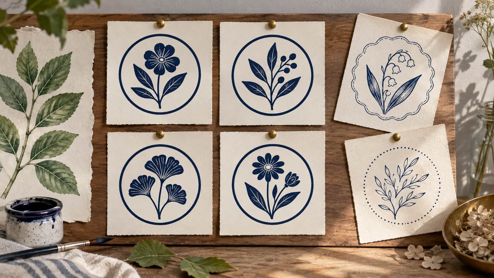
You ask an image generator for three matching stamp designs. One has a heavy double border, another has a delicate scalloped edge, and the third invents a ribbon around the center. Each looks plausible on its own. Put them together, and they look as though three different people received three different briefs.
A consistent AI stamp set needs more than the phrase “same style.” You need to decide which parts belong to the family, which part may vary, and which differences are unacceptable. The goal is not to make every image identical. It is to make the variation look intentional.
This guide uses an illustrative set of botanical, sun and water motifs to explain the process. The prompt examples are working briefs you can adapt, not reported test results from a particular model. The method concentrates on selecting and controlling related concepts before you build the final stamp artwork.
Decide what makes the designs a family
A family of stamps usually shares a small number of visible rules. Those might include the outer frame, the thickness of the main strokes, the amount of empty space, the position of the text and the visual weight of the center motif. The motif can change while the surrounding rules remain recognizable.
Start with the reason you need several designs. A workshop may want related symbols for three product categories. A community activity may need a small collection of themed marks. A business may want a consistent identity across several locations. The purpose determines which variation carries meaning.
Do not generate variation merely because the tool makes it easy. If the only difference is decorative and nobody benefits from it, a single reusable design may be clearer. A useful set gives readers a way to recognize both the common identity and the individual member.
Choose the most important family cue. If the frame is distinctive, keep it stable. If the type arrangement carries the identity, protect that arrangement. If the set is text-free, the relationships between motif size, stroke weight and empty space become more important.
Write a sentence that describes the family without relying on mood words. “A plain circular frame containing one bold motif with generous clear space” gives a generator and a reviewer more to work with than “premium vintage botanical style.” Mood can be added later, but structure needs a clearer instruction.
For the example set in this article, the shared rules are a single circular frame, one dark ink color, a simple center motif and no embedded lettering. The variable is the motif: a sprig, a sun or a wave. That limited change creates a useful comparison without asking the generator to redesign the whole composition each time.
Separate fixed properties from permitted changes
Make two short lists before writing a prompt. The fixed list states what every candidate must preserve. The change list states what you want to explore. This is your constraint sheet, and it should be brief enough to use while comparing images.
For the example set, the fixed properties could be:
- A single circular frame with no decorative second border.
- One solid ink color on a plain light background.
- Comparable stroke weight across the frame and motif.
- Clear space between the motif and the inner edge of the frame.
- No words, numbers, ribbons, shading or simulated paper damage.
The permitted changes are narrower: which motif appears, its internal arrangement and the small position adjustments needed to balance it. A wave can be wider than a sprig while still belonging to the same family. Consistency does not require forcing unlike objects into identical bounding boxes.
Use explicit exclusions for recurring unwanted additions. If the generator keeps adding stars, say there should be no stars. If it keeps presenting the mark on a wooden stamp mockup, ask for the artwork alone. Do not bury the actual task under a long list of unrelated prohibitions.
Keep factual wording outside the concept image when it must be exact. You can plan a text area without asking the generator to invent a business name or render a registration number. Later, build approved wording as editable text and reuse the same arrangement across the set.
Also distinguish constraints from preferences. A missing required motif is a failure. A slightly different curve may be a preference. If every stylistic choice becomes an absolute rule, you leave no useful room for exploration and may spend a long time rejecting acceptable ideas.
Mark the few constraints that affect the intended use. An open center might be essential because text will be added later. A decorative flourish might be optional. This priority order helps you choose between a visually exciting candidate and a simpler one that can actually support the planned design.
Choose one anchor instead of restarting the brief each time
An anchor is the approved visual reference for the family. It can be your own sketch, an existing design you have permission to use, or a selected generated concept. Its job is to show the structure you intend to preserve.
Choose it for the right reasons. A dramatic mockup may hide the artwork behind texture, perspective and lighting. A plain, front-facing concept makes frame thickness, motif weight and empty space easier to compare. The most attractive presentation is not always the best reference.
Where your image tool accepts references, state what the reference controls. For example: preserve the single frame and general stroke weight; replace only the center botanical motif with a simple sun. An unexplained reference leaves the tool to decide which aspects you care about.
Do not treat a reference as a guarantee of exact reproduction. Generative output can still vary in details and placement. If the border must be identical, plan to reuse a fixed border in the final editable construction instead of asking a new image generation to recreate it repeatedly.
The distinction fits the broader AI-assisted stamp design workflow: use generation where variation helps, then retain direct control over the parts that must stay exact. In this article, that means the concepts can explore motifs while the family structure remains a separate decision.
Give the anchor a clear filename and keep it with the constraint sheet. When you compare a later candidate, use that reference rather than your memory of the first image. Visual memory is not precise enough to judge whether a border has gradually thickened over several iterations.
Write a prompt card that changes only one thing
A prompt card is a reusable brief with one explicit variable. It should identify the intended object, the common structure, the permitted change and the presentation. You can reuse the fixed part without pretending that identical wording guarantees identical output.
Here is a starting prompt for the example family:
Create a front-facing concept for a one-color decorative stamp. Use one plain circular frame and a single bold botanical sprig in the center. Keep generous empty space between the sprig and the frame. Use simple solid shapes with a consistent visual weight. Show only the flat artwork on a plain light background. No text, numbers, ribbons, extra borders, shadows or distressed texture.
After selecting an anchor, the next card could be:
Use the reference to guide the plain circular frame, stroke weight and amount of empty space. Replace the center sprig with one simple sun motif. Keep the overall visual weight comparable to the reference. Do not add lettering or change the frame style. Show flat one-color artwork, without a product mockup, shadow or paper texture.
The second card specifies a replacement rather than requesting “another nice stamp.” That narrower instruction makes both the output and your review more focused. If the frame changes, you can identify it as a deviation instead of debating whether the new style is attractive.
For the wave version, change the motif instruction while retaining the fixed requirements. Avoid adding a new style adjective merely to make the prompt feel fresh. “Elegant ocean vintage engraved badge” introduces several new directions and may explain why a matching set starts to drift.
If the model cannot use a reference, describe the anchor in concrete terms and expect more manual normalization afterward. Do not claim reference-based consistency from a text-only request. The final construction step can still provide identical frames and text positions even when the generated motif concepts vary.
Keep each prompt with its candidate. A successful image without its brief is harder to extend, especially if you later need another member of the family. Record your own edits to the prompt as well; a small wording change can be the reason an unwanted visual feature appeared.
When feedback is vague, translate it into an observable change before generating again. “Less busy” could mean fewer leaves, no inner veins, a smaller motif or a wider gap. Pick the actual problem. Otherwise each attempt changes several things and teaches you very little.

Compare candidates at the same scale and on the same background
A large, beautifully presented candidate can win attention over a better-designed small one. Normalize the comparison first. Place candidates at the same intended outer width, use the same background and remove presentation effects from the decision as far as the available files allow.
Review the fixed rules before personal preference. Is the frame still plain and circular? Is there one motif? Has lettering appeared despite the brief? Does the motif touch the border? A candidate that fails a required property should not move forward merely because its shading is appealing.
Then compare visual weight. A sun made from a solid disk can feel heavier than an open sprig. A wave with several fine lines can feel weaker than both. The solution may be simplifying or redrawing a motif, not scaling it until it occupies the same rectangle.
Optical centering matters here. A motif with a long stem can be mathematically centered while looking low. Use the stamp centering guide when the family looks uneven despite matching outer dimensions. The frame can stay fixed while a motif receives a small visual adjustment.
Evaluate the set as well as each member. Cover the motifs briefly and look at the frames. Then compare the motifs without letting a particularly strong frame distract you. Finally, view everything together at the intended size. These are different judgments, and one can pass while another fails.
A simple review note can record four outcomes: constraint pass, motif clarity, family fit and required correction. Do not turn those into an invented scientific score. Their value is making your reasoning explicit, especially when another person will approve the set.
For example, a hypothetical wave candidate might pass the frame rule but fail motif clarity because its smallest line disappears at the intended size. A sun candidate might be clear but too visually dense. Those candidates need different revisions, and a general request to “improve both” is unlikely to express that difference.
Let the failure decide the next iteration
Once you identify a problem, change the smallest part of the brief that addresses it. If the sprig contains too many small leaves, request fewer, larger leaves. If the sun is too dense, request an open center or simpler rays. Preserve the already accepted frame and presentation instructions.
If several candidates fail in the same way, inspect the brief. Words such as “ornate,” “engraved” or “heritage” may encourage detail that conflicts with your requirement for a simple small stamp. A contradiction in the request can produce an attractive but unusable compromise.
Separate a concept failure from a finishing task. A motif that communicates the wrong idea needs a new concept. A useful motif with a slightly uneven outline may be better redrawn in a suitable design tool. Repeating generation for every small geometric correction can introduce larger changes elsewhere.
Be careful when asking for multiple corrections in one turn. “Make the motif smaller, thicken the border, change the color and add text” destroys the comparison with the previous candidate. You might get something better, but you will not know which change produced the improvement.
When the tool supports editing an image, give a clear target and preservation instruction. State which area should change and which parts should remain. Still inspect the result; an instruction to preserve is a request, not proof that nothing else changed.
Avoid using repeated generation to settle factual details. Business wording, location names and identifiers should come from an approved source. Correcting them is a text-validation task, not a creative exploration task. The same applies to checking whether an imported symbol is appropriate for your organization.
Keep rejected candidates long enough to remember why they were rejected. A one-line note prevents someone from selecting the same attractive but unsuitable image later. Once the final direction is settled, you can archive the unused concepts according to your normal project practice.
Build fixed parts once in your stamp generator
After choosing the motifs, stop asking generation to recreate the entire stamp family. Build the common frame and approved text arrangement as controlled design elements. Reuse those parts, then place each selected motif inside the same structure.
Record the frame dimensions and border thickness with the approved reference. Those values give the next editor a concrete starting point when the set needs a fourth design.
This is where an editable stamp generator becomes useful. The frame can remain a frame, the wording can remain text, and the imported motif can be handled as artwork. You can adjust one member without giving every element permission to change.
Keep the distinction between image import and native editing clear. Importing a generated picture does not automatically separate its components. If the picture contains a frame that conflicts with your fixed border, prepare the motif appropriately before treating it as the center artwork.
Do not rely on a filename to establish vector quality. A generated raster image placed inside a vector document is still raster content at that point. If the final destination requires specific geometry or file construction, confirm that requirement and prepare the artwork accordingly.
Review the completed family with the real wording present. A frame that looked spacious around a text-free concept may become crowded once names are added. Keep the wording consistent where it represents the same information, and deliberately accommodate members that require different text lengths.
For digital use, compare the outputs on the actual destination page. For physical production, obtain the supplier's requirements and a suitable proof. The family-consistency exercise does not replace the separate work needed to make a manufacturing file or approve an impression.
Also check the permission and usage conditions that apply to your source materials and the tool you used. This guide does not promise ownership, exclusivity or legal clearance for generated motifs. Avoid copying a recognizable third-party mark simply because the output resembles a plausible stamp.
The final family can be more consistent than the raw concepts because its invariant parts are no longer being regenerated. That is a workflow choice you control, rather than a prediction about how accurately any particular model will follow the next prompt.
Stop when the set passes its own brief
Without a stopping rule, concept generation can continue after the useful decisions are finished. There is always another motif to try or another variation of the border. Decide in advance what evidence is enough to move from exploration to construction.
For this example, the set is ready when all three motifs are recognizable at the intended size, each fits the same frame without crowding, no member feels substantially heavier than the others, and the approved wording can be added without changing the family rules.
That does not mean every curve has to match. A sun, a wave and a sprig are different subjects. Their differences should express the theme while the shared frame, spacing and treatment hold the set together. Excessive normalization can remove the very distinction the collection was meant to communicate.
Prepare a small handoff containing the anchor, the fixed/change list, the chosen motif references and a proof of the assembled family. Add one sentence explaining the permitted future variation. For instance, a fourth motif may be added, but the border and type arrangement should remain the same.
Give the next reviewer a specific question. “Does each motif read clearly while the set still belongs together?” is more useful than “Which one do you like?” If the answer reveals a real problem, revise that part. If the brief is satisfied, preserve the decision and move on.
AI stamp design variations are most useful when they help you explore a defined choice. Start with a fixed frame, one variable and a small set of candidates. Then use your stamp generator to turn the chosen direction into repeatable artwork that stays consistent when the next member is added.