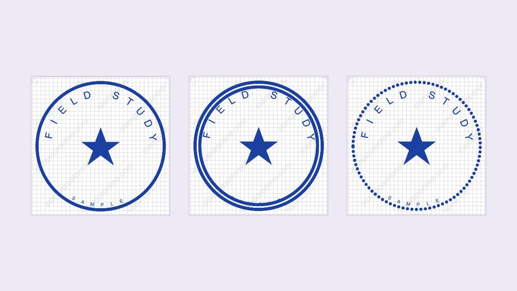
A stamp can look balanced with one outline and suddenly feel crowded with two. The wording has not changed, but the border now takes up more of the space around it. In an online stamp generator, comparing borders is easy; deciding which one leaves the lettering readable takes a closer look. This guide compares single, double, and dotted borders, then shows how to fix the tight spots without rebuilding your design.
1. Set the wording before choosing the frame
Start with the information the stamp needs to carry. Put the final name, short label, and any required second line into the layout before judging its border. A short placeholder can make a double outline seem roomy. Your actual business name may reach much closer to it.
Keep the plate size, font, text size, and wording unchanged during the first comparison. That gives you a useful question to answer: does this border work around this content? If you enlarge the stamp and shrink the letters between versions, you cannot tell which change helped.
For the example shown here, the upper arc reads FIELD STUDY, a star sits in the middle, and SAMPLE follows the lower arc. The three previews use the same lettering positions. Look at the lower word: the single border is already close, and the extra inner ring in the double version crowds it further. The double style needs a spacing adjustment before it is ready.
Use your longest line as the starting point, but check every edge. Curved words can approach the frame at the sides as well as the top. A short bottom label may still touch a border if its arc sits too far outward. Letter count alone will not reveal that problem.
2. Compare what each border adds
A single border gives you one continuous boundary to work around. It is a useful starting point when the design contains several text elements or a detailed center mark. There is less decoration competing with the wording, and fewer narrow spaces to inspect. A heavier single line can still dominate small letters, so simplicity does not remove the need to check its weight.
A double border adds a second contour inside the first. That can make a simple stamp feel more framed, particularly when the center is fairly open. It also creates another edge near the lettering. Choose it because both rings look useful at the intended size, rather than because two lines seem more finished than one.
A dotted border replaces the continuous outline with separated marks. Try it for a lighter visual rhythm or a less formal label. The dots need to remain distinct where you will use the stamp. If they merge into a rough line at a small size, or distract from the name, the pattern is not helping that layout.
There is no fixed relationship between these styles and a particular business type. A dotted border does not automatically make a design friendly, and a double ring does not establish official status. Judge the frame beside your actual words and symbol. If you notice the border first and struggle to read the name, reduce its weight or try the single version again.
For a quick comparison, look away from the canvas between versions, then read the name again. Check whether the border helps you find the wording or keeps drawing your attention to itself. This is a visual judgment, so you do not need to justify a preference with a rule about what a business stamp should look like.
3. Change borders in the online stamp generator
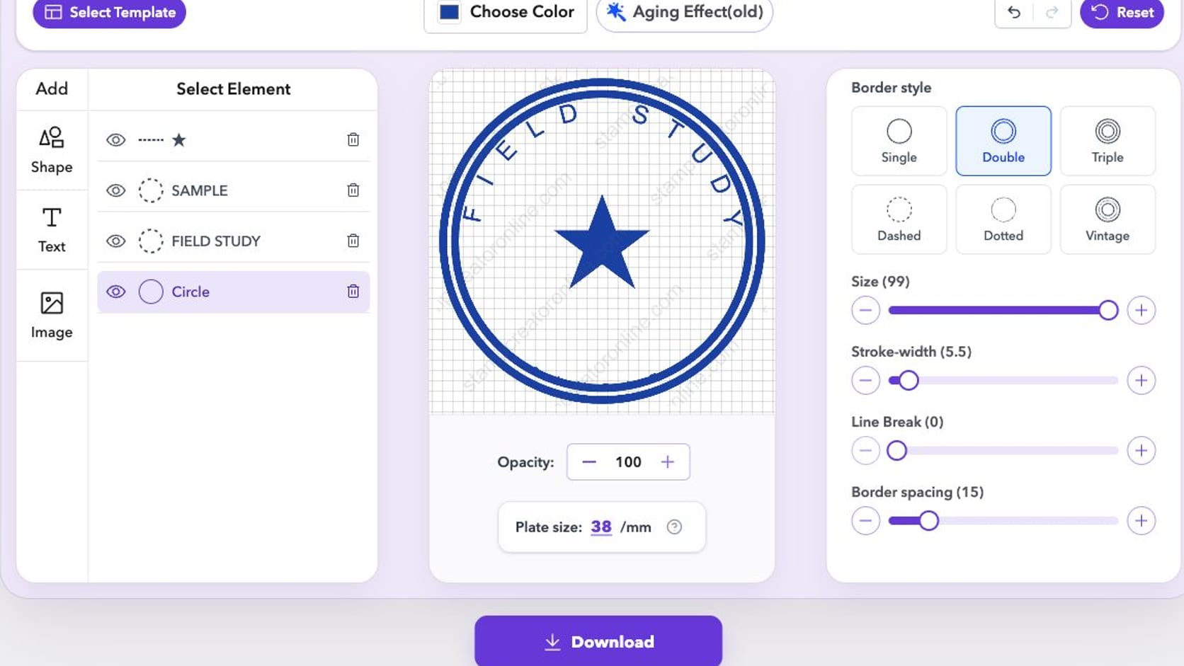
Open your design in the online stamp generator and select the outline in the element list. In the example, that element is named Circle. Selecting a text element instead brings up text settings, so check the selected row before looking for the border controls.
The Border style panel includes Single, Double, Triple, Dashed, Dotted, and Vintage. Begin with Single, then compare Double and Dotted while keeping the rest of the design steady. The canvas updates as you choose a preset. The examples in this guide focus on those three options so you can see the effect without changing several decorative details at once.
With the outline selected, Stroke-width changes its thickness. Double also exposes Border spacing, which controls the separation between its contours. These controls solve different problems: a heavy outline needs a weight adjustment, while two rings sitting too close together need a spacing adjustment.
Trying these border settings and previewing the design is free. You can compare the result before deciding whether you need a paid export. Keep any preview watermark in mind when assessing the screenshot; it is not an extra element in your stamp layout.
If a change makes the result worse, use Undo to return to the previous state. Avoid Reset for this comparison, since it can discard more of your work than the last border adjustment. When a template contains separate outline elements, select and inspect each relevant element rather than assuming one change controls all of them.
4. Give the inner ring and letters separate space
In the editor, a double border adds its second contour inward. Increasing Border spacing moves that inner contour farther toward the center. It opens the channel between the rings, but can reduce the room available for your lettering. A larger spacing value is therefore not an automatic cure for a crowded stamp.
Work on the part that is actually tight. If the two contours look almost joined, try reducing Stroke-width before spreading them farther apart. If the lettering touches the inner ring, adjust the lettering's position or arc radius. Reducing the arc radius brings curved text closer to the center, so check that it still clears the central symbol.
- Choose a border weight that does not overpower the letters.
- Adjust the gap between contours until you can distinguish them.
- Move the affected text away from the inner contour.
- Check the new space between that text and the center artwork.
Change one setting, look at the whole stamp, then continue. Pulling the lower word inward may fix its border collision while creating a new collision with the star. Reducing every text size can open space, but may make the smallest line harder to read. If the layout only works after several compromises, a single outline may suit the available room better.
You do not have to move both text arcs together. In the sample, the lower word is the immediate problem. Adjust that element first and leave the upper arc alone unless it also needs attention. Treating each line separately avoids disturbing a part of the layout that already reads well.
Do not treat every number beside an editor slider as a measurement in millimeters. Plate size is a separate setting. For a physical order, ask the manufacturer to assess the finished artwork at the intended plate dimensions instead of quoting a border slider value as a production specification.
5. Check the border where the stamp will appear
A large editing canvas can make small gaps look generous. Review the stamp at the size it will occupy on the document, label, or card. For a digital document, place the finished file in its intended position and look at the whole page as well as a close view. A border that looks attractive alone may be too prominent beside a small address block.
For a physical rubber stamp, the screen preview is a layout check. The impression also depends on the stamp, ink, pressure, and receiving material. Fine dots and tight channels deserve particular attention because the design relies on them staying separate. A home paper print can help you judge scale, but it does not reproduce an inked impression.
Ask your chosen manufacturer for its minimum line thickness, minimum clear gap, and artwork requirements. Check both the space between border rings and the space between the border and letters. Requirements differ among suppliers, so a value accepted by one company should not be treated as a rule for every stamp.
Request a proof at the intended size before approving production. If the design has delicate dotted details or a narrow double ring, ask whether those features are suitable for the selected stamp and surface. Keep the single-border version available in case the supplier recommends a simpler alternative. That gives you a practical revision path without redoing the wording.
For the dotted version, inspect the full perimeter rather than a few attractive dots at the top. Check the bottom arc beside the small label too. You want a visible rhythm around the frame and enough separation from the letters at every point.
6. Make one final pass around the lettering
Read the complete name first, then inspect the nearest border edge all the way around. Pay attention to the tops of tall letters, the ends of curved lines, and the bottom label. Look for a consistent visible separation, rather than equal slider values. Different letter shapes can make a mathematically similar gap look uneven.
If the letters themselves remain difficult to distinguish after you have opened the border clearance, revisit the typeface. The guide to choosing a readable stamp font covers that decision in more detail. Keep the border unchanged while comparing fonts, just as you kept the text unchanged while comparing borders.
Finish with the version that lets the wording do its job. In the online stamp generator, select your preferred border, check the lower arc once more, and review the whole design at its intended size. For the sample here, the next edit is clear: move SAMPLE away from the inner ring before approving the double-border layout.