
A stamp that fills the editor can look tiny in a Word document, enormous beside a signature, or soft after someone stretches it in a PDF. Those failures usually begin before export: the design was judged by screen zoom instead of a planned physical size. An online stamp size guide should therefore start with the destination, not a favorite preset.
This guide shows how to choose dimensions in millimetres, proof a stamp at actual size, and keep the result consistent across office documents, PDFs, printed pages, and a production handoff. It does not prescribe one universal size. The right dimensions depend on the available space, the amount of information, and any requirements set by the recipient or manufacturer.
Start the online stamp size guide with the destination
Name the first place the finished stamp will be used. “On documents” is too broad. A stamp placed beside a signature has different space limits from one placed in the corner of an A4 certificate. An address mark on an envelope serves a different reading task from a small approval status in an invoice table.
Measure the usable area, including nearby labels, lines, and margins. For digital placement, open the real document and identify a rectangle the stamp can occupy without covering content. For print, work in physical units rather than estimating from a screenshot. Record the maximum width and height in millimetres.
Then note the viewing condition. Will someone read it on a laptop at normal zoom, on a phone preview, on a printed sheet, after scanning, or after photocopying? A design that remains readable through several of those steps needs more open space and fewer fragile details than a large decorative mark used once.
If an authority, client, production vendor, or internal process specifies dimensions, treat that requirement as the starting constraint. Do not substitute a generic “standard” found in a template list. Requirements vary, and appearance alone cannot prove compliance.
Understand plate size, artwork size, and screen zoom
Plate size describes the intended physical footprint of the stamp. In a round design it is commonly expressed as a diameter. In a rectangular or oval design it needs both width and height. The artwork lives inside that boundary with margins between text, borders, and edges.
Screen zoom is only a viewing aid. A 38 mm design can appear wider than your hand on a large monitor when the editor is zoomed in. It is still 38 mm in the plan. Conversely, a large design can look modest when the browser is zoomed out. Never infer physical dimensions from how many screen pixels it occupies.
The visible ink area may be smaller than the stated plate size because the design needs clear margins. A border near the outside edge, for example, does not mean every millimetre of the plate is covered. Keep the distinction clear when discussing dimensions with a manufacturer: ask about plate size, usable artwork area, and any required edge clearance.
In the current editor, size controls use millimetres and offer standard and custom choices. Presets are convenient starting points. They are not a promise that every amount of text will fit or that every recipient will accept the result.
Match shape measurements to the way content reads
A round stamp is governed by diameter. Increasing that number adds room in every direction, including more circumference for curved text. Reducing it tightens the outer arcs and the center at the same time. If a circle is crowded, a small increase may help, but editing the wording can be more effective than making the mark dominate the document.
A rectangle separates width from height. A long company name may need extra width without extra rows. An address block may need height for line spacing. Keep the proportions tied to content rather than stretching the design after export.
An oval also uses width and height, but its curved sides reduce usable space near the ends. Text that fits inside a rectangular bounding box may still feel cramped against an oval border. Test the actual outline, not only the numeric dimensions.
Special shapes need the same caution. A triangle's stated side length does not translate into a full square of usable text area. Narrow corners contribute little room. Choose dimensions from the central readable region and keep the wording short.
Build at the intended proportion before adjusting detail
If you use a starting layout from the stamp template library, set the target dimensions early, then compose inside them. Do not perfect a large square design and squeeze it into a shallow rectangle at the end. Borders, curved text, centered lines, and symbols all depend on the shape's proportions.
Enter final wording before settling font size. Sample text is often shorter than a real business name or department. The correct size for “YOUR COMPANY” may fail with the approved name. Replace every placeholder, including dates and identifiers, then adjust the layout.
Use the smallest element as the warning signal. The main name may remain readable while a registration line, punctuation mark, or date becomes fragile. Remove low-priority detail, open spacing, or choose a larger plate. Making the entire design bolder can close counters and gaps without solving the hierarchy.
Keep a clean version without wear effects during sizing. Texture makes edges irregular and can disguise thin strokes at high zoom. Approve the underlying geometry first; add controlled wear only after the clean proof succeeds.
Create an actual-size proof sheet
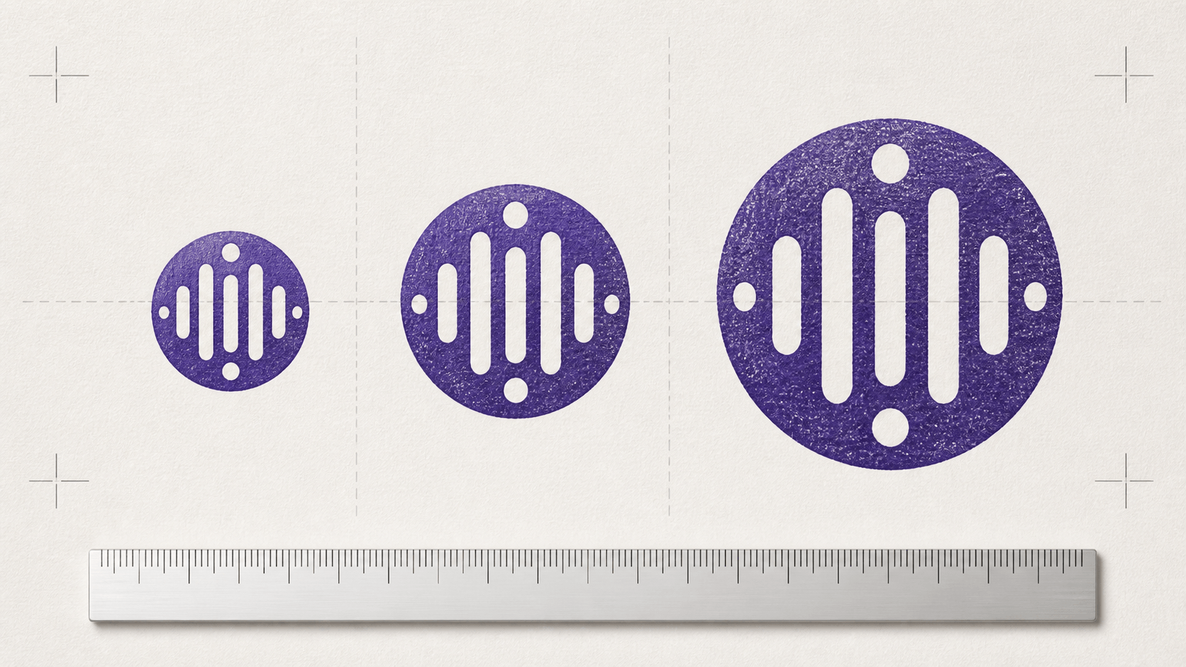
A proof sheet turns an abstract dimension into something reviewers can judge. Place the preferred stamp on a page at the target width and height. Add one slightly smaller and one slightly larger version beside it. Label the dimensions outside the artwork so the labels cannot be mistaken for stamp content.
Include a simple ruler or a known-size box on the page. Print at 100 percent or Actual size, then measure the reference. If it does not match, the print workflow has scaled the page and the stamp result cannot be trusted yet.
Review the sheet from normal reading distance. Can you identify the primary name immediately? Can you read the smallest line without leaning close? Are gaps between borders and letters still open? Does the chosen version fit the document space without feeling either apologetically small or needlessly dominant?
Mark changes on the proof rather than trying to remember them. “Increase lower line slightly” is actionable. “Make it better” is not. Keep the dated proof with the final file so later revisions begin from an approved physical reference.
Control PDF scaling during the print test
PDF print dialogs can alter page size during printing. A Fit option typically scales the page to the printable area, while Actual size is intended to print without scaling. If the purpose of the test is to verify stamp dimensions, use the option that preserves the page scale and confirm the result with a ruler.
Do not assume a PDF viewed at 100 percent on screen is physically accurate. Displays have different pixel density, operating systems apply scaling, and browser zoom can change the apparent size. The dimension in the document and the measured print are stronger evidence.
If a recipient will print the document themselves, allow for their workflow. A full-page PDF may be printed with Fit enabled, changing the stamp slightly along with the page. Keep critical readability comfortably above the failure point instead of designing to a razor-thin margin.
Place a stamp in Word without distorting it
Word documents can accept common image formats such as PNG through Insert > Pictures. After insertion, set a precise width and keep the aspect ratio locked. Dragging a corner by eye is acceptable for rough placement, not for an approved physical size.
Check both width and height after resizing. If a round stamp becomes oval or a rectangular border changes proportion, the aspect ratio was not preserved. Undo the stretch and enter one dimension while the lock is active.
Text wrapping affects placement, not the image's inherent clarity. Choose a wrapping option that suits the document, position the stamp, and verify it does not cover required wording. Then export or save a PDF copy and inspect that result separately. The Word canvas is not the last stage of the workflow.
Office applications may compress or resample images depending on settings and later exports. Keep the original downloaded file outside the document. If the embedded copy becomes soft, return to the source rather than repeatedly copying a degraded version between files.
Avoid enlarging raster files beyond their useful detail
A PNG is made from pixels. It can be reduced cleanly for many ordinary uses, but enlarging it far beyond its source dimensions spreads the same information over a larger area. Edges can soften or show visible pixels. Use an export sized for the largest expected placement and avoid repeated resizing.
Do not judge sharpness only at extreme zoom. Every raster image reveals pixels when magnified enough. Judge it at the intended size on the intended device or page. At the same time, do not dismiss obvious blur merely because the document will be viewed smaller; small lettering needs clean source edges.
If several people will place the stamp, provide a short usage note with the intended width, aspect-ratio rule, and approved file. A single shared source prevents one employee from using a thumbnail while another uses a stretched screenshot.
Test the stamp through the real document path
A print proof is one stage. If the document will be scanned, scan the proof. If it will be photocopied, make one ordinary copy. If it will pass through a messaging app or upload form, test that route with a non-sensitive sample. Each transformation can reduce contrast or detail.
Inspect names, dates, fine borders, and small gaps after the complete path. A light gray texture may disappear in a scan. A dense inner ring may merge with text in a photocopy. A thin serif can become intermittent. Correct the clean source rather than applying sharpening to the damaged copy.
Use dummy information during workflow tests. Do not upload real signatures, account numbers, registration records, or confidential documents to services merely to evaluate size. The layout question can be answered with representative text and a blank form.
Prepare a production handoff without guessing
Physical stamp manufacturers may request particular dimensions, line weights, colors, or file formats. Ask for current specifications before sending artwork. Provide the target plate size, confirm whether dimensions describe the whole plate or the printed artwork, and note any orientation requirement.
Send a clean master unless a distressed pattern is intentionally part of the approved design. Real ink, pressure, plate material, and paper create their own variation. Artificial gaps added for a digital impression may not be appropriate for production.
Include an actual-size PDF proof alongside the production file when the vendor accepts it. The proof communicates scale and orientation even if the editable artwork opens differently in another application. Ask the vendor to confirm final dimensions before manufacture.
Keep the approval response with the source files. If a later order appears different, you can compare the stated dimensions and proof instead of relying on memory.
If an order, account, download, or production question depends on your specific situation, use product and payment support rather than relying on a general sizing rule.
Record the approved size for repeat use
A good proof loses value if the next person cannot identify the approved file. Put the physical dimensions in a short readme or file note, not only in a filename that may be shortened during upload. Record the shape, width and height or diameter, date of approval, clean or textured status, and the intended document use.
Keep source, delivery, and proof files separate. The source is the editable design. The delivery file is the approved PNG, SVG, PDF, or package used by the team or vendor. The proof is a page that demonstrates scale and placement. Giving those files distinct names prevents someone from inserting a screenshot of the proof as if it were the final artwork.
For a shared office workflow, add one small example document with the stamp already placed correctly. Remove private information and use neutral sample text. Colleagues can inspect the image dimensions and wrapping behavior without rebuilding the placement from memory. Tell them to copy the original image file into new documents, not to crop it from the example page.
When the wording changes, reopen the source and repeat the size check. Replacing a short department name with a longer one can reduce letter size or alter spacing even when the plate dimensions stay unchanged. Treat a content change as a new proofing event, not a harmless text swap.
Review the record when software, printer, document template, or production vendor changes. The approved physical dimensions may remain correct while the route used to preserve them changes. A brief actual-size proof catches that difference before a large batch of documents or a physical order depends on it.
Use a two-level size checklist
Design checks
- The final wording is present and approved.
- The shape and proportions match the content.
- The smallest text and gaps remain clear at target size.
- Borders do not consume the usable area.
- Texture is assessed after the clean version passes.
- The artwork retains its aspect ratio.
Workflow checks
- The destination area has been measured.
- The proof prints at the intended scale.
- PDF Fit or Actual size settings are understood.
- The stamp survives the expected scan, copy, or export path.
- The original downloaded file is archived separately.
- Recipient or manufacturer requirements are confirmed.
Choose dimensions, then prove them
Begin with the real wording and set the dimensions from the space you measured. Preserve the intended proportions, test the full document route, and keep the approved size with the source files.
The useful outcome of an online stamp size guide is not a magic diameter. It is a repeatable proof: stated millimetres, preserved proportions, an actual-size print, and a file that survives the route it will really take. Choose dimensions from the destination, then make the evidence visible.